Warpath – The Corporation
July 8, 2011 by dignity
Video Sponsors: Infinity - Wayland Games
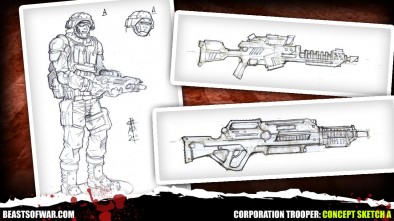
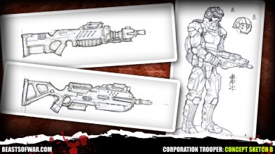
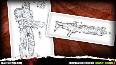
Andy, Ronnie and Alessio have saved the best for last as we get an exclusive look at some of the first concept art for the basic Corporation Trooper's.
Get the Rules here:
Beta Discussion Groups here:
Also if your a Backstage Pass holder you can download a set of Unofficial Markers & Templates we created.
Supported by (Turn Off)
Supported by (Turn Off)
Supported by (Turn Off)




























![Very Cool! Make Your Own Star Wars: Legion Imperial Agent & Officer | Review [7 Days Early Access]](https://images.beastsofwar.com/2025/12/Star-Wars-Imperial-Agent-_-Officer-coverimage-V3-225-127.jpg)











So how do we listen? I couldn’t find it on iTunes
I got the same error message “You’ve reached an audio only episode. if yould like to listen, we recommend subscribing to this show in itunes or a RSS reader.”
A mixture of ‘real life’ soldier and marines from Halo – nice look about them. Now I just have to get a Sgt and name him Johnson lol.
I do like the third ‘most armour’ one, but in terms of the overall gameworld, with Forgefathers already having that ‘layered’ armour look, I think the middle one would be the one I would pick for the core troops.
The hummer thingymajig is nice too, but is small light transports more in suiting to the other humans, the rebs?
They look nice but they need a “Owned by theCorporation” feel to them, maybe an emblem or sponsorship like the race car drivers have.
Maybe that sort of detail might be left to each individual when they paint their miniatures?
and what does not work are these studs all over them , because this somehow doesnt come together with their advanced technology background
If you mean the helmets, watch Ghost in the Shell – I think those are sensory devices.
If you mean the armour…well I’m glad there aren’t TOO many, that really would be a little too grimdark 😉
really I think in Sketch A they really look like studs on the helmets, but it doesnt really matter and about Ghost in the Shell probably saw it at least 20 times ( And “Stand Alone Complex” 2 times ^^) …but actually youre right its been quite some time since I saw it , probably I should watch it ^^
Of course the Humvee (in Spaaaaaaaaace) goes well with the Corporation, given its design aesthetic based upon current real-world soldiers. For me, I’m concerned that it not be “just a Humvee”. It doesn’t need to hover, necessarily, or be covered with missiles, but I would definitely like to see it be different enough from a real Humvee that people say “Oh, I see, it’s a Humvee in Spaaaaaaaaaaace” rather than “Why are you using a Humvee in a science fiction game?”
As far as the trooper sketches, Trooper A looks too lightly armored to be a standard frontline combat troop – maybe his uniform in spaaaaaaaace is really tough and he relies on mobility, but compared to existing drawings of the Forgefathers and Marauders, with their bulky armor, he is way under-outfitted. Trooper B looks pretty good, but remarkably similar to the look of another company’s basic human infantry (which may be a plus for some people). So for my money, I’d like to see Trooper C, the heaviest armored one, be put forth. With lightweight future alloys and ceramics, the armor might be lighter than it looks, while still offering excellent protection to the whole body.
Also, I’m definitely loving the closed helmets, although the open ones aren’t bad either.
And the guns are looking nice, although I find the one that just looks like an M-16 to be a bit meh, and would prefer one of the boxier ones.
From how the Corporation have been described I would never see them as bulky or heavily armoured. I always saw them as soldiers with highly technological suits of body armour that weren’t like traditional marine outfits – but more incredibly resistant weaves and bodysuits. Sometime like the Nanosuits from Crysis – just not as skin hugging.
Maybe thats something we will see with their elite troops rather than the basic ground and pound guys.
P.S – also not being able to see their faces would be a fantastic idea for helmets. They are hell bent on conquering and controlling the stars so it would reflect their soulless nature to have them with the more closed helm look about them.
I agree! Just because these guys are humans- do we really need to see every individual face? I think the faceless numbers of the Corporation would be a better aesthetic- think Stormtroopers in Star Wars? Possible seeing the lower jaw for squad leaders- to set them apart?
Yes! Score for Mantic…just take my money now guys. I’ll be playing corporation! At least I know that a 200$ investment will be enough to get me an entire army with lots of options.
Subscribe how. Not all of us are techno enlightened and I thought that once we subscribe to backstage it would be a matter of point and click not more subscriptions to other sites. Sorry for the rant.
For me A or B would be the way to go (both?). C does look cool but my worry would be that they just looked like “Tallfathers”. The others still have a distinctly human look. Which I like 🙂 more great work Mantic.
You have got to put the hummer with corporation. It is such an iconic human design. Sure it is stout and stocky which is dwarven, but its not dwarfy enough for forgefathers.
Anyway i like the corporation designs. well armed and well equipped troops. Well funded too, having the largest organized body to back it. Im hoping to see some elite units though in heavier powered armor that keeps with the same look and feel.
Keep it up guys!
MANTIC……..
Keep the humvee type for the corporation. The 2nd or the 3rd trooper look best IMHO. BUT! I like them all. Please whatever you do make the sprues so we can get at least three poses or more. If not not biggie. OH can we make the humvee with just the wheels? The traks look awkward.
I like B the middle art as it looks like a Starship Trooper trooper. As for the helmet, closed is good as @brennon said and if it is open have them with glasses or visors to cover the eyes so you never feel from them any emotion.
my vote definitely goes toward C. B would be my second choice. I could ask for more poses, but these are just concept sketches and mantic has always done well with posing and options for their troops.
The Hummer needs to stay with the corporation. I agree that the faceplates down give them that “Faceless corporation” feel. I also agree that A & B are better than C, But I like B the best, but A’s weapons better, maybe just give multiple weapon options.
And the secret corporation troopers are….. the kamikaze Scotsmen with “no time to waste” special rule.
middle pictured trooper is the best in my eyes
OH $%£^&. So I have a good whine as the program format changes from audio only to vid, oh well. Must admit I do like B and as has been said above I’m not over keen on the studs which seem to be a main feature of the Forgefathers which I must admit I do like.
Closed Helmet, yes … beside that let me be greedy :
A would work for scouts, B for the normal troopers and C for the Heavy support, need not be heavy weapon support it migh just as well be the guy in the mauler suit that get forward in the melee
my vote has to be with “B” and yes yes yes – humvee with the corp
Why not put some of the vehicals with a couple of optional body panels,or accessories EG a more baroque norse Forgefather version of the cupola, a straight to business(posibly with a raised roof..) corporation/reb one and a rebuilt with scrap cos its just gonna break again Marauder version, to represent something designed by the dwarfs, taken and modified by the humans, then given in a state of disrepair or just outright stolen by the orx…
One thing I’m kinda disappointed with, they dont have bullpup rifles (IE ones were the trigger is moved in front of the action to reduce over all length), but I’ll live with that since it makes converting and re-posing the model a much tougher job when most of his gun is cast into his arm. The concepts don’t show this, but please don’t shove the but of the rifles into the elbow of the model, yes you probably could get away with that with a laser because the recoil impulse wouldn’t be the same as with a projectile weapon, but it means you can only react and look for danger to the right of were your rifle is pointing, since your head can’t turn any further to the left(well it can but you might need an orx’s help for that and it wont be comfortable). Look at how Wargames factories troopers are posed with the gun resting on the upper arm, its still not perfect but it looks better than GW’s parallel to the shoulders stance on the newer minis.
I like B and C. I think B body and C face mask would look awesome together. Also, I think A would make a good Scout type unit.
I would go with B’s armor, C’s face shield holding the bottom gun from A.
Nice, I’m liking those 🙂 I say B – C seems too heavily armoured (they are a Corporation – so they won’t look after their employees by kitting them out in elaborate, expensive uber-armour – a life’s only worth so much, ultimately they are an asset) and A seems too weak (they may not care for their soldiers but they aren’t stupid). So B all the way, I even prefer the closed helmet.
I say keep C but use it for more of a Heavy/Elite unit and keep the Hummer – just sex it up a bit with different shaped body panels and a nice big chaingun – a la Halo 🙂
I see no reason why they wouldn’t use this kind of vehicle as a mass produced ‘go to’ combat aid or transport for small units – it’s big, it’s armoured, it’s reliable and it has a lot of firepower – I wouldn’t like to see ‘slick’ sci-fi for these guys, save that for the poncy pointy ears 😉
Have to agree – B for the basics, C for the Special Forces.
Just look at AT-43, the Red Blok had 3 similar-but-different troopers just like this.
The lower gun from B is just so Halo Assault/Battle Rifle…please keep it in.
Oh and with regard to the ‘Star Commandoes’ I recommend two sources of inspiration – first an old C&C clone called 7th Legion:
http://www.mobygames.com/game/windows/7th-legion/cover-art/gameCoverId,2172/
Given the build menu pic for the game’s ‘Slaven Riders’ I swear the developers played 40K at some stage…
Also you could take Mr Naismith back to his roots:
Apologies to @labambaman but I didn’t know where else to steal the pic from. If you use this approach then ditch the sword and the studs – they are too grimdark. The helmet will need work too, but I’m no artist – I don’t know how I would change it.
If you need a name for these planned elite troops, how about ‘Supremely Protected Enhanced Suppression Soldiers’?
I love acronyms 😀
Here are my misunderstood soldiers! We’re just trying to make the universe a better place!
I am pleased with all the pics, do everything they say on the tin! Got a nice Doom-ish look in places. Standard generic soldiers. Standard infantry! Like it.
how many on dakka are gonna go OOOOOO imp guard replacements…..
Yeah! Humans! And they look good.
a i like a with the mask
I vote b though a is great too. I agree with the post of using all three to represent different types of infantry though.
I love the art. I’m really looking forward to the miniatures for these.
And the “star commandos”
Awesome.
I prefer trooper choice B. Although I think the legs on C are better than on B, so maybe switch the legs on B for C and voila! Cool basic trooper…real like the blast shield visor on trooper B also.
I like B the best. Not to crazy about the studs/rivets on the other sketches. Although I like the styling of C minus the rivets. Maybe could use style C for a heavier troop. Bulk him up a bit more with self-contained armor like a Spartan from Halo.
Don’t really like the Hummer either. If you want to give them a transport how about something like the LAV-25 the the US Marine Core uses now. The Hummer is a vehicle that first of all is not produced commercially anymore and in a few years most modern armies are going to have them phased out. So using a hummer like vehicle in the game will not lend to the futuristic, sci-fi feel.
I really like B, especially the cargo pants look great. And for the Hummer, the one with the tracks looks awesome :).
Offtopic:Too bad we didn’t see any miniatures in Warpath week, but I guess it was a bit too much to ask for ;). Still can’t wait to see Forgefather stuff :).
I prefer the torso of A with maybe the legs of B or C. Less super chest armor and more ammo/utility pouches. Plus A’s shoulder armor isn’t too ridiculous. As far as guns, any with a more bullpup-like design.
I like the overall look of C; maybe tone down the rivets and make the armour look a little more “mass produced”, a bit like B, but keep the coverage of C. I prefer the aesthetic of B’s armour, except the boots which I don’t think really gel with the rest of the outfit. A’s shoulder pads are my favourite, and C has by far the best helmet design as far as I’m concerned.
C’s rifle is my favourite, as it has a somewhat boxy appearance, being squared off by the frame around the barrell, and the telescopic stock. A looks to me like something you might see 100 years from now, which doesn’t scream “IN SPAAAAAAAAACE” to me.
As for the Humvee; there’s no doubt in my mind that it will be a Corporation vehicle. Ronnie was talking about Afghanistan and iconic imagery, and the only thing more iconic than putting the American’s Humvees in the game is not including the Brit’s armoured Land Rovers.
I’ve got three requests:
1. If you’re going to have different armour variants for different squad types, make at least one of them a full hard armour suit (like Star Wars stormtroopers, Mass Effect , etc), instead of the current hard armour over fatigues look.
2. Have separate heads, so that we can choose either helmeted or unhelmeted troops.
3. Have at least one sprue of female soldiers, so that we can make a mixed force or even an all-female army. Do this and I will buy a Corporation army.
Yes to female soldiers. Let’s get some diversity. Also, I want female soldiers for all the races not just humans. You can’t get more Forge Fathers without Forge Mothers and Marauders have to come from somewhere. Unless they they are like 40k orcs and just shoot their spores everywhere.
The problem with female soldiers is that under the armour and 70 lbs of equipment they’re indistinguishable from male soldiers. The only way to make them look distinctive on the tabletop is to have overtly feminine faces and long hair or boob armour, which both tend to look ridiculous.
You are not the first to make this claim but every time I’ve seen someone try to prove it by posting a supposedly ambiguous photo, they have failed.
I can tell the difference between a male soldier and a female soldier. If you can’t, that’s your problem.
I think C looks really cool, but B fits better with what you guys have been telling us. So my vote goes for concept B 🙂 Although I think C would be great for these elusive ‘elite’ troopers, better armoured, better weapons. I know some people would love to field an elite army of Corps, me included 🙂
The hummer looks great, although I think the corporation would suit more intimidating heavily armed APC’s than a light fast open topped armoured car, maybe the Rebs can have the hummers 🙂 that would be great
Please not the hammer. Its so worn out topic.
Please not the modified Humvee its so worn out topic.
Too many of them everywhere, all games, movies, even scifi movies of class D use modified hummies
Hell Yes with the Humvee for the Corp. Troopers. Pic A would be good for Airborne Troopers or Scouts. Pic B is much better for the basic Trooper, front line Troop. Pic C is good for Heavy work like going to ground after the Dwarfs (In Space) following them deep into there mine works, to root them out.
That would be a mistake, if you go after Dwarves the best you can do is keep it at the surface ;). You don’t go into a place where THEY have the advantage. They already are powerhouses in close combat, so put yourself in an area where they 1. Have the height advantage even more then outside, 2. Know the way better then you do. 3. Will put up traps like cave ins. 4.A place where they can swing their weapons but you can’t….
That is exactly what they want ;). If you want to kill Dwarves you have to keep it on the surface, and rather then heavily armoured you want to use their disadvantage to your advantage. They are SLOW to move ;). So you want fast moving troops that can outflank them :). I mean… no offence but you also don’t go into a drinking contest with them, you go into a stay sober contest with them ;). You bring the fight to them, not give all the advantages to them ;). I mean it isn’t just their armour that makes them so tough, it is those short legs and arms with the thickness of tree trunks. But they aren’t agile nor are they fast… use that to your advantage :).
Next thing you know you’ll be wanting to beat them in a Beard Growing contest with your Elf Army :P, when you should be going into a “Clean shaven” contest ;).
I’m partial to A and B in that order, but really, I’m not going to be fussed whichever look they go for. The reason I like ‘A’ is that it looks like some bean counters were in there deciding on where the break point was for expense-to-survivability. That seems very corporate to me.
I really liked the look of the tier troopers but also I am looking forward to seeing these Star Commando, Space Rangers, Solar Marines or Omega Core whatever they may end up being.
The skeches look sic. I hope before you guys go into production that you have a open rules test of the different races a ‘Gamma tes’t before you do so the armies are all balanced against one another. Because no matter how good anyone person is the masses always find away to break things.
But you guys have got me hyped.
It would be refreshing to see a take on the modern solider in the future. Today’s combat trooper carries a lot of kit and armour so I don’t see that changing much. Plus modern armour doesn’t need rivets and bolts to make it work, so I’d drop them from the models completely. The best asset for them will be information and real time data presentation so that means glasses/goggles/helmets, plus sat comms kit also. I like the gun design and hope the heavy weapons allow for a more advanced look. Keep the hummer, all grunts need some wheels…
Hope mantic break the mould on future humans and not go gothic, ww1 or anima.
No Hummer. You guys should make it look more like the bat mobile from the “The Dark Knight”
I like option B with the chest pouches from option A, Modern Body armour is all held together (across the shoulders and around the torso) by velcro (usually) and plastic clips, so I imagine future armour would be similar.
If the Space Commandos are what I think they are going to be I am pretty sure that mantic will have the full powered exo skeleton troops covered. Troop C certainly doesn’t cover that sort of design, it just looks like a more full kit of modern body armour before the soldiers cut all the mobility killing pieces from it so they can still move.
I’ll be happy to see futuristic soldiers that actually have some sort of webbing or battle harness so they can actually carry their ammo, maps, sat nav, and water around the battle field.
Lose the Humvee, not enough protection for a battle ‘in SPACE!’ and go for some of the design points that are used by the up and coming protected mobility vehicles that the western militaries are working on. V shaped hulls for mine protection is a good start, no flat surfaces for armour either. And the weapon mounted on top has to have a decent sized round and look like it is capable of an awesome Rate of fire.
i dont see trooper ‘a’ being used by an army that favors gunboat diplomacy – much more intimidating if your troops have no obvious weak spots ( fluff wise much of it may well be decorative plastic, apearance is the important factor) Trooper ‘c’ might be used for the elite troops, but it cant possibly be cost effective to have the forgefathers make armor for your entire army. which leaves us with ‘b’ as the best balance between intimidation and cost.
as far as the humvee goes – not for the corp – a futuristic megacorp will have much better options available for troop transport ( perhaps the dropships transporting troops planetside are armoured enough for direct battlefield use) i can see it being used by either the rebs (who may have to make do with modifying particularly rugged civillian vehicles) or the mauraders ( who where given at least some human tech, but probly not the best available )
I am a fan of trooper “B”. gets my vote.
I could just imagine now a few platoons of those running around. That the artwork is provocative enough to make me want to start designing paint schemes tells me I am on the right PATH…
I wasn’t even going to collect Corporation!! But I’m like you, and starting to visualise the colours these guys would be wearing! Must admit, I’m trending towards plain colours- grey’s grey/brown (Graveyard Earth-y) or black- purely to reinforce the whole “these guys have sacrificed individuality when they accepted the Corporation into their lives” ethos.
B looks like just the right combination of armor and mobility.
In my opinion the humvee should definitely belong to the Corporation rather than the Forgefathers, it looks like something built by humans for humans.
i think “C”. it looks “mantic” to me. the same way the orx have layered armour ( a more basic version supplied to them by the corporation). which is derived/copied from the FF armour. who mantic have said, are the most technologically advanced race.
Well one of the most, I think they mentioned the Astarians being quite mysterious as well so they probably can compete with the Forgefathers in that aspect. and the race we don’t speak about hehehe… that race can probably do some nasty shit too ;).
Just different approaches to the same problem of “KILLING HUMANS!”:D:D. Man I love Warpath already… where are the miniatures ??:D:D.
When I saw the tree different looks I thought they were tree different types of units, sort of like “scouts” (A), “regular units” (B), “elites” (C), I think it would work fine like that…
The “hammer” like vehicle it looks too close to what the army has now… how far into the future is the story?… I think the vehicle should look different considering that some planets have atmospherics and gravity differences.
Please don’t repeat design elements throughout different races/armies. There are always multiple directions to move when it comes to portraying particular traits. Jes Goodwin has set the standard.
Have to agree with the majority, i really like the design of soldier B, that, combined with Soldier A’s 2nd weapon would look badass!
That HummVee is behind the times.
TRY to go look at the RG series of vehicles, crop out the frame on the drivers and passenger side, and block it off with a turret on it, then keep the back open for stowage with uparmored sides and rear.
Hummvee…. IN SPACE!!! is just a tuna-can waiting to be opened. anyone riding in that thing is a dead man with temporary use of thier arms and legs.
Very nice, plausible, generically useful SF troops. Not Gothic or skull obsessed, weapons that are smaller than the men carnying them and no melee weapons beyond the ever present knife or bayonet and so much more useful because of it. Now I am excited about this range, even if I do not go near the rules I can see a multitude of uses for a couple of boxes of these guys.
The idea of differently styled troops is almost too much to ask for as well so you could use them as different armies. Who needs aliens?
The vehicles, less exciting. An SF humvee, it is an eternal role but maybe a little less humvee like? Half tracks, no, don’t go there, they are obsolete because they were neither fish nor fowl.
I do believe that I’d be happy with any of the three. But what I would REALLY, REALLY, REALLY like to see are a mix of men and women! I know that many modern armies allow women into their infantry, and I don’t see why the Corporation wouldn’t!
I mean really, since women get about 75% of the wages of men, why wouldn’t the corp be happy to exploit women in their ranks? At least a few? Something along the lines of Startship Troopers light mobile infantry (as in the movies) would be fantastic!
Thanks
n.
Well if the minis turn out to be anything like the forgefathers or the orx, they’re golden. The transition from consept to actual mini was really good with them. So I have high hopes for the Corporation.