Games Workshop Reveal The Coming Of The Dwarfs
January 27, 2014 by brennon
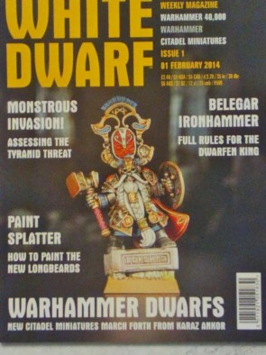
The Dwarfs are coming down from the mountains as February arrives for Games Workshop. With a new White Dwarf Magazine on the way it would be remiss of us not to at least carry on a tradition and share some of the sneak peeks inside. There is also a teaser image above...
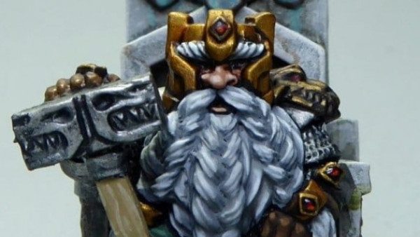
As you can see the front cover is of the mighty Belegar Ironhammer and the issue also includes rules for the Dwarfen King. It sounds great to know there will be a sneak peek at the rules before the book comes out.
I do like the model, apart from that rather stupid helmet. I know Dwarfs love a bit of pomp and ceremony sometimes when they show off their riches but they are also practical! (Edit: Some have said that this is actually an icon on his back rather than part of the helmet, so that might be a bit easier to remove!)
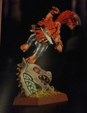
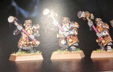
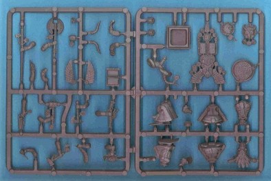
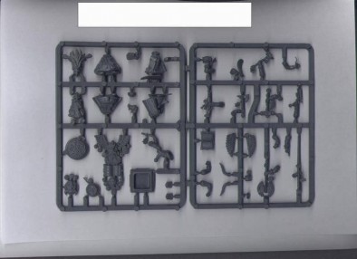
As well as that cover we've seen inside the issue and glimpsed the new Slayer character model and some Hammerer/Longbeards that have been put together as the new plastic kit.
The Slayer hero is quite neat looking but he is in yet another impractical stance. I know dynamic is good, but why does he need to be tripping over a rock? Shame really because I think they could have achieved the same 'charge' feel without it.
The Hammerers and Longbeards however are much more awesome and although it looks like they got someone derpy to paint the faces once again they are epic and covered in armour just as they should be.
Sourced from Bugman's Brewery.
Update:
A friend of mine sent over some images from another blog site with what was one of the old Dwarf Lord Kits. Not going to see the light of day, but it quite funky to see.
Can't wait to see what else is coming on the Dwarf front!
Supported by (Turn Off)
Supported by (Turn Off)
Supported by (Turn Off)





















I hope Belegar Ironhammer comes with two helmet options… I don’t want a Dwarf that looks like he is the Rio Carnival!!
I love the slayer in that stance, he will be mine!!
I am in two minds about the Hammerers though, the swirls on the helmets make them look like they have horns… blegh…
What on earth has Belegar got on his head? Looking at the slayer, it seems as if GW are already lining up an Asterix license to replace LotR lol. Agree that the pose doesn’t work at all. Reminds me of the Snoopy dance. Totally underwhelmed by these. It’s a shame AoW couldn’t get their act together in time as their dwarfs are a cut above these ones.
That enourmous comedy bonnet is definitely overcompensating for a lack of inches 😉
I’m sure it takes a lot of technical skill to design and manufacture something like that, but just as with many of GWs recent plastic kits, just because you can do it, doesn’t mean you should do it. Focus on making it look good instead of going crazy with your fancy CAD software.
“Just because you can, doesn’t mean you should” – very, very true.
I think this applies to Games Workshop a lot nowadays. We’ve seen how good Dwarf heroes can look without all these frills thanks to Warhammer Forge and their command kit. I just don’t think they need this eccentricity to the Dwarfs.
As I say above, what happened to the practicality of Dwarfs? The Hammerers and Longbeards certainly have that – which is good thankfully.
BoW Ben
The FW dwarfs are definitely a lot better than the slayer and lord here. They probably won’t cost any more to buy either. FW seem focused on turning out nice looking mini, whilst over in the main studio, the switch to CAD design and plastic production a few years back has unleashed a horde of over-designed kits. It seems like they’re determined to push the boundaries of what they can do with the technology.
This is called restraint in design. We have been guilty of breaking this rule ourselves (everyone does from time to time).
But the key to great design is often about what you leave out… not what you put in!
Hopefully we’ll start addressing our own breaches of this rule in the coming weeks!
They don’t always get it wrong, but the kitchen sink philosophy does seem to win out more often than not at the GW bunker these days.
Oh come now they have shown remarkable restraint, there is not a single skull on the model….
Another thing about the miniatures is they favour a rather artificial looking “video game” style. I think that might be because it will appeal to teenagers. I suppose a lot of people have raised this point and it may sound like a bit of a cliché. The figures nowadays often look like they are doing a “myspace” pose rather than going into battle. The new model on the front of white dwarf looks like he is going to a 70s disco in that hat. Try to imagine someone turning up at your local nightclub in that outfit and doing all… Read more »
Actually a lot of the time the new GW stuff is even more expensive than forge world when it is made out of plastic! The GW fans seem determined that even plastic miniatures are worth buying over high quality resin miniatures. Real die hard GW fans will keep buying plastic at all kinds of prices, even when they could buy forge world at a cheaper price nowadays.
I prefer this guy
http://www.games-workshop.com/gws/catalog/productDetail.jsp?catId=cat440054a&prodId=prod780848
What happened to GW taking inspiration from the older stuff? The old citadel and marauder dwarves are still the best.
I agree… I have over 100 citadel and marauder Dwarfs.. simple but full of character. Bring back the Norse Dwarfs!!
That is one of the coolest Dwarf models out there. I love the grumpy nature of him.
Also – the post above has been updated with (what appears to be) the Dwarf Lord plastic kit. It might actually be something far older from back when the Miners were released and we won’t see it.
BoW Ben
The lord’s a bit OTT and the slayer’s just daft. IMO of course – and I like the rank and file.
+1 for Citadel’s old dwarf ranges. Remember these? http://solegends.com/citcat1988/0307impfdwfs-02.htm
I do
I wish I still had some of these fellas. I was probably still using enamel paints back then but they still looked good.
You can get some old school looking dwarves just like these from Old Glory. They even have boar riders and a huge steam tank thing. They look impressive. Huge range also. And probably cheaper than the new GW.
Bring back Squats.
Could have done without that pose on the Slayer model myself. they could have gotten away with just a re-release (in failcast) of the Old Gargrim Iron Fist Model that had a far better pose (this was also the most “wrong” model GW ever did with the completely butt nacked slayer jumping off the head of a felled chaos warrior) As for this news I both love it and fear it Love it as Dwarves were my first Fantasy Army and Fear it as I can See GW removing what makes Dwarves Dwarves in fantasy. The Rune system I don’t… Read more »
Hang on a sec!! Is that monstrosity actually on his head, or behind him on a banner pole, like the old Ungrim Ironfist model? I tried to zoom in, but the photo gets grainy. If that is his banner, and his helmet is actually the lower horned bit, then this is an awesome mini!!
I have been told it might be a banner pole rather than part of his funky helmet.
BoW Ben
Phew, that would make sense and be in keeping with previous models. In that case… he will be mine!! 🙂 Thanks Ben
I was thinking there was only one thing missing from that helmet a Basketball hoop. I can see it’s a banner now 🙂
Whilst the positioning isn’t silly if it’s a banner, the design doesn’t improve.
What is new in the GW modeling toolkit ?
– Making models that fly of race icons, we seen this with the Dark Elfs and now with the Slayer here.
The silly slayer has had a drop too much Bugman’s and is falling of a stone dragon head.
Prolly not helped by all the weight of the hair gel and hairspray required to keep his mohawk up raising his CoG
I do like narrative in a sculpt.
You’re acting as if there’s such a thing as a “dwarf that isn’t pissed off his face” … these creatures do not exist.
Well, the terrain pieces are there to try and justify the cost, and have the dwarven Longbeard design moved to the more ‘realistic’ look of the WETA/LOTR range?
Epic beards, nuff said.
Another Fantasy release of pure class.
Hammerers mediocre, the lord actually from the my little pony toyline and the hero is frozen in a Matrix moment .. not thrilled
Some people think that back banner is part of his helmet?! As soon as I saw it I just assumed it was a back banner! Gods help us if it actually IS part of his helm… but I don’t think it is. I LOVE the Hammerers! I’ve always been a big fan of the Iron Breakers, but never the old Hammerers (I know, bad me!), so I’m tickled pink that I’ll no longer have to proxy in my local games regular Warriors for Hammerers. $50 for 10, though… ugh… I’ve liked nearly all the new clamshell plastics, but am slightly… Read more »
Yep, went back and looked, cleaned the pic up a bit. That’s definitely a back banner: you can see his helm on it’s own, with two big horns sticking out the sides, and the banner with it’s dangly runes off center. I love the model. Here’s hoping it’s plastic (though it being some of the last of Finecast seems inevitable…).
I like the designs, especially the obvious Norse influences. Unfortunately, as usual the miniatures are painted in the awful heavy metal style that makes even the best GW minis look like toys. GW minis look a hundred times better when painted in a more naturalistic way.
I’ve always been in favour of the grim dark painting over the overly colourful and clean look they do now. Considering how bloody and messy the Warhammer World is even the bright colours of the Bretonnian Knights should be splattered with mud and gore with a dash of wear and tear in my opinion.
Even races like the Lizardmen with their gold and jewels are an ancient race, nothing survives that much war without some kind of damage and destruction.
…it might also have something to do with that being easier to paint <_ < -- >_>
BoW Ben
@brennon you’re undoubtably right. I think GW have a different ethos when it comes to painting to other companies. Take Corvus Belli for example. They hire one of the best professional mini painters to make this minis look the best they can look in their promotional material. GW on the other hand show us simple paint schemes that the average person can hope to emulate. I can see why they do it, but the result is that GW never show us their miniatures in the best light. Personally I always want to see the bare plastic of new releases because… Read more »
Over I like but prefer the old hammers, but that’s probably just me. Although these do possibly have a more kings guard – affluently armoured look, so I can see where they where going with it. Will be interesting to see the models, as a lot of the time GW manages to take some of the most skilled mini painters and make good minis look bad with them
As an update – here are a bunch more images from 40k Warzone…
http://40kwarzone.blogspot.co.uk/2014/01/more-dwarf-pics-so-good.html
Loving the variants.
BoW Ben