Games Workshop Website Gets New Lick Of Paint
April 11, 2014 by brennon
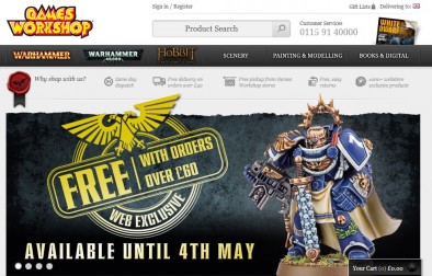
Games Workshop's website has been given a new look and it's been a lot more streamlined. A few things are missing and I'm sure people are going to notice that!
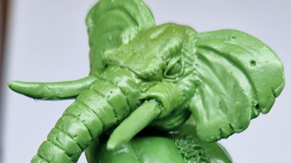
As you can see above the new website has been celebrated with this website exclusive for orders over £60. It's a re-make of an old model done in plastic. I suppose it's great if you're doing a big haul of the new Warhammer 40,000 models.
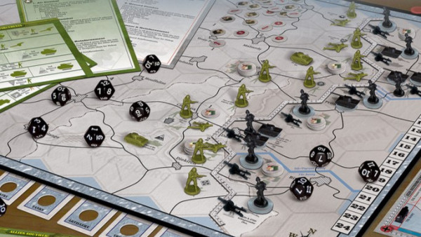
Noticeably absent is the Specialist Games Range (but we knew that was going) and as far as I can see any section for errata and FAQ. Maybe these are going to pop up elsewhere? Interestingly the blog has gone too.
What do you think of the new slick look?
Supported by (Turn Off)
Supported by (Turn Off)
Supported by (Turn Off)




























Very streamlined and from a design perspective, clean, efficient and pretty. One thing I didn’t like was the price, £35 for an iPad guard army list??!! You’ve got to be … Joking!!
I may just have been blind previously but it seems like you will only be able to buy plastic in store, all fine cast is now Web only
I think the blog is still there, scroll down to the bottom of the page and click on “Whats new today”
I actually just noticed that GW doesn’t even have a freephone number for its customer services
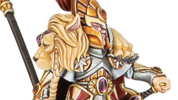
I like the captain model.
new website(store) is shit way did they need 2 put up 8 items just for the baneblade kit and as for the free mini whys it not a khorne model after all its got 39 fecking skulls on it
It’s not perfect but it’s a lot easier to use on a smartphone.
Product listings are a bit bizarre, though. Empire handgunners and crossbows (the same kit) have an entry each, while the state troops kit (which make 3 troop types) just has one entry. It’s all rather odd.
Presumably handgunners and crossbows are seperate listing in the army list but state troops, however they are equipped, is just one. The new listings seem to be aimed at matching the kits to the army list entries.
That’s a very good point. I don’t understand why someone downvoted that.
@somegeezer you know how this place works. If you make a comment on a GW story that doesn’t bash GW, someone will down vote it.
Someone will probably down vote this 🙂
no that sounds about right, thumbs up sir
Ha! That’s very true.
Honestly it looks like someone has used a WordPress template and put the required images in. It’s soulless! From a design perspective that is. I say that as a web designer myself.
It would work very well on phones or tablets so I guess that’s what they’re going for.
No flash, no pzazz, no hype, it’s just another shop you’ll see countless times on the web.
The sorting options are nice though, lol
Are they anything else than a shop for better or for worse – they are not a little upstart that can keep the creative spirit alive just because …
I don’t expect much more from them than say M&S or any other high-street/online retailer …
First impressions is that its an improvement on the old site (tho 0 RIP Specialist games… gits…) No reason ever to play GW again (too much better stuff) but love the background all the same; surprise to not see a more integrated Black Library site – just a small link at the bottom of the page?? The teeny tiny ’99p’ on the end of the prices made me smile for some reason…
clunkier, more bland, inefficent and generally worse in every way.
They are working hard to make the company and its intelectual property bland and uninteresting .. the only thing alive in the soulless mess that GW has become are the black library audio dramas.
I guess they couldn’t afford to modify the template very much
And it seems that all prices have gone up
of course, it’s an opportunity to “inconspicuously” increase the prices along with the codex releases.
Cause no one has the capability to notice that 😉
Hmm just noticed, at least some of the dual kits are listed as separate kits. E.g the Coven Throne and Mortis Engine kit is listed twice – one for each.
Other than artificially ‘bulking’ out whats on display, I don’t see a reason to?
Makes it easier to find? If I browsed the old website I would have to know in advance that there was one kit for both of those products, and I would have to know which one was the featured image. This way, a user can look for whichever one they’re after and find the kit, and then discover that it’s one kit for two units. When you consider that GW is increasingly trying to appeal to new gamers rather than old hands who already browse the web for GW rumors or subscribe to White Dwarf, it makes sense to make… Read more »
I think the clue was in the old titles, same example: Coven Throne/Mortis Engine 😉
You are browsing, you come across it, see its something that can make two or more kits out of it before you read the description.
Now you see something and have to check the small print at the bottom of the description to find out its a multi-build kit.
This is what most likely going threw the guys at GW. Honey I want to have a model for my birthday. She asks what model. He says he wants to have a Banehammer. If I was this guys wife I would be looking forever for the banehammer with little success. Now it helps a bit that us uneducated buyers can see the model and name instead to guessing are way threw it all. Also the reason might be for the collector that buys with there eyes. This new setup shows yes the same kit over and over just depicting swapped… Read more »
Well, if your other half asked for a Banehammer or whatever and you end up on the website, there is a little thing called a Search function. Type Banehammer into it and see what you get. Its not rocket science. Unless you do a search for rocket science… 😉 I’m not convinced about the collector angle either. How many would see one pic on the web and say, “yes I must have that?!?!?!”, and then click to buy without going into the production description first? And if two similar pieces next to each other on the site (cause if read… Read more »
I thought about the search function afterwards. That would be the most obvious solution in any setting but this is GW reasoning I’m talking about 😛
Yea, the site just bugs me having stuff split as now its look at 2 or more entries for one box instead of one entry. Its inefficient and that bugs me – in or out of GW 😉
The Space Marine Captain looks awesome, as usually for GW models.
skulls = awesome , more skulls = awesomerrr
In a waiting around for the bus pose, instead of a action I’m killing Xenos scum pose?
I can understand fantasy having somewhat stand around static poses due to the ranking of units, but for 40k I’d like to see a lot more dramatic poses to make it look like they are in a war zone not a parade ground.
You see, this is what I’m starting to despise about the BoW community. This guy gets down voted for saying he likes a miniature. What kind of prick does that?
I thumbed you up due to the inappropriate thumb down. You made your view known and you should not be punished for a positive statement. That is unless you were being sarcastic and the post will never show you true intentions 😉
The Shrines of Knowledges have completely gone.
I have tried accessing the errata pages through google/external search engines and it just diverts to the home screen of the website.
I assume with the rumours of new editions out this year, this is the reason, but it’s a bit frustrating.
I’m just going to come out and say it. This whole post went from mostly positive, to down right negative. Personally I believe that GW have done more in the last 6 months to change their company direction than has been done in say the last 5 years. There was a comment somewhere above how GW “seems” to be aiming more towards the new players, and not the older seasoned players. Personally I’m not sure that is completely true, although it is obvious they would always desire to attract a new player base. Lets face it, a good portion of… Read more »
Hear, hear. BoW should be a website for people who love wargaming. Sometimes it feels like a website for elitist jerks who just want to sneer and make snide comments.
well said. There is often too much of what I refer to of ‘ex wife’ behavior on the interwebs. What I mean by this is those individuals replicate the behavior of an ex spouse who spends the rest of their life complaining about the partner they say they want nothing to do with and actually spend more time obsessing about the negatives of the thing they shouldn’t be interested in.
I was just about to put a comment on here about the new site, when I read Valbarca comments and I do agree with you as I have played all the GW game systems for over 23 years. I feel we can feel a bit lost and bitter about the empire that is GW, and we do need to sit back and think about it as a hobby and a gaming system, that need good things to say about it. And not just all the bad as if you don’t like it don’t bother with it. So sorry if I… Read more »
Just a shame that while doing this they’ve completely removed all the Epic:Armageddon rules….as well as all the other Specialist Games stuff, very sadly for me as it’s the only stuff of theirs I really like!
I must say it would be ace if The Epic box set came back
Hey, with the Epic-UK site, the tactical command forums, and places like Steel Crown Productions you can still play Epic Armageddon anyway!
Yup
Plenty of 6mm Modern and WW2 types can be used for IG as well
why would they do epic 40k when they can just do 40k with bigger models i.e imp knights baneblades stompa etc etc already out
Because Epic: Armageddon is a very different game.
And, like Blood Bowl, one of the ones with a highly regarded ruleset!
It’s slick but just a bit soulless. Though I find it ludicrous that GW expect people to get excited about a free mini if you spend £60. Such a shame.
Plus the additional one you can buy once you get that one… :/
2 tactical squads, the glue & paints to build them you get a free captain there is a basic army to get you started with your freebie model. I think that’s pretty good?
If GW made a good website, people would have said so. It’s. That. Simple. But clearly GW have messed up with launching this site, deadlines missed by the looks of it. I don’t think it’s fair to judge the website as it’s clearly missing junks of what it’s meant to have. I have to scroll all the way down to find out “what’s new” which is absurd – I can’t instantly see click to see the new releases etc: I doubt they intend it this way. We’ll probably see some large changes during the month, parts moved around etc. They… Read more »
I think its a good website, there are tweaks and refinements needed but you get that with any changes to a website. Didn’t the BoW team explain we may experience some disjointed browsing and hiccups as the BoW site gets overhauled over time for example?
In telation to the duel kits as long as they aren’t charging different prices for the same kit whats the problem? I think it actually makes it easier for new players and more people in the hobby is good surely?
Its certainly not a ‘bad’ site, its not particularly inspiring though. Good and bad are very subjective in these situations though.
@ Solar – I agree I like the old site, but this one does show options and allows you to sort by unit type seeing all armies. Overall not bad with some goodness if your looking for it. Could it have been better sure, but then half of us wouldn’t have anything to complain about…. J/K I do my share of complaining and my better half swears I’m not happy unless I share hate now and again. That’s why I am always looking for a way to play my DA terminators against Chaos to show some good old fashioned HATRED!