Black Library & Games Workshop Reveal Valerian & Aleya
November 12, 2019 by brennon
Games Workshop has revealed some new miniatures to celebrate the release of a new book in the Warhammer 40,000 Black Library collection. Watchers Of The Throne: The Regent’s Shadow is coming out soon and supporting that we have some models of the main characters, Valerian & Aleya.
The new models have been sculpted to reflect the two different characters and their role within the story. On the one side, you've got Valerian who is a 'younger' Adeptus Custodes member who is looking to prove himself in battle. On the other side of the coin, you've got Aleya who represents the old order and so is much more prim and proper. You can see the designer talking about the models below...
I quite like the models and although I do much prefer models with more dynamism they did put forth some neat reasonings as to why they are posed as they are. They do make for nice display models which are very close to their book-cover counterparts.
So, if you're looking to get yourself some of the characters from the pages of The Regent's Shadow then you can keep an eye out for them. They will be available at the Black Library Celebration in 2020 so watch out for them.
Are you a big fan of these books and the two characters they've immortalised in plastic?
"Are you a big fan of these books and the two characters they've immortalised in plastic?"
Supported by (Turn Off)
Supported by (Turn Off)
Supported by (Turn Off)







![Very Cool! Make Your Own Star Wars: Legion Imperial Agent & Officer | Review [7 Days Early Access]](https://images.beastsofwar.com/2025/12/Star-Wars-Imperial-Agent-_-Officer-coverimage-V3-225-127.jpg)





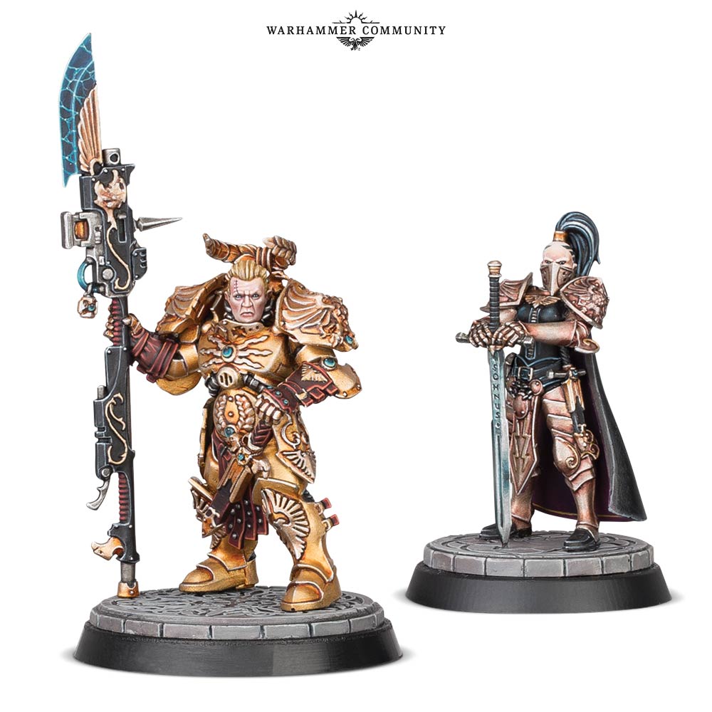









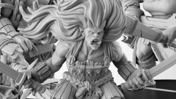

The dude looks like someone pumped up his head, then bashed it down between his shoulders. The hairdo doesn’t help either. The woman looks fine.
Oh, look. A GW model that’s too busy. If I was even tempted to buy these models, I would putty in a neck on that guy.
I like them, although a static pose for 2 simultenous release might be a bit odd. Of the two, i like the woman best.
I’ve said as much before and i’ll say it again: I’d really like it if someone sculpted the characters on the book cover.
Two fantastic characters an figures.
Even with the reversal of who’s in the foreground, the male figure is waay short compared to the imposing pseudo-space marine shown in the cover art. And way older looking too.
At first I thought this was a Donald Trump – God Emperor in-joke?
Gods do they have no quality control? Was this guy a former Age of Sigmar guy?
Head is WAY too big on Val and the proportions are wrong – I thought GW were removing the classic “unrealistic proportions” that plagued their range for so long. Pretty sure the current Custodes are proper human proportions. Why is this model so bad?
And whilst the detail is fine for plastic, if that’s a resin model then it’s underwhelming.
Feels like this guy is one of the less-than-competent Age of Sigmar sculptors that got a promoted to 40K and proceeded to bring down the quality.
The Custodes didn’t really need another character standing still with his spear / axe in the upright position.
Would have been nice if the pose had been a bit more dynamic.