Micro Art Studio Preview New Pre-Painted Terrain Range
January 5, 2022 by brennon
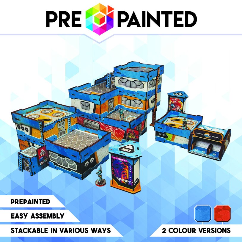
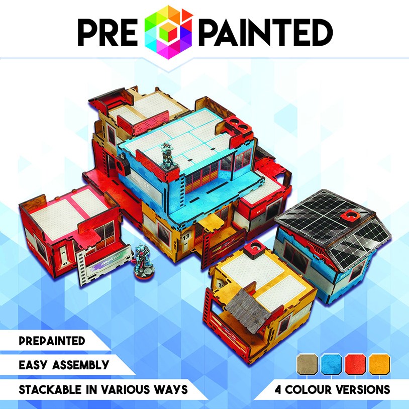
Micro Art Studio has been showing off some of the new terrain they have lined up for 2022. They are going to be delving into the world of Pre-Painted/Pre-Coloured Terrain which can be dropped onto your tabletop easily.
Pre-Painted Terrain // Micro Art Studio
The terrain has been designed to match a couple of different colour variants. Each set is also easy to assemble and can be stacked to add height to your battlefields. This is pretty darn good for the likes of Infinity as you can see.
Pre-Painted Terrain // Micro Art Studio
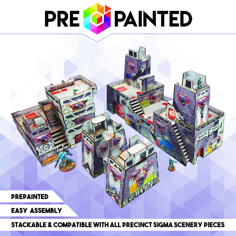
The focus at the moment is on creating terrain that suits their existing Kokkyo-3, District 5 and Precinct Sigma lines. They are also working on something completely different which will be fun to see. I am certainly interested to see what they do with this as it should make getting to the tabletop that little bit easier.
Pre-Painted Terrain // Micro Art Studio
The designs on these pop that's for sure. This would take a lot of work with regular brushes and airbrushes to get right, especially when it comes to some of the more detailed elements like the graffiti.
With plenty of ways to introduce this alongside the existing terrain by Micro Art Studio, I think this could well be a solid option for Sci-Fi skirmish games. It will be interesting to see what the price point will be for these.
Does this tickle your pickle?
"I think this could well be a solid option for Sci-Fi skirmish games..."
Supported by (Turn Off)
Supported by (Turn Off)
Supported by (Turn Off)


























![TerrainFest 2024 Begins! Build Terrain With OnTableTop & Win A £300 Prize! [Extended!]](https://images.beastsofwar.com/2024/10/TerrainFEST-2024-Social-Media-Post-Square-225-127.jpg)













I do like Micro Arts Studio’s work. But this colour scheme doesn’t do it for me. It’s too bright and duplo for me with those clashing primary colours. I prefer something more muted and compatible with my cyberpunk noir themes I use for Infinity. Saying that, I am sure there will be many people coming here to rejoice and give praise for this terrain. I wish Mirco Arts Studio all the best.
Yeah, at some point it became seemingly mandatory to equate “cyberpunk” with “hot pink neon garbage” which is fine, but these don’t even manage that much. Top one looks like the local water authority, bottom one looks like a McDonald’s playset.
Great looking terrain but way to clean for most people an tables I think.
It hurts my eyes to look at it.
It might work for something like infinity which often has a garish colour scheme…
But for more serious games it looks infantile… like power rangers or telly tubbies live there.