Walking Tall with Scibor’s Mechanised Armour
March 21, 2012 by brennon
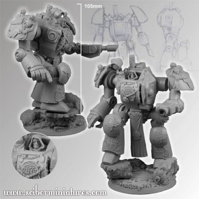
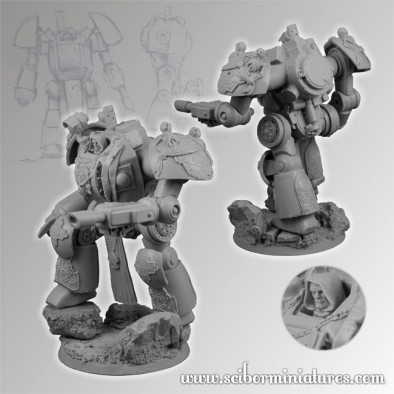
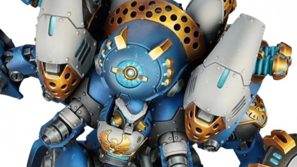
Scibor Miniatures do love their Science Fiction knights, so it seems obvious that the next step for them would be to give them a big new toy to play with. Check out the Templar Mechanised Armour below and see what you think...
The model comes in resin, with a scenic base and stands at a whopping 105mm tall.
Now I think this doesn't look too bad. It's a little static and I think the head poking out the top is a little bit silly but overall with a bit of work it would look quite good on the battlefield. Cut that exposed head off the model, put a massive templar helmet, or a closed hatch on it, and your sorted. Never made much sense to have all that armour and then to see an exposed head ready to be shot at.
What are your ideas for this model?
Supported by (Turn Off)
Supported by (Turn Off)
Supported by (Turn Off)




















![TerrainFest 2024 Begins! Build Terrain With OnTableTop & Win A £300 Prize! [Extended!]](https://images.beastsofwar.com/2024/10/TerrainFEST-2024-Social-Media-Post-Square-225-127.jpg)













Althought that looks rather nice I can’t help being bothered by fact that head is exposed.
It needs an option to cover the head, then it would work much better for me. As such, though it is just a small detail, the head poking out ruins it for me.
thats prety cool but like the others i dont like the head sticking out. something tells me darrel will be opposed to that lol 🙂
So Scibor have a Dreadknight…and aside from the iconography (which was clearly added on top of the base sculpt) it looks worse than the GW one. It just seems to be made up of bland cylinders bolted together with no integration of extra detail, so it ends up looking more cartoony than it should. Definitely gets a no from me.
It’s nice to have alternatives, but this is not the best Scibor sculpt they have put out.
I think the shoulders in particular are too far from the torso.
Its a pretty awful design, and with all that armour they left off the frickin helmet.
For a first venture into mecs, it’s not bad but not the best. Some things that do and don’t work on it is the torso is full of detail and the back tank thing helps it look big and powerful. The cons of this yes the small head. But thats not what came out to me at first. It was the arm joints, they seem a bit to long. Keep the model close to what a humans body form should be like and the next mec should be more to what people want.
Why do all Gothic sci-fi mechs wear loin cloths?
BoW Sam
Because they all have huge rods. And huge shafts. And huge pistons. And other hydraulics that need protection.
Ah so they’re just covering up the junk. O.K thanks for clearing that up.
BoW Sam
I don’t know if there’s a real reason, but it always reminds me of “Hell comes to frog town” were Rowdy Roddy piper has a loincloth to cover the bomb and tazer combo the government wired to his fun-buttons.
They have the loincloths and such because they are meant to be mechanical embodiments of their human/super-human counterparts. That way it looks like a massive (in this case) Sci-Fi knight to scare the enemy away. The more ‘humanoid’ it looks the more terrifying I guess.
BoW Ben
replace head with a helmet and i think it’ll look better. hope they do a celtic version
Doesn’t look that good, but a bit of converting and modeling can fix that… but the price?
Not their best work. The iconography is nice, but the actual model is sub par for them. The face sittin out there is odd. Heck he could kill himself punching or shooting close range and take some blast schrapnel to the face.
Like everyone else, I’m not a fan of the exposed head. I wouldn’t mind a transparent canopy or have the cockpit completely sealed and have a targeting array/robotic head on top. I do like the fact that the pilot has some protection unlike the GW Dreadknight where the pilot is slung in front of it like a baby in one of those carriers. To me, the rest of the model just looks incomplete. You have all this nice scroll work on some panels and the rest are just blank. You also have these mechanical exposed joints and a giant reactor… Read more »
Can’t help but notice he is in the classic Scibor one foot on the rock pose
cant help but thinking about a one man sauna
http://farm4.staticflickr.com/3056/2478646026_42eb7a1139_z.jpg?zz=1
The more I look at it I think if it came without the iconography it could be a good weird world war mec of some sort.
I dunno, it looks clunky in a weird way that i dont realy like. Its those shoulder joints i think.
The head could be dealt with.