The Scibor Mechanised Templar Gets a Refurb
March 28, 2012 by brennon
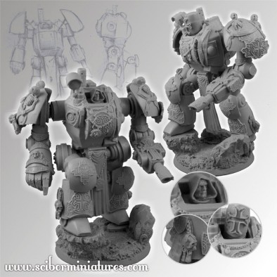
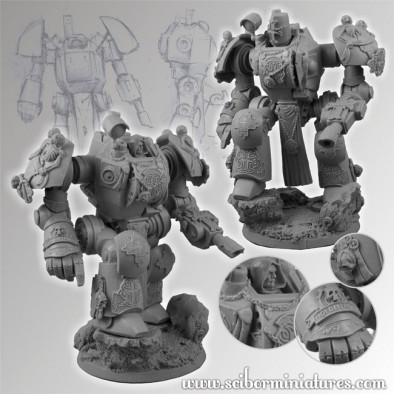
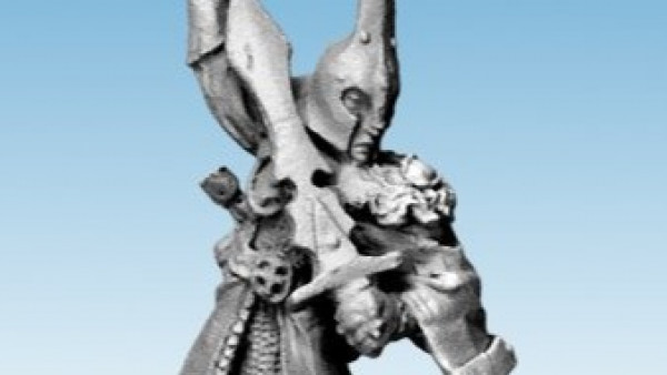
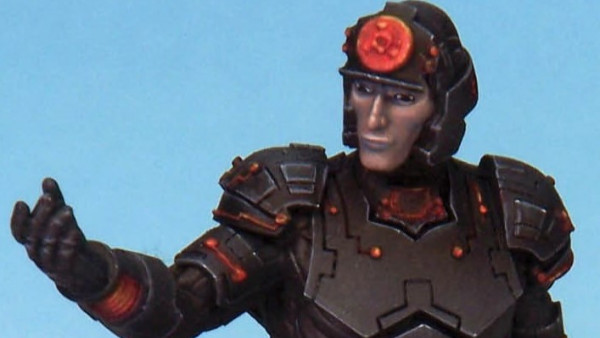
Last week we showed you the new (and rather large) model from Scibor Miniatures. The Templar Paladin was a bit of a Marmite model with you guys, and it seems the internet on a whole agreed. So check out this updated version and see what you think now...
The new model has added detail to the legs and arms, shoulder pads for some added bulk and a helmet to replace the plain head. This has only been a good thing and I think it looks far better with these improvements. If you already purchased this model then the extra bits will get shipped out to you too, how nice!
What do you make of this updated Paladin?
Supported by (Turn Off)
Supported by (Turn Off)
Supported by (Turn Off)






































I feel I should say that smooth areas with little or no detail is not a bad thing, it can be good for free hand work or adding you own details on. With that said I think this is a vast improvement to what was offered before. Also the option for the helmet it a big thumbs up. I like that it has a real world templar look to it on this big robot. But the thing that I like most it not with the model far say, it with the Scibor teams attitude. They got feed back and acted… Read more »
I think needing more details is not the issue, it’s the way the arm mounts stick out an inch either side just looks ridiculous and considering thats a major area needing protection from incoming fire, whacking some large plates on each arm that offer no protection to the shoulder socket from oncoming fire seems rather redundant.
@jaerin yes I agree with you about the exposed shoulder joints. There needs to be an modification to the shoulder pads. They need to be bigger. Just like the rest of the space marines in 40k. I think with some fleshed out shoulder guards then this model will look a treat :D. Also, a big thumbs up on the helmet. Looks really nice. Shame i cant find any helmets like that for my Black Tide army I want to start 😀
I quite like it, assuming it’s cheap. It’s got a strong manga/robotech look but covered with gothic symbols etc. Interesting model! Wouldn’t mind picking one up and painting it. I assume it can be used as a proxy for Power Loader Knight.
Seems like they gave that thing options to gave helmeted head which is good thing.
Adding detail really just helps mask the underlying problem with the lack of ‘combat grittiness’ that the long shoulder joints and bland powerplant design give the model – it definitely looks better (and the helmet is interesting with that abstract visor) but personally I still don’t think I’d go for it.
This is better, but the shoulder attachment area needs to be shortened and bulked out a lot more with hoses and hydraulic rams etc.
I’m not sure of the new helmet. Maybe a larger non-rotating helmet?