Pulp City’s Nuke Gets an Atomic Make Over
September 25, 2013 by dracs
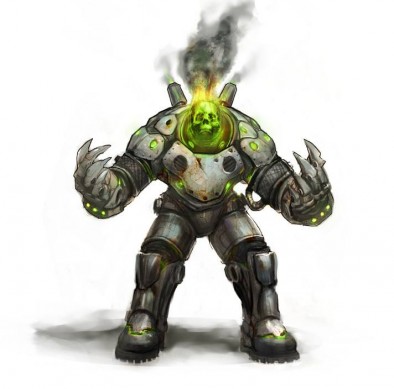
With the new Supreme Edition on the way Pulp City is not only getting some new stuff, but it is also taking the chance to give some of their existing supremes a bit of a make over. The first of such we get to see is the dangerously radioactive Nuke.
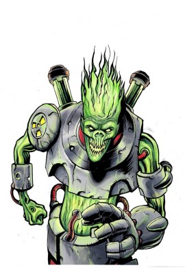
Just to give us a reminder, here is the original appearance of Nuke.
The style looks a lot darker and grittier to my eye, the bulky armour and claw tipped hands making him far more formidable in appearance than his former skinny encounter. He is very reminiscent of some of the modern depictions of the Superman villain Atomic Skull.
Along with this we have been given a heads up on just what is intended for Pulp City's Supreme edition:
Today I want to start what I'm going to call Why Wednesday. So why Supreme Edition? The answer is faster more exciting game play. Long time fans will remember that our original Supreme Cards were often a giant wall of text that required a significant amount of time to read and understand. With Supreme Edition we have simplified everything so that you can tell at a glance what each Supreme does and what their role on the battlefield is.
In addition to making game play faster Supreme Edition is giving us a chance to revisit some of our old Supremes and update them as well.
Are you guys excited about the new activity in Pulp City?
Supported by (Turn Off)
Supported by (Turn Off)
Supported by (Turn Off)


































I love the new look. I approve!
Looks a bit like Atomic Skull in Terminator Armour. Kinda cool.
Yeah I said he looks like Atomic Skull in the article. He reminds me of the way he is depicted in the animated film Superman vs the Elite
Nice new look.
I like this sculpt, nice and dark and far better then it previous version.
actually i was going to say it look’s like Atomic Brain from Mutant and Masterminds RPG!