Astral Claws from Forge World
June 5, 2011 by beerogre
Forge World have launched a new set of pads and upgrade kits for their latest Space Marine chapter... the Astral Claws...
They're doing all the usual stuff... shoulder pads... vehicle doors... all that.
Why not check it out.
BoW Andy
Supported by (Turn Off)
Supported by (Turn Off)
Supported by (Turn Off)














![Very Cool! Make Your Own Star Wars: Legion Imperial Agent & Officer | Review [7 Days Early Access]](https://images.beastsofwar.com/2025/12/Star-Wars-Imperial-Agent-_-Officer-coverimage-V3-225-127.jpg)




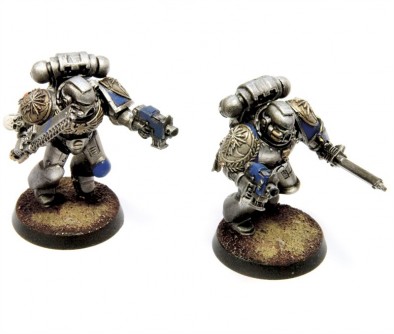
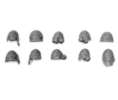
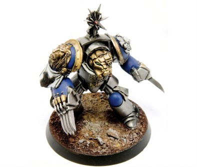
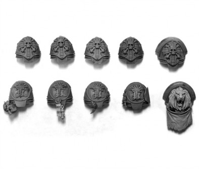







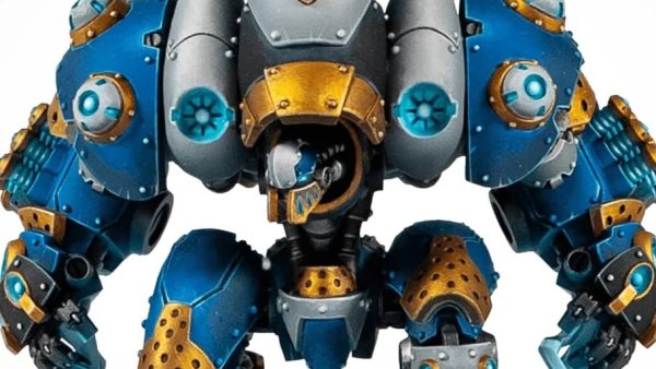


The pads aren’t bad, in the usual GW style of baroque and skulls… I can understand yo would choose these shoulder pads instead of the less-skully ones from other companies, because they’re official, and all that jazz… Those SM, however, are apallingly badly done for a studio paint-job. They really don’t show the detail off…
BoW Romain
Intersesting. I have come to the conclusion that the ‘Eavy Metal style has the advantage of showing the details well in photos. Whether that was a conscious decision or not I don’t know. Personally don’t like the standard GW painting but do admire the painters’ skills.
Not sure what the blob on the termie’s shoulder cloth is. Servitor used it as an oil rag? lol
I don’t expect studio style pics from Forgeworld. Given that the ‘Eavy Metal style has been rather hit and miss lately I think its a good thing. I do think that they look a bit lost in these pics though. I think the metal areas need to be painted a bit better though as they look rather bland. I also think they need group shots and ‘in game’ shots to make them seem better than a very simply painted ‘quick’ army. It also doesn’t help that the Grey Knights have just come out and have a very similar paint scheme.
Nice enough looking pads, still can’t kick my allergy to “heroic” scale though.
I agree about the painting, it looks like a 3 colours and done job. There’s a slight bit of shading in places but it looks like a little bit of black or brown wash at most.
I really like the lion one, this shizzle is dope.
It looks to me like these were built, painted and photographed by someone with either little experience or little interest in 40k, first thing that jumps out at me as wrong, none of the astral claws pads should be on the right on power armour. Chapter Iconography goes on the left, squad iconography goes on the right.
I also would like to question how much mileage their is in producing a full range of icons for a chapter relatively few people will want to play. I mean really how many times have you ever thought “hey wouldn’t it be cool to hear a heroic story about the bad guy when he was still a good guy?”. I’ll tell you. Once, Then you saw Phantom Menace, and realised how bad an idea that actually was.
Lmao about the Phantom menace comment.
As for the producing lines few people will ever buy: welcome to FW’s entire business model these days