More Snippets Of The D&D Starter Set Revealed…and Dragons!!!!
June 17, 2014 by brennon
Dungeons & Dragons is slowly but surely approaching us like a displacer beast stalking through the shadows. The new Starter Set is looking amazing and a few more snippets have been released about what's inside...
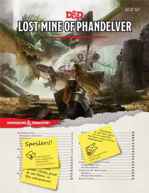
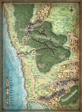
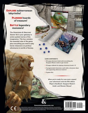
Not only have they shown off the contents of the adventure module you'll be running your fledgling heroes through but also included the map and indeed the back of the box art so you can see exactly what you get inside. For the price they're asking this is a fairly obvious buy even if you have just a passing interest in Dungeons & Dragons. It could end up as an awesome evening of entertainment!
I love the look of the artwork in this new edition and the character sheets (from what we can see of them) seem to look awesome too. I think it's going to be brilliant heading back into this world again!
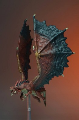
As well as the Starter Set they previewed the massive iconic Red Dragon from their upcoming selection in conjunction with WizKids and also went into detail about the relationship between the two companies. Both them and Gale Force Nine have been working very closely with Wizards of the Coast to get things just right.
All looking pretty cool right!
Supported by (Turn Off)
Supported by (Turn Off)
Supported by (Turn Off)





















![TerrainFest 2024 Begins! Build Terrain With OnTableTop & Win A £300 Prize! [Extended!]](https://images.beastsofwar.com/2024/10/TerrainFEST-2024-Social-Media-Post-Square-225-127.jpg)

























I have always found D&D starter sets to be brilliant for easing newcomers into this massive rpg system. It is especially good for getting younger players interested without frightening them off with the big books.
I do like this new range of WizKids dragons, great detail with dynamic flying poses. I have pre-ordered the starter set with Amazon. However, I am still not happy with the staggered release of the core books this year and having to wait until November for the dungeon masters guide.
I might have to pick it up. I did the play testing and found it fun. My heart still lies in the 1 and 2 editions. Spent many a Sunday afternoon playing.
You playtested 5ed? A question…I love 3.5, will I like 5ed? =)
This looks rather nice and promising. It seems Wizards really went back to the drawing board after the rather lukewarm reception to 4th ed. One thing that really draws me is the box art…subdued colors, looks like a painting, and has a much more generic fantasy look as opposed to 3rd/4th edition which tried to give DnD a sort of “image” with strange, unrealistic armor and weapons. What I’m trying to say is that it looks like the old 2nd Edition artwork…and I’m very pleased by that. While I think both 3rd and 4th edition brought some improvements to the… Read more »