Mac vs Thunderstone Quest
Recommendations: 51
About the Project
Mac's gallery and blog for this deckbuilding game and miniatures.
Related Game: Thunderstone Quest
Related Company: AEG Alderac Entertainment Group
Related Genre: Fantasy
This Project is Active
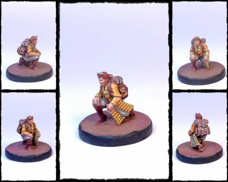
Yellow Halfling Bard
The piper was going to be the yellow one.
The model is not good. All de details are gone and you end up having to figure yourself what is it that you want things to be.
I mean, the miniature might very well be a faun, as halflings wouldnt really need boots. Also, the goggles could be horns, really.
Yellow pan flute, yellow shirt, neutral browns everywhere else.
… but, really, was it supposed to be a faun?!
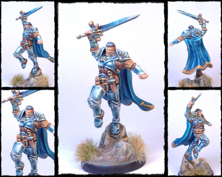
Blue Human Paladin
The obvious choice for blue was the armoured guy. This is one of the best models of the bunch, even if the face details are non existant and the scale seems a bit off compared to the others.
The armour was done in a blueish Non Metallic Metal, with a blue cloak and light brown leather parts.
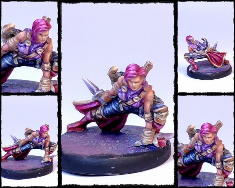
Purple Elf Rogue
For purple I picked the Rogue as I find it suits it well.
The different clothes were painted in different shades of violet, dashing purple hair, and purple boots.
She is wearing a crossbow and some darts in her back, but the details are very sketchy and the painting still needs some work.
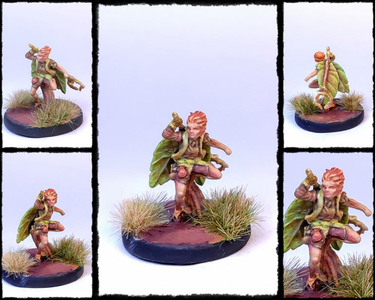
Green Fairy Enchantress
The little faity guy was the perfect candidate for green. The mini is probably one of my favorites, but its super tiny. The character itself is great, but the details got lost in the casting process, specially the hands and face. The mini really is tiny.
Obviously the green element was pretty obvious, as the little guy has two big leaves in the back. The hair and other bits were painted orange, as it fits the character and works with the colour scheme.
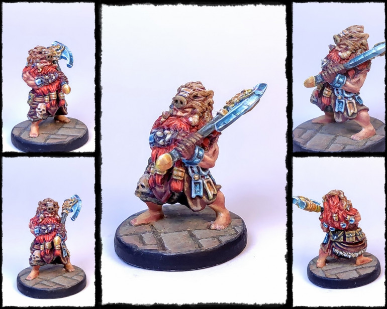
Red Dwarf Warrior
For red I decided to go for the Dwarf. This mini is probably the one that holds the details the best. Its quite bulky.
I used the hair and beard, very proeminent in the miniature, to be the red element. It does contrast well with the gold and silver rings and charms, and also the axe.
The boar head I might redo in black, or maybe a different, more orange brown, as its lacking as it is, I think.
The miniatures
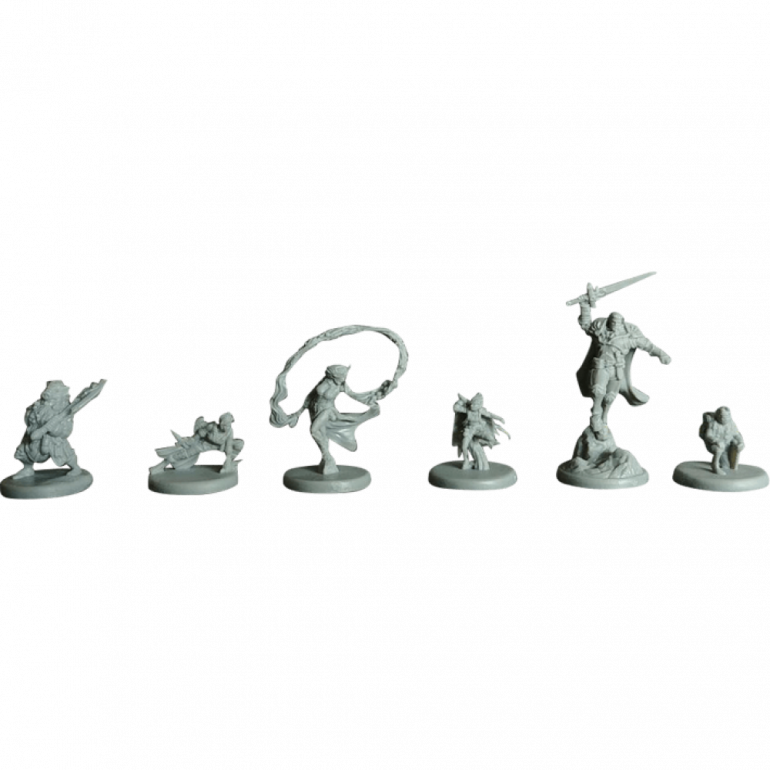
The miniatures are, well, not good at best. The sculpts are good but they seem to be all over the place. I love the characters and the poses, but the scale (or style) isnt kept through all of them.
Or the quality.
The issue here are the casts. These minis are produced in that kind of rubbery plastic that, while durable, holds very badly any detail. The edges are all blunt and the small details are either too lumpy or all pretty much lost.
Of course, these are miniaturas from a card game and I dont even remember them representing any particular character, or needing them all that much. Glorified boardgame pawns is what they are, probably a kickstarter afterthought. Just guessing.
Intro
I dont often get to actually play them, but I’m a big fan of deckbuilding games, in particular those that are more cooperative in nature and/or story driven. I have some on my game collection, like Legendary: Marvel, Lord of the Rings: the living card game, Arkham Horror, the living card game and Marvel Champions.
I also got Thunderstone Quest, a fantasy deckbuilder game in which 2-4 adventurers work through a narrative arc which will allow them to upgrade their basic deck while encountering monsters and exploring dungeons. The box I got also came with a handfull of miniatures. They are not the best casts ever, and for sure not essencial for the gameplay, but add a bit of extra character to it, and with a bit of care, they can even be kind of cute.
A bit of research on the internet to gather some ideas for painting them, I noticed that there was a trend to use colour schemes based on the Guardian Key cards from the game: Blue, Red, Yellow, Green, Purple and Orange.
… and thats basicly what I decided to do.
























![TerrainFest 2024 Begins! Build Terrain With OnTableTop & Win A £300 Prize! [Extended!]](https://images.beastsofwar.com/2024/10/TerrainFEST-2024-Social-Media-Post-Square-225-127.jpg)
