Space 2021 – A Star Saga
Recommendations: 740
About the Project
Each year I like to try and set a challenge for the year, usually painting some Kickstart miniatures boardgame or other. Due to not being in a great place at the start of 2020, it wasn't really possible to make any sort of pledge (I was living in a room that basically had a bed, a clothes rail and a TV). Things did get better over the year, I got some furniture, a desk, some lights and eventually got the paints out of the storage unit where I had been storing most of what I owned. By the end of the year I was pretty much back in the swing of things and that leaves me ready to do something for 2021.
This year's pledge is going to be Star Saga. Not just the Eiras Contract game but the complete, all-in kickstarter pledge PLUS the additional Deadzone mercenaries! And to make this even more fun, because I backed Star Saga jointly with my brother (something we do regularly), we will be painting it jointly - and it's the perfect game to do it with. My brother isn't the world's greatest painter and to be fair it is not his main interest. But that gives him a skill that I struggle with - Batch painting. I really struggle to paint large batches of grunts and minions, he struggles to focus on and paint a single miniatures to high standard. So a game that by design contains a large number of grunts and a smaller number of characters is absolutely perfect. He will be batch painting the goons and I will be painting the heroes and Villains. I will also be designing all the test colours schemes for my brother.
Also, given that it's been sat in the box for a few years now it's perfect for the Spring Clean challenge, even if I am starting it early.
Because it's a boardgame and will likely be played with people who don't play lots of miniatures games the intenion is to stick to the artwork as far as possible so that what is on the board looks like the picture on the corresponding card. Each entry in the blog will be a single character or miniature type and a little bit of information about the painting of it and my thoughts on the miniature. I won't be doing progress shots and tutorials because there is so much to paint that taking progress shots and writing blog posts would be way too time consuming.
So with all that out the way, let's begin!
Related Game: Star Saga: The Eiras Contract
Related Company: Mantic Games
Related Genre: Science Fiction
Related Contest: Spring Clean Hobby Challenge (Old)
This Project is Active
BONUS DEADZONE - The Piper
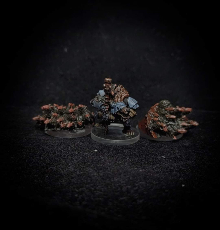
Oh, no, this ship isn’t sinking and we’re not leaving. In fact, I think we shall stay. The future belongs to the rat.
As part of the Star Saga kickstarter, I opted to buy the Deadzone character packs, which basically gave you the metal mercenary models for Deadzone and accompanying Star Saga character cards. This was a good move for someone who also has more than a passing interest in Deadzone (we will come onto that in the next project entry). As I had just painted all of the Veermyn for Star Saga I decided to fish this character out and paint him somewhat out of sequence – the original plan was to paint the metal Deadzone mercs after the expansions were all complete.
This is a fairly old model I think and it kind of shows. From the angle you’re looking at in the photo, and indeed from the reverse angle it all looks fine. However the details on the areas that are cleverly hidden by the angle are somewhat lacking – areas like the chest and stomach. Honestly that’s not really such a big deal and for gaming miniatues I generally hold to the ideal that if you can’t see it, it doesn’t matter.
Overall I actually had quite a lot of fun painting this, even to a basic standard, as it’s a colour palette I don’t normally use. I also really like the deployable ratswarms that he comes with as well. Much like Ogan Helkkare comes with deployable gun turrets and shield generators, the piper can summon rat swarms.
4.2 - Ector Zanchez
You run a flip six, three hole and you score…
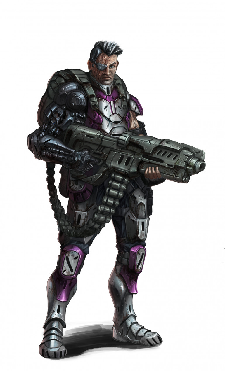
Conceptually this is one of my favourite characters. Ector Zanchez is a former Dreadball Xtreme player who, following a serious injury was saved by Blaine (the mysterious “fixer” behind all the missions in Star Saga) and now has to work for him as a merc to pay off the debt. Given that he has a robotic arm and his face is scarred on the same side as the arm, it would seem as the injury, and subsequent repairs were extensive. As a merc, as well as carrying a fairly heavy duty gun, he is also a grenadier.
However, background aside, the miniature; I am not overly keen on the pose but the details were at least good. Or at least that was until my primer decided to burp and laid down an awful, grainy textured undercoat. Suffice it to say I was absolutely fuming. During lockdown over the last year, primers have been in and out of stock and at the moment citadel primers are hard to come by. So I was using an army painter primer and this is far from the first issue I have had with Army Painter primers nor is it the only issue I have experienced with them. My honest opinion is that they are a vastly inferior product to the Citadel primers. I don’t really have the time or inclination to strip the model down so I just had to go with it, how it had clogged some of the details and left flat surfaces with a very grainy, bobbly texture. I took the photo on a lower resolution to try and disguise that
Art Credits Rob Jenkins and Roberto Cirillo
4.1 - Nastanza
In the right place at the right time, a single bullet can change the galaxy
The project has been quiet for a while, for a number of reasons. A big reason is that we have been unable to obtain the Wraithbone primer we use under the contrast paints for many of the minion models. Because the minions weren’t progressing I put everything else on hold. However I did find a solution to that problem by getting a bit more creative with what primers we had. Specifically looking to prime in greyseer for miniatures that have less skin on show and then picking out certain areas, like flesh, in Wraithbone from a pot.
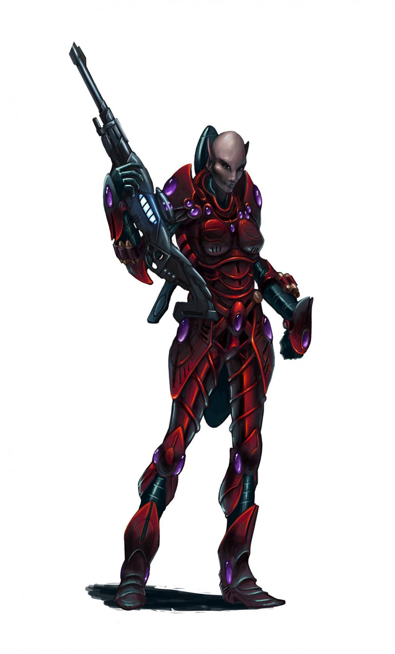
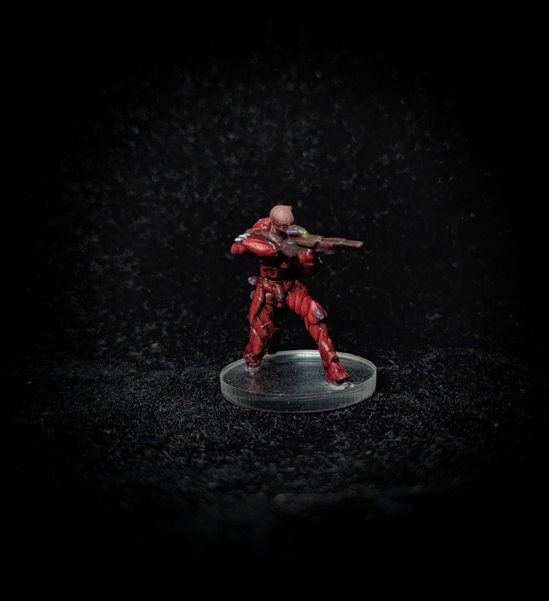
So having solved that I pressed on with the heroes and we are now into The Devil’s Betrayal, a campaign that sees the mercs raiding a Rebel stronghold to “confiscate” a sample of the Plague. Like the other expansions it has two heroes, the first of which is Nastanza, an Asterian sniper.
I love the dark red armour on this and I ventured into Vallejo paints to lay down the base colours using black red. I highlighted it up using a mixture of Vallejo and GW paints and then at the end gave it a glaze using thinned Nuln Oil to darken it down.
Now, while I really like the concept the model was, well, poor. The details were incredibly soft and I found myself having to freehand highlights on where there should have been a definite edge. It was a real challenge to paint.
Art Credits Rob Jenkins and Roberto Cirillo
3.11 - So Hin
Only when the last ocean has been turned to polluted sludge and last planet has been poisoned to a toxic wasteland will humans realise that they cannot eat money.
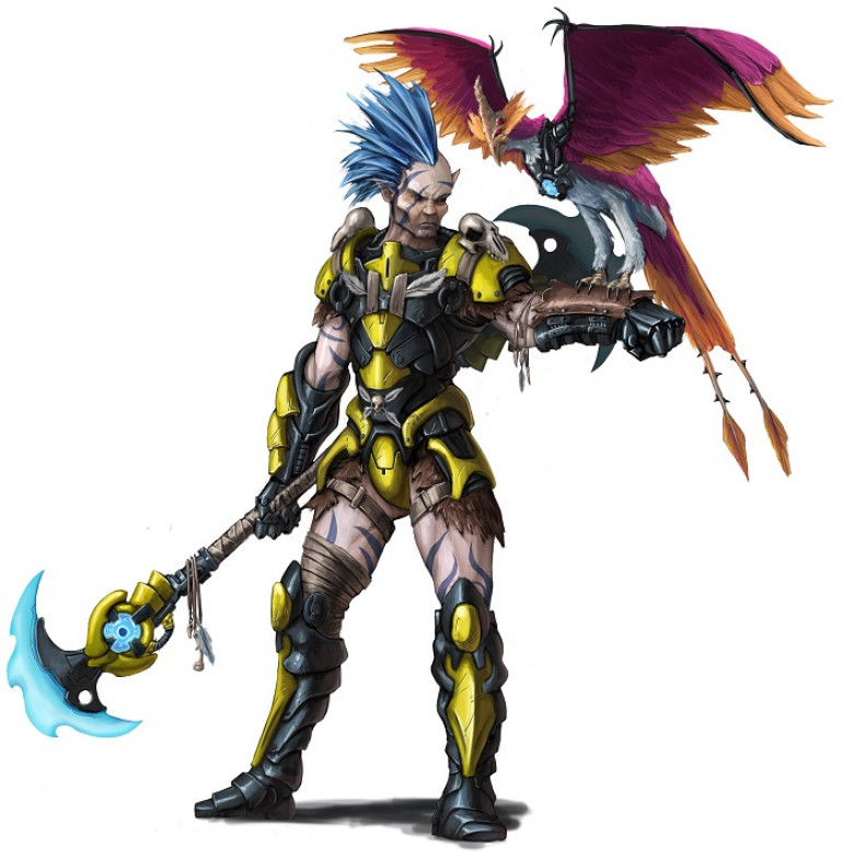
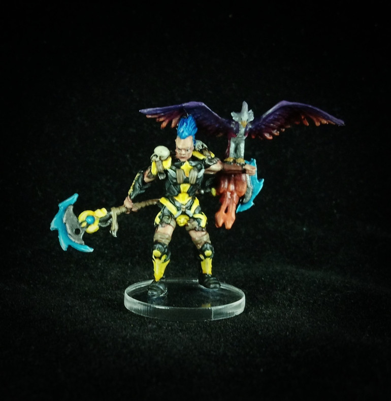
So Hin is an Asterian, essentially a Space Elf. Although the Asterians tend not to engage in warfare themselves, preferring to operate remotely through highly advanced drones, there are some among them, the Kalyshi, who prefer to take part personally. So Hin is one such person who operates as a Mercenary and reports back to his clan all that he sees of the GCPS.
As a model, I was really looking forward to this one, with its nice, bright colours. However the reality was somewhat different. It was an incredibly hard model to paint with lots of soft and poorly defined details, in many cases details had to be freehanded on (the leather cords and bands around the legs, shoulders and chest), it wasn’t possible to do good edge highlights; all sorts of problems. Overall I am pleased with the results and completion of him means that the Terror In The Deep expansion is now also finished.
Art Credits Rob Jenkins and Roberto Cirillo
3.10 - Ota Sora
A true warrior is always prepared for death. Their own or someone else’s.
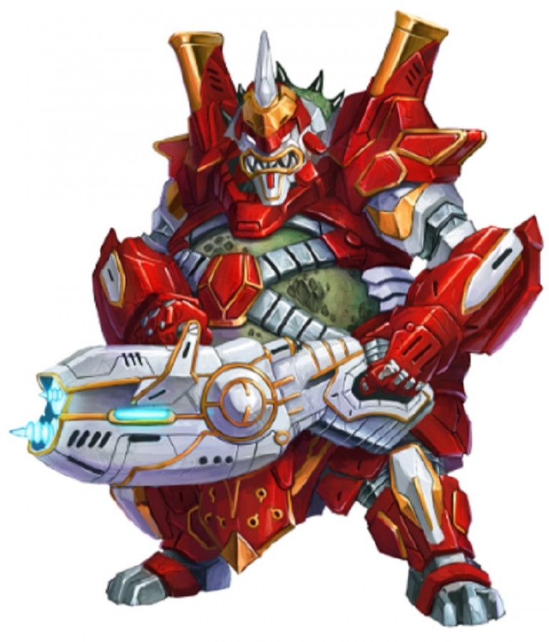
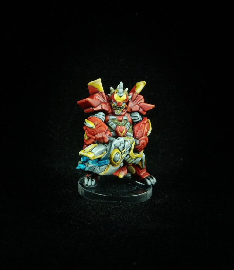
Whilst I may not be the biggest fan of the Nameless, I can certainly say that the two heroes that come with Terror in the Deep are probably my favorite two characters from the whole Star Saga game. This one is Ota Sora, a Matsudan, a species tricked into virtual servitude by the Greedy Corporations of the GCPS. Ota Sora seeks to regain his family’s lost honour by proving himself a capable warrior and leader.
I love the design of the Matsudan and I was very pleased see them released as a faction in Deadzone. Whilst a little cartoony, which is typical of the Mantic style especially in Star Saga, the armour has some very strong Samurai overtones; the large bulky shoulder pads reminiscent of Japanese armour and the two bits that stick up at the top look a little like Sashimono. And of course the helmet with the Oni mask design.
This took me around 10 enjoyable hoursto paint and I am sad to say that the camera doesn’t do it justice. The brightest highlights on the red seem to have been mostly lost.
Art Credits Rob Jenkins and Roberto Cirillo
3.9 - The Goliath
Just shoot damn it! Shoot it until you run out of ammo, then reload and shoot it some more!
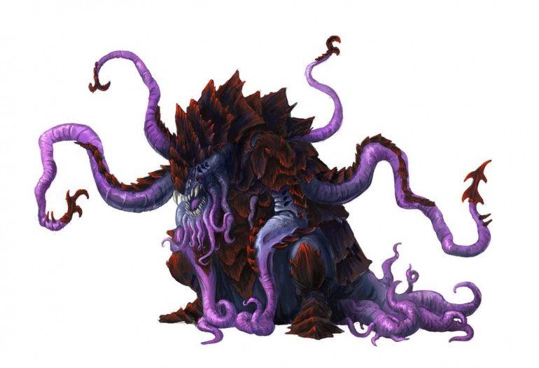
This bad boy is the Goliath, I can safely say that I am not really looking forward to fighting against it! This beast came with a mission book all of its own.
For painting, the sams contrast paint techniques and colour palette were used as all of the other Nameless minions, the texture on this model was no less Pronounced and so it has been painted using the same contrast paint with a purple wash and finished with a Gloss Varnish to give it a wat look.
Art Credits Rob Jenkins and Roberto Cirillo
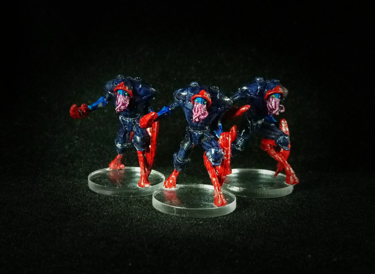
3.8 - Assassins
The last of the lower forms of the Nameless, the Assassins. I will say that the Nameless models were absolutely perfect for contrast paint. Ian now has one more Nameless project to do – something a bit bigger. I will be painting the two Mercs that came with the expansion.
Art Credits Rob Jenkins and Roberto Cirillo
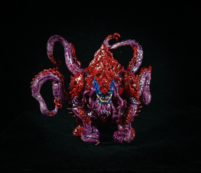
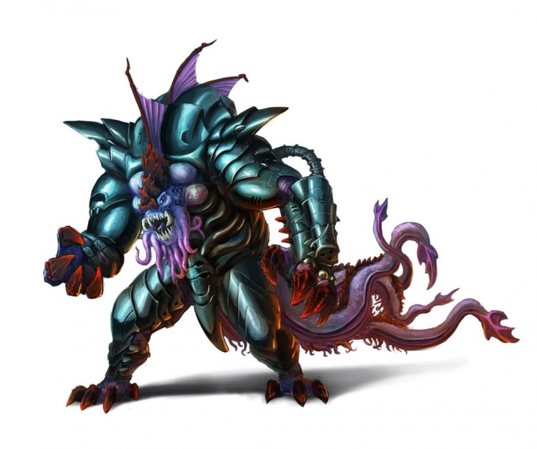
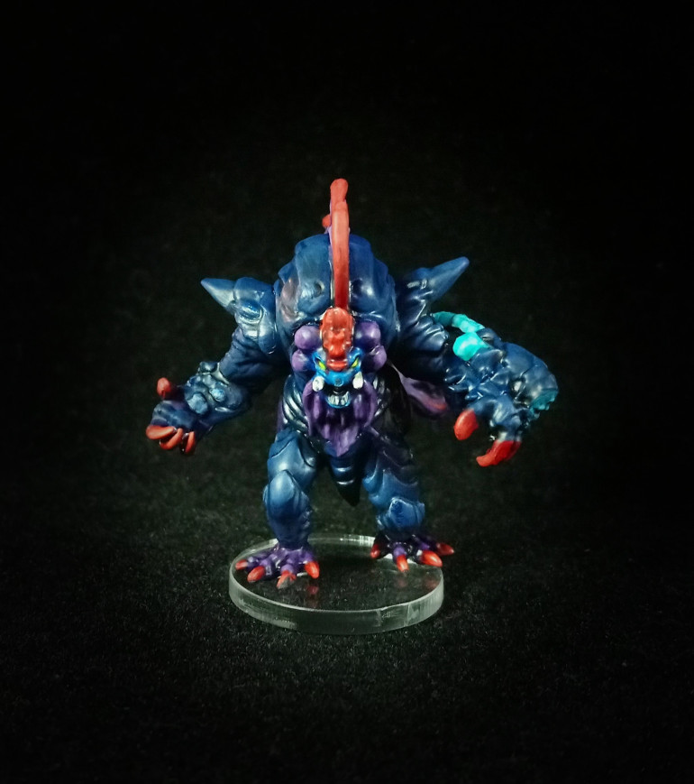
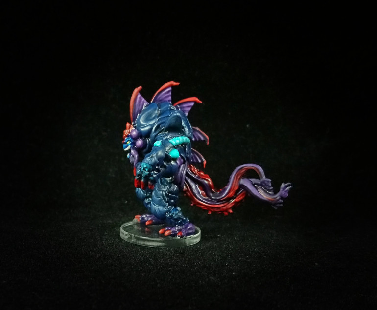
3.7 - The Blight
I have no idea what that was but it was one tough son of a bitch.
This is the final boss for Terror In The Deep. Known as “The Blight” he’s a particularly vicious example of what is known as a Calamiton. In terms of painting I think he was probably slightly more interesting than the previous characters because he brings together all of Nameless colour palette together, whereas the others tend to 3 out of the 4. I really like the splashes of red and purple on the dark blue background.
Now I get to paint the two Mercs that came with this expansion and I am really looking forward to them, two of my favorite miniatures of the whole kickstarter.
Art Credits Rob Jenkins and Roberto Cirillo



























![Very Cool! Make Your Own Star Wars: Legion Imperial Agent & Officer | Review [7 Days Early Access]](https://images.beastsofwar.com/2025/12/Star-Wars-Imperial-Agent-_-Officer-coverimage-V3-225-127.jpg)
