Breathing Life into Kingdom Death
Recommendations: 109
About the Project
This project will document the painting of the initial survivors, White Lion, Screaming Antelope and Butcher. Depending on how it goes additional models might be added as well.
Related Game: Kingdom Death: Monster
Related Company: Kingdom Death
Related Genre: Horror
This Project is Active
The update has been updated, now with 100%% more brains
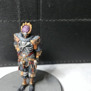
So after posting the last update I kept staring at where I believe The Hand is supposed to have an exposed brain. Initially I hadn’t really noticed it and later when I did I figured….eh. But the more I considered the more I realized it had to be called out both to hold true to the mini and because it would give him that creepy bit that all these mini’s share. So here he is. I also took the opportunity to paint the eye slits I hadn’t noticed until I looked at the blow-up pictures.
Now on to other things…for real this time….
Seem to be hands everywhere in this game
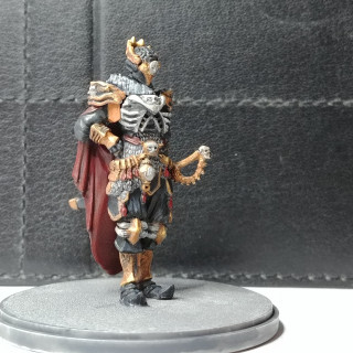
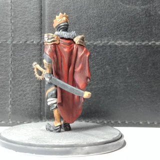
The Hand is the next to get painted up and just in time as I believe he’ll be slapping our survivors around in our next settlement phase (we’ll see how that goes).
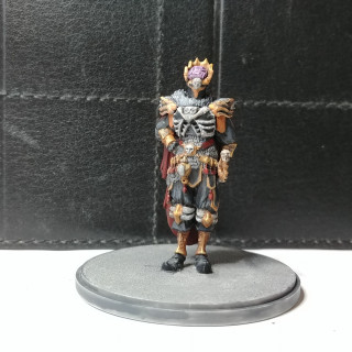
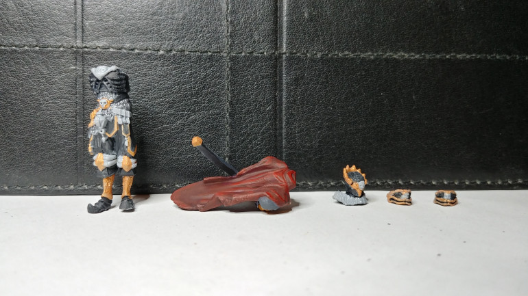
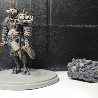
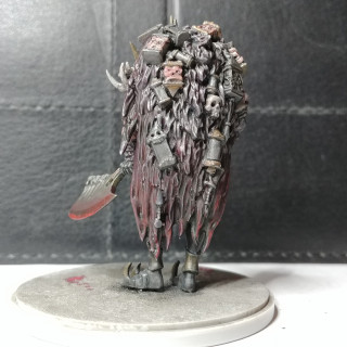
His mini carries a nice air of arrogant presence that suits him well. I did find during my test fitting that the cloak is a bit odd to attach. It seems to want to sit high on the body which throws off the alignment of the head and shoulders. After looking at some guides and messing around I found that it will snap in lower than you might think so that top of the cloak is just a bit higher than the back. His right arm is also fiddly but some reference shots can help show you how it’s supposed to sit.
Color wise I carried on with black and red as main themes but upgraded his bling to gold.
Next will be the Watcher who presents some nice OSL potential. The Phoenix is also staring at me from the paint table. Need to figure out the color scheme for that one.
Constant screaming is probably not the best way to avoid Lions...
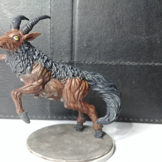
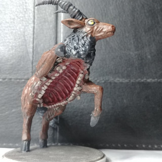
Dashing into view is the ever popular Screaming Antelope. In all he was a fairly straightforward paint.
One part I had to consider a bit was how to do the eyes. It seems most go with a single color which does give him a fairly creepy appearance. The game art goes along with this but one of it’s hit location cards describes eerily human like eyes so that would imply pupils and such. In the end I went with a more real-world antelope eye including the interesting slit pupils they have.
I’m questioning my choice of color for the creepy little hands that are tearing it’s mid section apart. I went with a pale flesh color but I’m thinking it might blend with the teeth a bit too much. Might go back and pink them up a bit later.
Now for The Hand
Putting on that armor seemed like a good idea at the time...
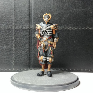
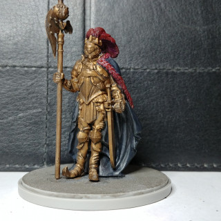
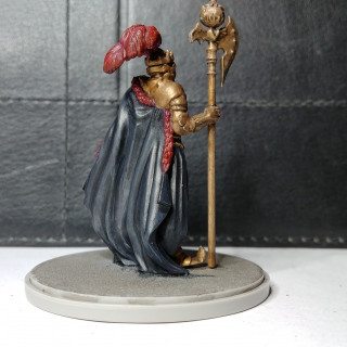
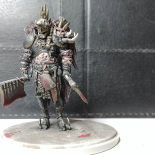
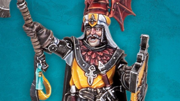
So the Kings Man beat out the Antelope as next to the painting table. The model is posed in a very stiff, chess piece like way (in my mind anyway) and he fights with large sweeping axe swings but with a rhythmic cadence. All that combined made me decide to go with a clockwork theme.
Sticking with the overall ideas I painted his entire body in Tarnished Brass and then washed it in Brown Liner to bring out the details a bit. His cloak was done in various blacks to contrast while his plume and edging carried over the blood red triad both to further contrast and to tie him in with the other models a bit.
I do have to mention how amazingly detailed and ornate the armor is. I was tempted to start picking things out but in the end stuck to my theme. Fortunately I have few more Kings Men minis so I can revisit him at some point.
The base is just plainly done for the moment. Something else I’ll come back to at some point.
Now for that Antelope…
It's a dangerous world
So the bad news is my poor survivors haven’t gotten any love but the good news is that my son and I are in the midst of another Kingdom Death campaign. So far so good for our budding settlement. Given the fatality rates it’s amazing how each survivor manages to pick up a sense of personality…generally right before they’re torn apart…but hey it’s all in good fun right?
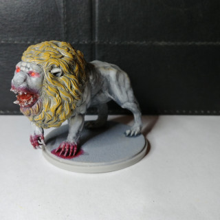
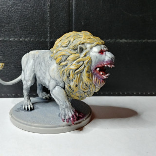
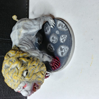
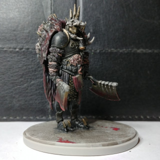
The other bit of good news is it’s gotten me going painting up some of the mini’s from the Monster side of the house. My intent is still to stick to minimal colors, solid contrast and a stylized feel. I think it came across well in the lion and a bit less so in the Butcher. He ended up a bit more “standard” imposing evil guy but I’m happy with him regardless.
I’m not sure where I want to go with the basing. I made an attempt to paint up some of the ubiquitous stone faces on the White Lions base but didn’t think of doing so until he was glued and painted which made things a bit difficult. I’m actually quite happy with the effect from a technical point of view but I don’t think it really evokes the idea of a carved floor (more feels like spirits coming out of the dark to me). Might have gone better if I’d done it beforehand.
With the Butcher I just went with a grimy wash and then added in some pools of dripped blood. I like the minimalist feel and I think it suits him.
Next up will probably be either the Antelope or the Kings Man (or both 😉
Into the darkness
Hello all
So I’ve had my Kingdom Death set sitting around since the kickstarter and finally got a game in with it earlier this year. The game was a lot of fun even if all our poor survivors were eventually wiped out. In retrospect I think a big part of their dying was due to the embarrassment of being used as bare plastic (what self respecting mini wants that?). So now it’s time to remedy that.
The KD models really are pieces of art in themselves with personality and story just about oozing out of them. One of the key elements to the narrative and the models is the lanterns they use to navigate the land of darkness they’ve found themselves in. My intent is to stretch out from my usual painting method and go for a more stylized effect centered around the lanterns, the little light they provide and the oppressive darkness that surrounds our intrepid survivors.
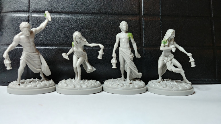
First some model prep though. For as great as these minis are they often have some…interesting…join points. Some are tucked away quite well but others can be odd shapes or gaps that stand out pretty predominantly.
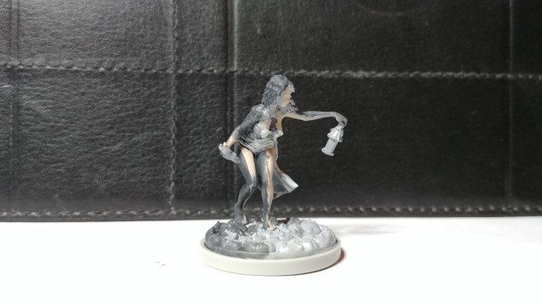
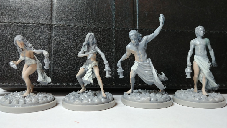 After priming I blocked out the areas the lantern light would hit with Fair Shadow - 09046 and Linen White - 09061
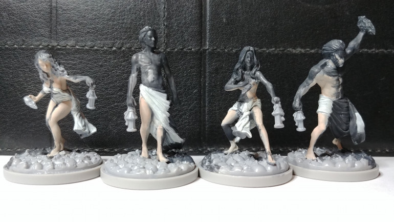 Here I've covered the unlit portions with Faded Black - 09657. As you can see many of the models don't have a lot of direct light.
Based on the lack of light on three of the minis I’m going to have to rethink how I lay these out a bit. My original plan was a hard contrast between lit and not lit but I may need to soften that a bit to include a partially lit area. What I might do is reserve color for the fully lit areas, grey for the partially lit and black for the rest. I’ll try working that up a bit and update.


