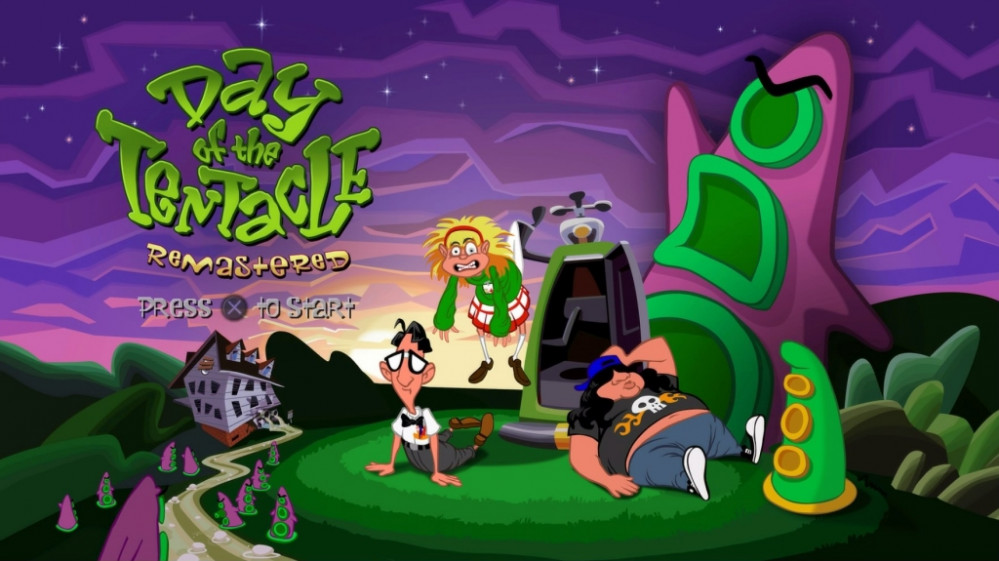
Day of the Tentacle diorama
Recommendations: 121
About the Project
A while back I found some Day of the Tentacle .stl files on Thingiverse and printed them out. They sat on my painting table for months but when I finally got around to painting them, I figured they needed a diorama to really show them off!
Related Genre: Humour
This Project is Active
Slapping on the paint
Whose idea was it to decorate the set in yellow and orange?! I’m pretty sure that back in 1993 when Day of the Tentacle was released, LuscasArts didn’t consider the idea that nearly thirty years later someone would want to recreate scenes from their game using tabletop miniatures.
Because if they did, even back then, they’d have know how utterly useless Citadel yellow paints are for coverage. Orange isn’t much better. Army Painter isn’t much better. And my Coat d’Arms paints (who were the original manufacturers of Citadel paints, back in the day) were the worst of the lot.
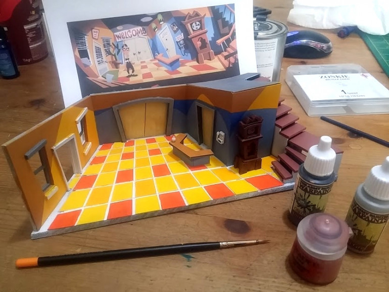
It’s taken quite a few coats just to get this far, and there’s still plenty of tidying up to do. But here’s the latest progress:
I still need to put the risers on the staircase and the handrail and add in a couple of missing tile pieces (alongside the left-hand wall, it just looks a bit bare). And wait for my fresh inkjet ink to arrive so I can print the banner/signs on the doors and phone.
But I reckon another couple of hours and a bit of black edging and it won’t look too bad….
Creating my own .stl files
Everything so far in this little project came from Thingiverse – the characters, the little handbell on the counter, the doorknobs for the doors etc.
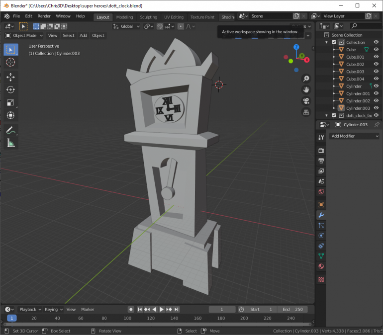
But there was one thing I was unlikely to find, and that was a stylised, cartoon grandfather clock (though I did spend quite a bit of time looking!). So I figured I’d have a go at making one myself.
It’s little more than a few basic primatives mashed together, then “edge-edited” – where I selected an edge of a cube or rectangle, and just nudged it away from vertical/horiztonal.
The result doesn’t exactly match the artwork in the game, but looks close enough as a “cartoon-style distorted perspective” grandfather clock to fit in the scene.
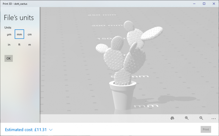
This cactus was my favourite find on Thingiverse. I simply added a cylinder, scaled the top face of it up a bit, then duplicated and squashed the cylinder to create a lip around the top of what had become a plantpot.
With the walls and floor now cut and assembled, and the “window dressing” printed and in place, it’s time to crack out the paints and bring this thing to life!
Fire up the laser cutter!
I don’t know what it is, but I’m always comforted by designing stuff on a screen before committing to an actual phyiscal “thing”. While carving foam with a craft knife was fun, I always felt like I was just playing – working on a screen makes me organise my thoughts and as soon as I’d decided to use mdf, I knew I’d have to design stuff on a computer a laser cut it.
This gave me a peculiar sense of reassurance.
So it’s exactly what I did.
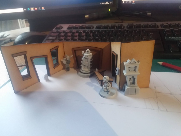 Like the clock? I created the .stl for that one myself. The tiny hamster (and the other models) I found on Thingiverse.
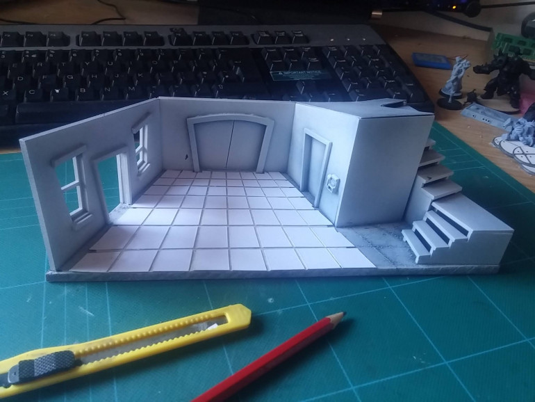
A bit of PVA glue and some masking tape to hold things together while the glue dried and it wasn’t long before the basic shape was roughed out.
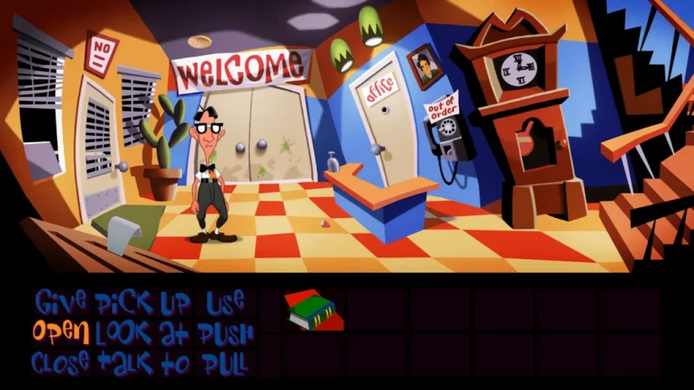
You can see that the angles of the doors and windows don’t exactly match the artwork in the game – but still give the same sense of quirkiness, while fitting in with the physical 3d world.
I primed the entire model then scored lines into the floor to help me when it came to painting the chequerboard floor tiles.
Sadly this is where things started to go wrong! The scorelines created raised areas so I tried to sand them down. In doing so, I sanded some of the primer off the floor.
So I added another layer of primer. Because I’d sanded the surface, this extra layer of paint soaked into the fibres and made the floor look like fuzzy felt! No amount of priming and sanding could get it back to a nice, smooth finish, so I cut out some floor tiles from cardboard and glued them down.
There’s a lot of glue and paint that needs to dry on the model right now, so I’ll have to come back to this later….
Adding a diorama
It was only after I completed the full set of characters (ok, not quite – I’ve still got the cron-o-john and Doctor Fred to paint) that I thought they needed something more interesting than a bare shelf to stand on, to really show them off to their best (did I mention I was actually rather pleased with the paint job?)
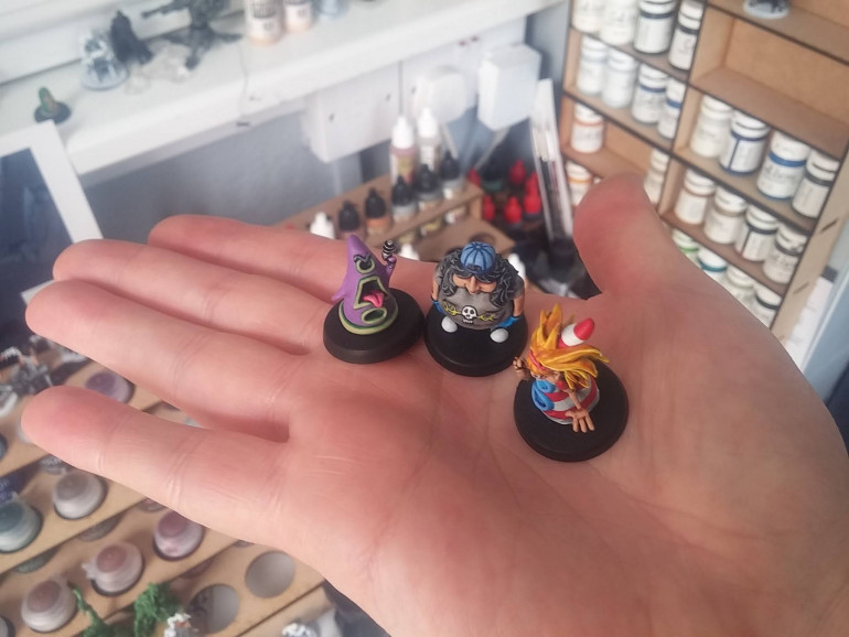 I said I'd take a photo of them on my hand to show how small the miniatures are - and my wife laughed at how my tiny Trump-hands make them look like 54mm action figures!
There are so many iconic and instantly recognisable scenes from Day of The Tentacle – from Doctor Fred’s lab, the kite scene with Benjamin Franklin, George Washington’s wooden false teeth, to Hoagie cutting down a “cherry” tree….
One scene that everyone immediately connects with is probably the opening location in the game – when you’re done with the cut-scenes and you’re finally left to it, controlling the characters and actually moving around yourself. Everybody immediately recognises the motel lobby:
I decided to recreate this location for my Day of The Tentacle diorama.
I loved the quirky angles and slightly disjointed look of the artwork in the game – like a Van Gogh painting, you can see the perspective is all wrong – yet it also looks “just right”.
I found that converting a 2d image into a 3d location, complete with messed up perspective angles, tricker than I first thought.
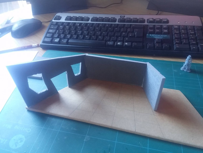
I used grey foam to mock up a simple layout. It looked quite nice, and being able to hack at the foam with a knife to change the angles where it was needed was fun to do.
But ultimately the foam had a nasty “furry” finish that I wasn’t happy with – it detracted from the nice “clean” look of sharp angles and bright, almost primary colours you typically get in a cartoon.
So I scrapped the lot and started again.
Embracing cartoon painting
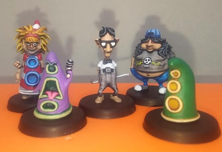
I’ve spent years trying to shed my old-school black-lined cartoon style of painting. I even tried zenithal highlighting and painting with inks and, while I had varying degrees of success at it (mostly it sucked) I always seem to fall back onto my default base-shade-highlight-outline pattern of painting.
So this time, I figured that if I was going to paint some cartoon characters, what better style to paint them in than my natural, default style.
I think they turned out ok.
A long time ago in a printer far far away
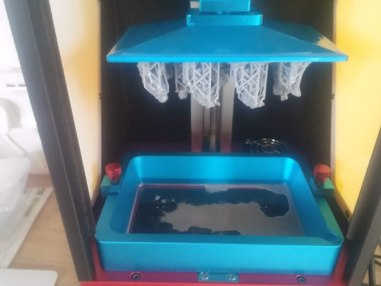
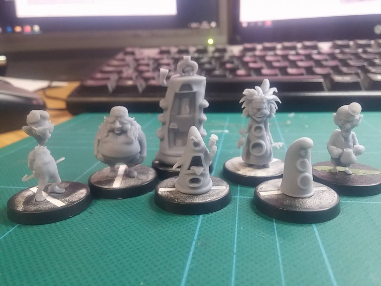
….I printed some cool little minis. They were of the lead characters in the 90s classic point-n-click adventure Day of The Tentacle.
It’s a game that seems to fit in a very narrow niche. To those who have heard of it, it’s a part of our culture. But stray not-so-far either side of a specific age range of nerdy teenagers at the time, and the very name just draws puzzled blanks.
But for me and most of my (similarly-aged) friends, it was nothing short of delightful to find some Bernard, Laverne and Hoagie miniatures on Thingiverse a short while back.
I scaled the minis to be somewhere between 28mm and 32mm (it’s hard to tell exactly what they would be in tabletop terms, since their cartoony proportions make them distorted and they don’t quite seem to “fit in” with miniatures of either scale).
They’re very much out there on their own. But, printed up, they look great now they’ve escaped the confines of a 2d computer monitor and actually appear as 3d objects.
