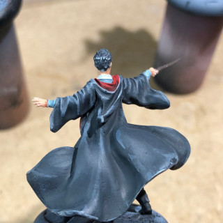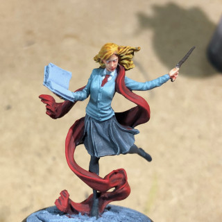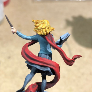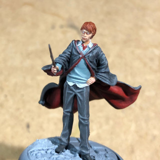
Harry Potter miniature adventure game
Recommendations: 152
About the Project
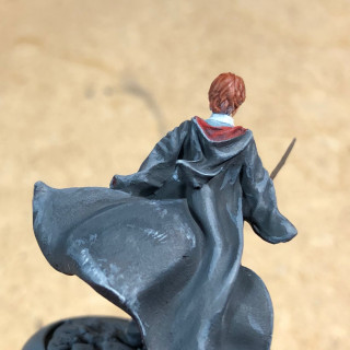
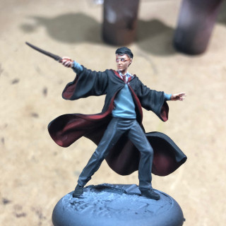
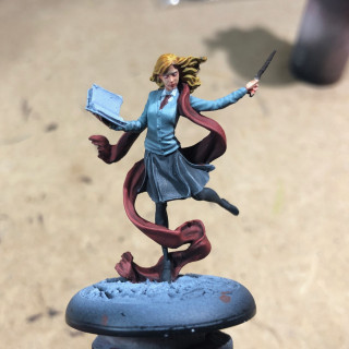
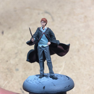
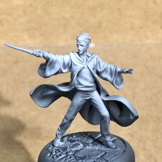
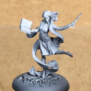
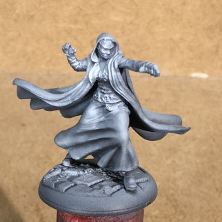
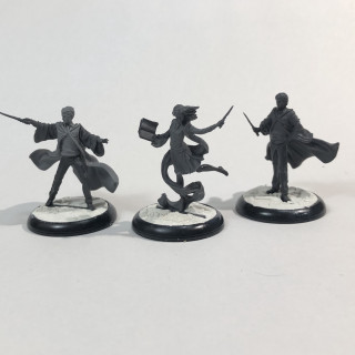
This is my go at assembling and painting the characters from Knight Models' Harry Potter miniature adventure game. I like the universe and cannot find too many related projects or painting tutorials on the interwebs. If all goes well, I will continue to add new models as I get to them.
Related Game: Harry Potter Miniatures Adventure Game - Wizarding Duels
Related Company: Knight Models
Related Genre: Movies
Related Contest: Spring Clean Hobby Challenge (Old)
This Project is Active
All your base are belong to us
Texture not required
Yes! This is the part where the model is almost done. Because I’ve textured the bases at the start and they’re “indoors”, I should be able to finish these rather quickly with some different colours. I wanted to have them match the game board as much as I could and, looking over my paint selection, decided to go with Citadel. Stormvermin Fur was almost a perfect match to the base tiles and the rest of the look should be easy to match with a classic base, shade, drybrush-highlight combination. Actually I sneaked in a couple of extra steps. 🙂
- Basecoat Stormvermin Fur
- Drybrush Celestra Grey
- Wash Agrax Earthshade and Athonian Camoshade blending them on the base to get some brown/green variation
- Drybrush Deepkin Flesh
- Paint the rims black
Accio gaming board!
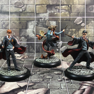
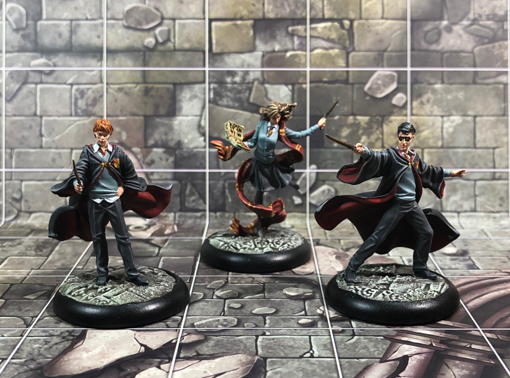
And here they are, ready to fight the evil minions of He Who Must Not Be Named and earn som point for House Griffindor. I am very happy with the end result and learned quite a bit.
Learning points:
- Vallejo paints are amazing! I will continue to use them for the next models in the HP project and probably some other projects as well.
- Take time to learn and have fun but not too much. I have spent a disproportionate amount of time to get here. Lots of fun was had but I will try to be more effective on the next batch.
- Practise doesn’t make perfect but adds confidence. There’s nothing wrong trying new techniques but if it doesn’t work, shelve it for some other project and continue to use what works for you. Fun is still the key word.
- Resin is brittle. This is the first time working with resin models and they do require a more gentle hand than sturdy injected moulded plastics.
Next up:
The bad guys… people. Deatheaters!
Highlights and shades part 2 - redo
Back to layers
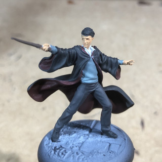
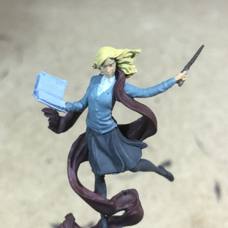
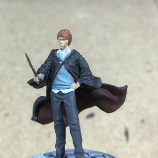
Trying a different approach, I started with a new paint pallet this time thinned down with glaze medium. I wanted to be able to work with thin layers but keep the pigment coherency. Otherwise everything was the same, pre-blending my paints on the pallet for easy use. I also added a dark grey and a bit of black to darken the cloaks and some vermillion to brighten up the red on the linings and Hermoines scarf. Things were looking up.
Eyes and details
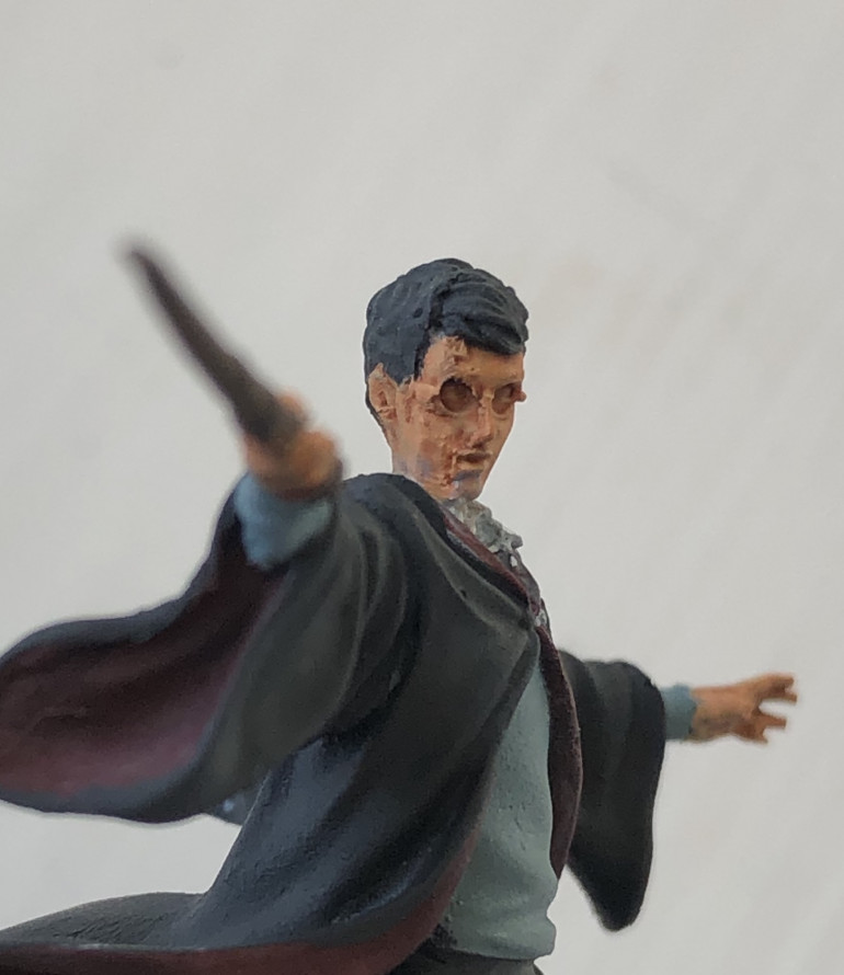
I never paint a models eyes. Mostly because I’m concerned I’ll do a botch job and end up with a goofy looking face. Because these models are so realistic and it would add life, this would be the perfect time to overcome that concern, which I’m glad I did. I even bothered to chose three different eye colours. They’re hard to see but I know they’re there and that’s all that counts. 🙂 But I’ll let you be the judge.
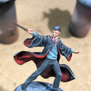
With the yellow stripes, the book and a brown hair dye for Hermoine, I called them done. This was the point of diminishing returns and spending more time could improve them but would take a disproportionate amount. The one thing I’m not happy with is Harry’s glasses, which look more like a superhero mask. Some time in the future maybe, this might be corrected. (Probably not.)
Next up:
Back to where it all began; basing.
Highlights and shades part 2 - do
Wet blending … or not
Update attempt number two. My previous upload failed so I hope everything works out this time.
Picking up where I left off, I needed to add the next highlight colours to make the dastardly trio pop more. The cloaks were up and wet blending was the technique of choice. I blended my colours on the wet pallet and went at it, gradually working my way around the folds on the back and the sleeves. Things were going well, transitions looked good and after a lip-biting hour it was time to take a step back and judge the result. It didn’t look too bad, except too bland and grey. Up close didn’t help much. I had thinned my paints too much and the end result looked chalky. The texture I tried to add to the cloth didn’t translate well either. Time to rethink my approach.
Highlights and shades part 1
A short update on painting today
Progress has been rather slow… that is to say none, last week. Some much needed time with the loved ones followed by the arrival of my new 3d printer distracted me for some days. But the hobby-mind keeps working, also in off-hours and I was pondering the current state of the minis. Since my last update I put on a quick wash of GW Reikland Fleshshade on the faces and hair and didn’t like it at all. It just didn’t feel right for the minis. And if it doesn’t feel right, it has to be changed. So I went in again with the basic skintone and did the shading with regular paint instead of washes. I also tried to clean up Harry’s face a bit with a sharp hobby knife, which sounds a lot more like a Martin Scorsese mafia drama then it actually is. 🙂 It didn’t make a lot of difference but I felt better for doing it.
On with the show
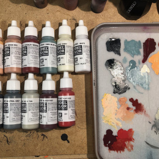
Rather than following someone else’s recipe this time, I went with my own feeling and picked highlights and shades from my collection of paints, starting from the base colours chosen for the last step. I’m not done so it’s a halfway step. All colours used can be seen in the image below but I’ll also add a list. For now, the skin, shirts, jumpers and red linings of the cloaks (except Ron’s) are done. I might go back in when it’s all done and adjust where needed.
Lessons learned
Layering on transitions takes a very long time. I mixed my paints a bit too translucent, which doesn’t work well over dark colours. I need to practice my wet blending which hopefully could speed things up a bit.
Next up:
Highlights and shades part 2.
A lick of paint to start
Progress has been a tad slow. We are lucky enough to be able to go for walks in these trying times so I’ve been enjoying the good weather as much as possible during the weekend. I did manage to block the main colours in, just to get some more definition and first impressions og where the minis are going. Standing on the back of giants, I’m not shy to follow the great work of others and in this case found inspiration in an already active project, which I’d like to credit here. Do check it out, the guide and quality is fantastic!
Harry Potter Miniatures Game painting guides by @volleyfireandy.
I used the paints listed in his vlog as a starting point but will likely deviate a bit as I go on, going with my gut-feeling. Hopefully I won’t end up with a carbon copy of his work. 🙂
I’m not too happy with Hermoine’s hair colour and will darken it down quite a bit as I go on. To help define the white shirts, I gave them two layers with GW’s Apothecary white contrast paint. The effect is very subtle and might get some more work once I progress further.
Lessons learned this step.
- Be inspired by others. There is no reason to be original and reinvent the wheel if others have done a great job that you like. Copying is a great form of flattery. Do remember to give credit and praise where it is due, though. 😉
- Quality control. Be prepared, here comes a bit of gripe. Because the models are so delicate, I paint them using a pair of magnifying glasses. Unfortunately that also means spotting bits I’ve missed so far. There were resin supports hidden underneath chins and folds i had missed before. What’s worse, Harry’s face is not the best of casts. Once seen, it cannot be unseen. This might be due to production strain at Knight Models during the initial release (the game is 1st ed.) but when I pay a premium price, I do expect a higher degree of quality control from the company. Don’t get me wrong, I still love the models, but this is not something you glue together in an hour and get playing. At least not if you care for the final product. Next batch of models, I will do a second check for missed supports or miscasts after the zenithal priming step.
Next up: shading and highlights.
Fixing the bases and some priming
Filling the gaps
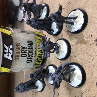
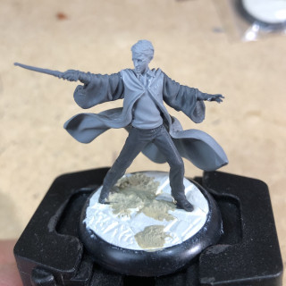
After a bit of a break and pondering how to fix the gaps left in the base texture by the bottom pegs on the minis, I decided to try an option that might actually benefit the look once I get to play some games. Filling in the gaps with putty and sculpting it to match the texture from the rolling pin was never going to be satisfactory as I wouldn’t be able to sculpt it well enough. Off course, most of it would be hidden underneath robes in case of the Deatheaters but would be very visible on to heroes. So I opted for an added texture on top of the flagstones. Adding some “dirt” and perhaps some tufts when it’s all painted could blend the bases in with both indoor and outdoor environments, from the halls of Hogwarts to Hagrid’s pumpkin patch. We’ll have to see in the end but here are some results so far.
I have had some Dry Earth texturing paint from AK Interactive that needed to be used and this might be as good a time as any. The grain is fairly smooth and wouldn’t seem out of place with the detailed sculpts. Hopefully you can see the results in the pictures below.
A quick spray
Next up is the quick priming step. There isn’t a lot to say about this as this has been covered extensively in numerous blogs, videos and pdf-guides. But for the sake of completion, I have added it as well. All steps are done with my airbrush, starting with a black primer, followed by a neutral grey layer from about 45 degrees all around and finally a white highlight from directly above focused on the head, shoulders, face and chest.
I rarely choose not to do a zenithal priming anymore. It highlights all the details on the mini that i might otherwise miss. My eyesight hasn’t been what it used to be and the details on these are so intricate, that I can use all the help I can get. 🙂 It does showcase the intricacy and quality of the sculpts rather nicely.
My gripe about the flimsy and frustrating assembly has scabbed over a bit. The broken wands remain that way. Hopefully it won’t look too silly once they’re done. If it does, I’ll try to fix it at the end.
-
AK Interactive Terrains Dry Ground
-
Vallejo Black surface primer
-
Vallejo flow improver
-
Vallejo Game colour Neutral Grey
-
Vallejo Game colour White
Next up: painting – The fun part!
Assembling and basing
Assembly blues! (the Rant)
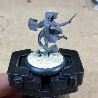
This is it! I have had this game sitting on my shelf for quite some time, having picked up a copy after much deliberation and procrastination, on a rare and wonderful trip into town with my daughter. Sharing our love for the Harry Potter universe, it tipped the balance and off I went, with a tin can filled with promise. The copy is first edition so the components are very flimsy but that is covered well enough by a lot of people. The resin figures are absolutely stunning but also absolutely fragile and extremely fiddly to assemble. Wands have broken off, parts are so tiny, they’re almost impossible to hold on to, let alone keep in place and for some reason the superglue would stick to any surface in seconds except for the models. Hermoine’s left leg took a good 40 minutes positioning, keeping steady (almost impossible) and an unreasonable amount of tries to get in place. Seldom have I cursed more during an assembly than on this project. Even Infinity metal helmet antennas are nothing compared to this. They don’t break.
Basing.
So. Rant over, once assembled they do look fantastic! I didn’t like the look of the bases, unfortunately after having glued 3 Deatheaters to them already, and so decided to try a different approach. I used Milliput and the Green Stuff World Temple texture rolling pin to create a new texture. (Thanks Gerry!) They look a lot better but I haven’t solved the issue with the slotta bases yet. I’m afraid to remove the supports from the minis as their feet are very small and probably won’t have enough contact surface to glue them in place. I could try to drill and pin them but again, there is hardly any volume to drill into. I’ll have to ponder a bit on how to solve that.
Take aways and tips
- Use a medium thickness superglue to assemble the different parts and tweezers to hold the smaller ones in place. The thicker glue will provide a bit of a goop to hold the bit in place and tweezers avoid everything from sticking to your fingers.
- The resin casts are very crisp but do have some very thin mouldlines. I found the round file from The Army Painter to be the best tool for the job.
- The base slots are too wide for the miniature’s tabs to fit snuggly into, having quite a bit of wiggle room. Filling the slot with modelling putty and pressing the figure in that will provide a much better fit and make it easier to position the model upright.
- Don’t glue them on their bases and change your mind. 😀
-
Milliput Superfine white
-
Green Stuff World Temple texture rolling pin
-
PK-PRO Superglue medium
-
Sharp hobby knife
-
Hobby tweezers
-
Citadel flat clippers
-
Army Painter round file

























![TerrainFest 2024! Build Terrain With OnTableTop & Win A £300 Prize [Extended!]](https://images.beastsofwar.com/2024/10/TerrainFEST-2024-Social-Media-Post-Square-225-127.jpg)
