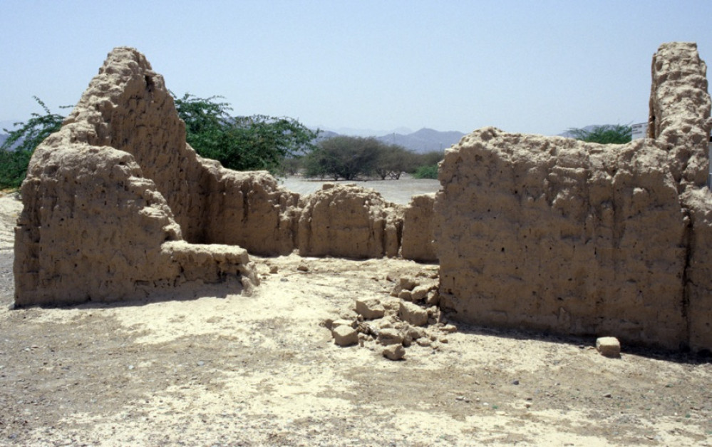
Abandoned Desert Village
Recommendations: 99
About the Project
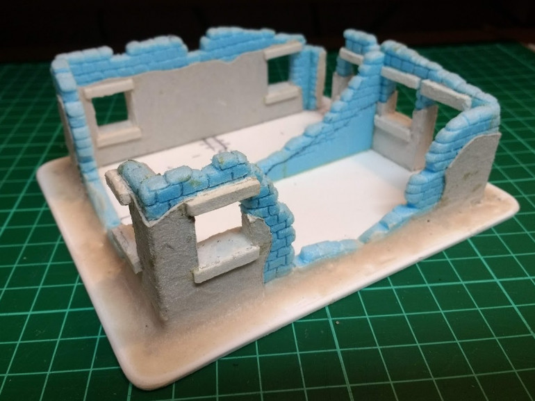
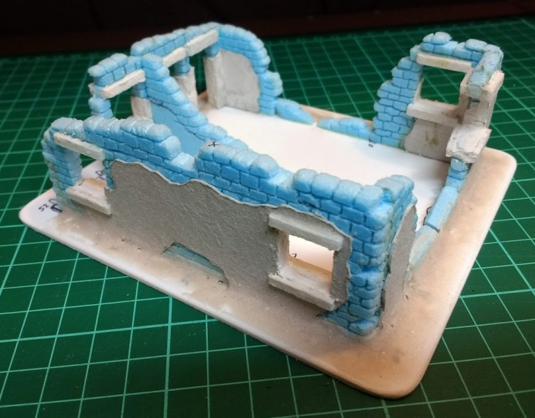
I want to create some 28mm scenery for a desert table that’s a bit different. I want to try and create a derelict village that was abandoned decades ago and is slowly collapsing and being worn down and buried by desert sand storms. I have some cast resin terrain pieces that have been in my stash for, erm, quite a while... I can’t remember what company made them, I vaguely recall buying them at a war-games show many moons ago. To supplement these pieces, I plan to add a few bits to them and scratch build a few more ruins in a similar style to give me more terrain. I’d like to share my scratch building adventure in the hope that it will inspire others and prove that it’s not hard to create your own terrain.
Related Game: Bolt Action
Related Genre: General
This Project is Active
Getting plastered (part 1)
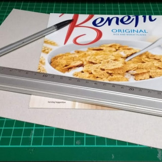
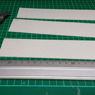
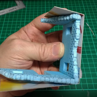
The base for the render/plaster is a layer of card, in this case, good old cereal packet. I started by cutting some strips 45 mm wide.
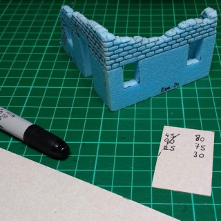
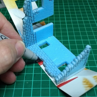
Next measure the outside of the wall to be covered, for each corner to be turned on the outside, add an extra 0.5mm to allow for the thickness of the card around the corner. (For internal corners, deduct 0.5mm) I always write the measurements down on a scrap of card/paper as an aide memoire ‘cos, you know, numbers… and remember; measure twice, cut once. Or is it measure twice, make two different marks, cut along the wrong one? Or pick up the off cut and try to fit that to the wall and wonder why it doesn’t fit? Or cut your finger and bleed all over the measurements? sometimes I forget.
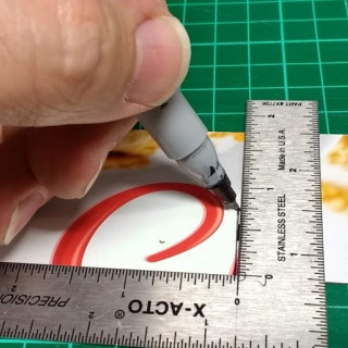
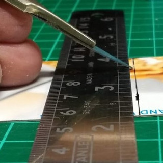
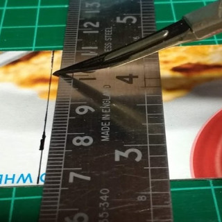
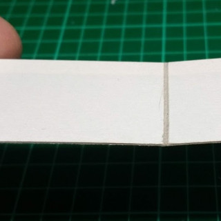
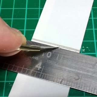
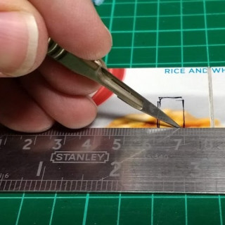
Anyway, next start marking in the fold lines where the plaster wraps around the corners. Remember the addition or subtraction for the thickness of the card… (You came here for some interesting or relaxing hobby talk and you get a maths lesson, sorry). The next bit can be a little tricky and requires a bit of patience and a steady hand, some practice will help you get the hang of it. Place the ruler approx. 1.5mm away from the fold line and then gently cut into the card with the knife held at 45 degrees to the surface, don’t cut all the way through the card, repeat this cut on the opposite side of the fold line in the opposite direction. The objective is to cut out a triangular shaped section of the card that will leave a groove that acts as a hinge line that can be folded around the wall section. This stops the card deforming and creasing up when folded. As an alternative, a heavy score line can be put along the fold line with the back edge of the blade, but this doesn’t reduce the creasing as effectively.
After cutting in the fold lines, offer up the cladding piece to the wall to check the fit. If it doesn’t quite match, more material can be cut out along the edge of the fold line to re-position the fold slightly.
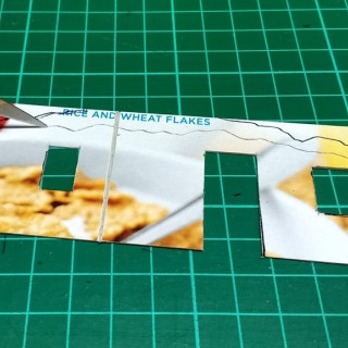
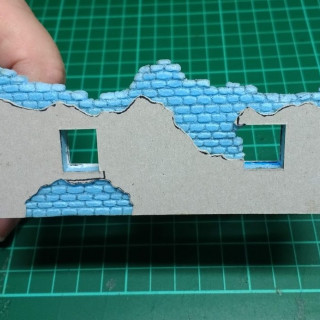
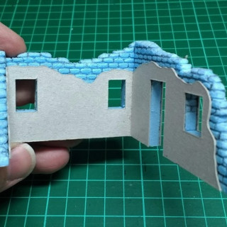
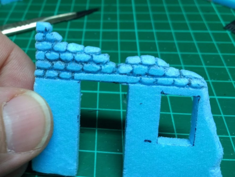
Once the fold lines are in place, mark in the position of the windows and doors and cut them out. Then mark in the broken edges of the walls and cut 3-5mm inside this line to expose the brickwork.
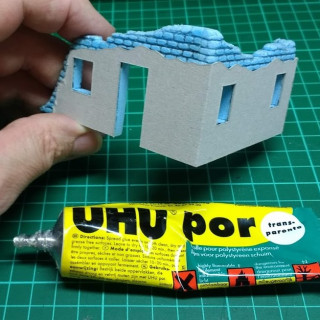
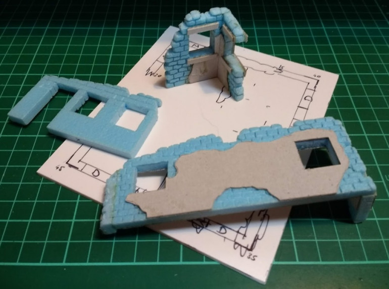
Once the plaster piece is cut to size, it can be glued into place. I use UHU Por, this will stick polystyrene, card and paper and doesn’t have any solvents that melt polystyrene. PVA can be used but takes a while longer to cure and I’ve found the card can warp as the PVA shrinks as it dries. Before you start gluing, extra bits of card can be cut away to expose more brick work if you want a more derelict look. The inside of the walls can be treated in the same fashion.
Brick by brick (part 2)
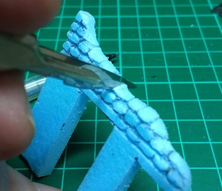
Next, start carving the brick detail. There are a couple of options tool wise for carving styrofaom; the back edge of a knife, a toothpick or a pencil are all good options. Basically, you need a tool that will press in a shallow groove without cutting too deep into the foam.
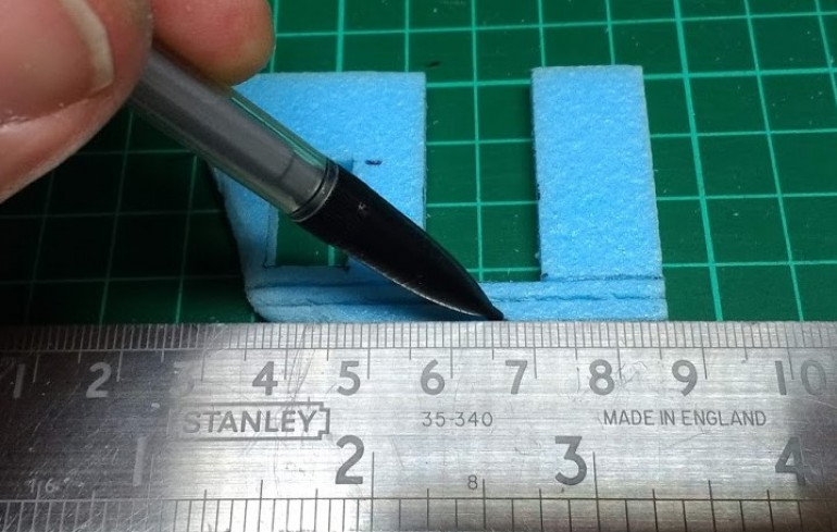 First, lay in some horizontal parallel lines about 3mm apart. If you want to represent regular sized bricks, keep the gap consistent, but if you’re going for a more rustic, hand made brick or stone wall effect, it’s ok to allow a bit of variety in the thicknesses of the brick layers.
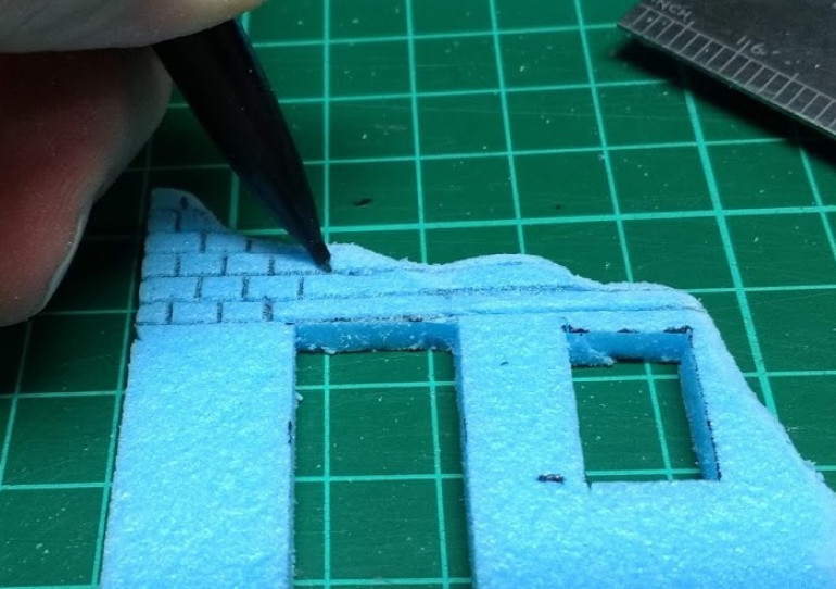 Next add in the vertical lines, aim to get a regular looking overlapping pattern going unless you are going for the rustic look. This is what I am going for, I imagine these bricks were hand made so they are almost, but not quite, the same size.
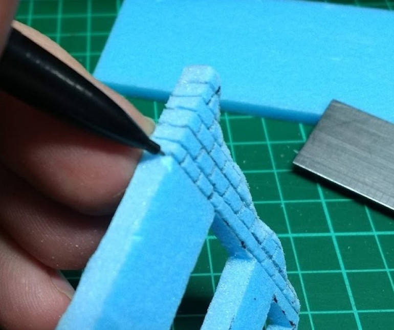 Carry the mortar lines around the edges so that when you carve the reverse side, the layers of bricks line up.
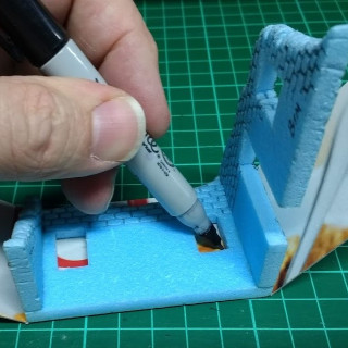
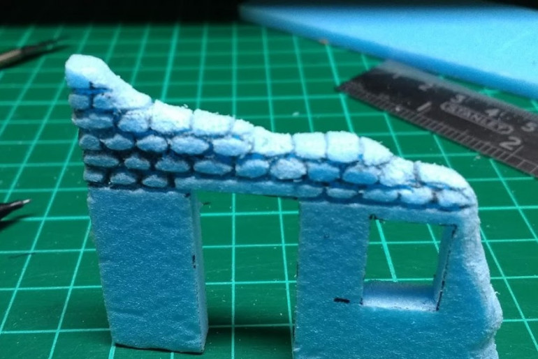
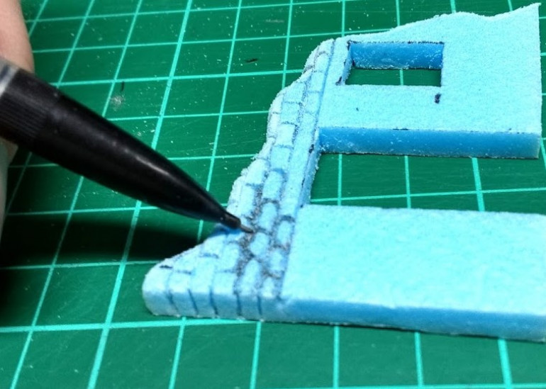 This will leave you with a nice neat regular looking bit of masonry. To age the brickwork and make it look a bit more irregular/rustic or more like stone, the edges of the bricks can be modified. Use the sculpting tool (I usually use a pencil) to press around and round over the edge of the individual bricks. This can take a while, but it adds a lot of character. Large areas of these walls will be covered with plaster/render, so the detail only needs to be carved into the exposed brick work around the collapsed edges and on any patches where the plaster has eroded/fell off.
 Brick by brick (part 1)
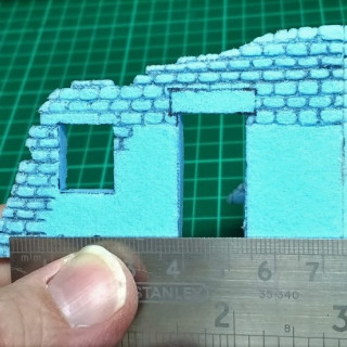
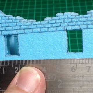
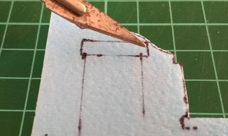
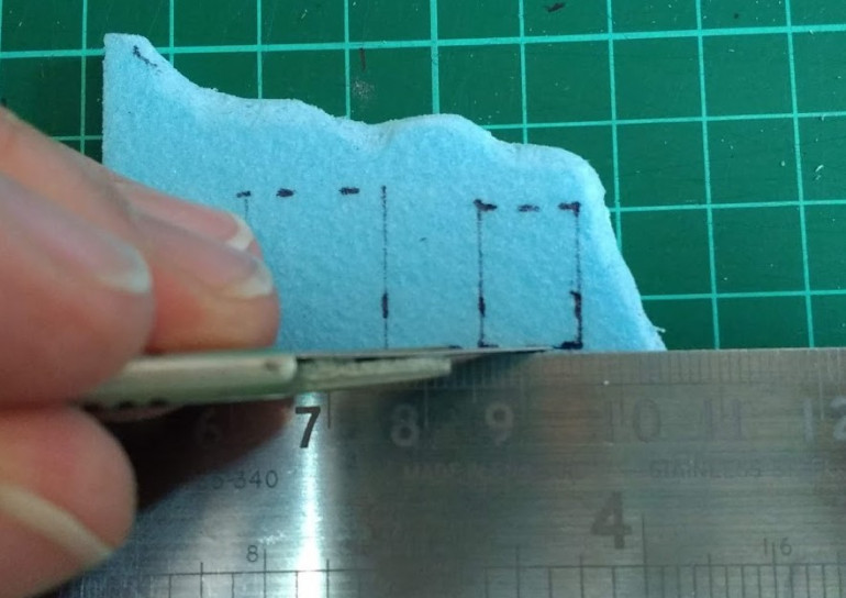 Then cut out the windows and doors. On some pieces, this may make the piece quite weak, so leave cutting out the door way until ready to assemble the pieces. For example, this picture below shows how narrow the door lintel will be; prime spot for the piece to snap if the handling gets a bit clumsy.
One important thing to consider; Styrofoam, card and paper eats the edge off a blade. Make sure you have plenty of spare blades for your knife. You can feel the blade start to drag and the foam or card starts to tear as the blade loses its edge. Don’t try to persevere with a blunt blade, it’ll only get worse.
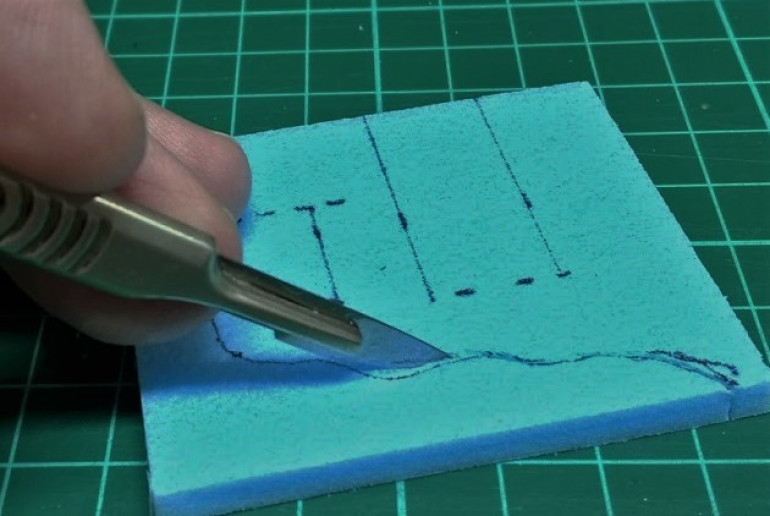
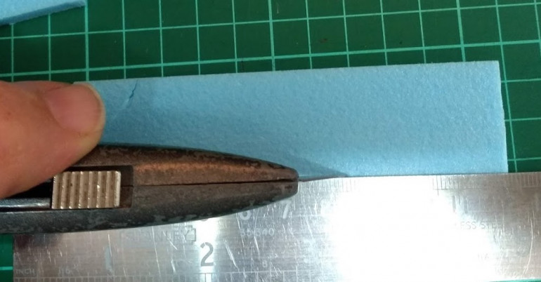
For making the long cuts, I like to use a larger, heavy knife, like a Stanley knife, and for the detail work I use a scalpel with a narrow blade. When cutting thicker materials the blade can wander off the vertical and leave a bevelled edge to the cut, to try and minimise this I try to look straight down over the knife and the piece I’m cutting to keep the blade as close to vertical as I can.
Keeping the blade cutting angle shallow to the piece can help to minimise dragging/tearing of the material.
Once you have the ruler in position on the piece you want to cut, keep a firm pressure on the ruler to stop it sliding as you cut and keep a slight side ways pressure on the knife to keep it running along the edge of the ruler. I always try to lay the ruler over the piece of material I want to keep, so if the blade does wander it goes off into the off-cut and doesn’t damage the piece I want. A steel ruler is a must for cutting and always make sure the tips of your fingers don’t hang over the edge of the ruler, making offerings to the Blood God can slow down the work rate…
Cuttin' it up
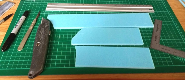 The basic building material is 5mm thick extruded Styrofoam (Blue Foam), this is easy to cut and shape and the surface can be carved and textured to give nice looking effects like brick or stone work. I started by cutting some 50mm wide strips from a sheet.
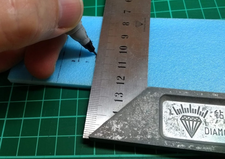
 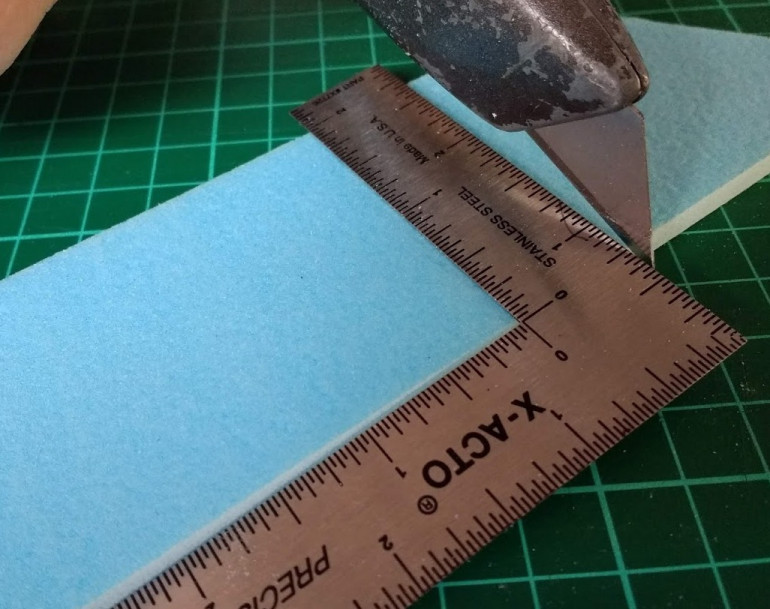 Using a set square to guide the lines for cutting will help to keep all the right angles lined up so the corners match up without too much fiddling and re-cutting/sanding
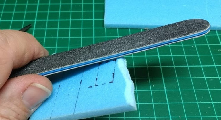
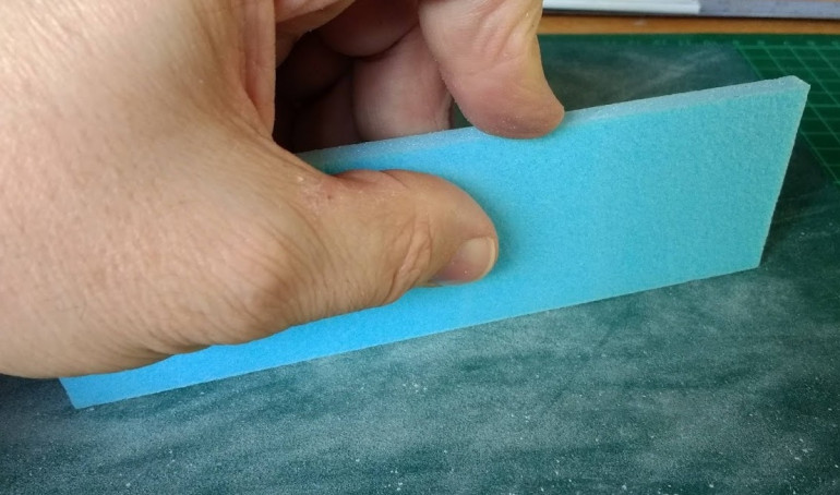 After cutting some of the edges aren’t quite square, so a quick pass over a sheet of sand paper flat on the desk top will soon straighten it out. To find out if the edge is straight, stand the piece on edge and see if it falls over or leans over out of true.
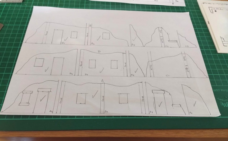
 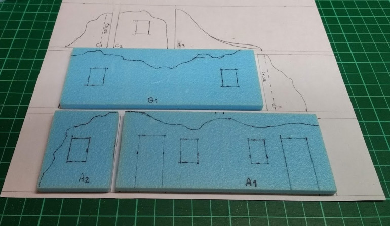 The drawn plan also works as a cutting list, I label the parts on the drawing and as each part is cut to the starting dimension, I lay it on the plan so I can keep track of the pieces.
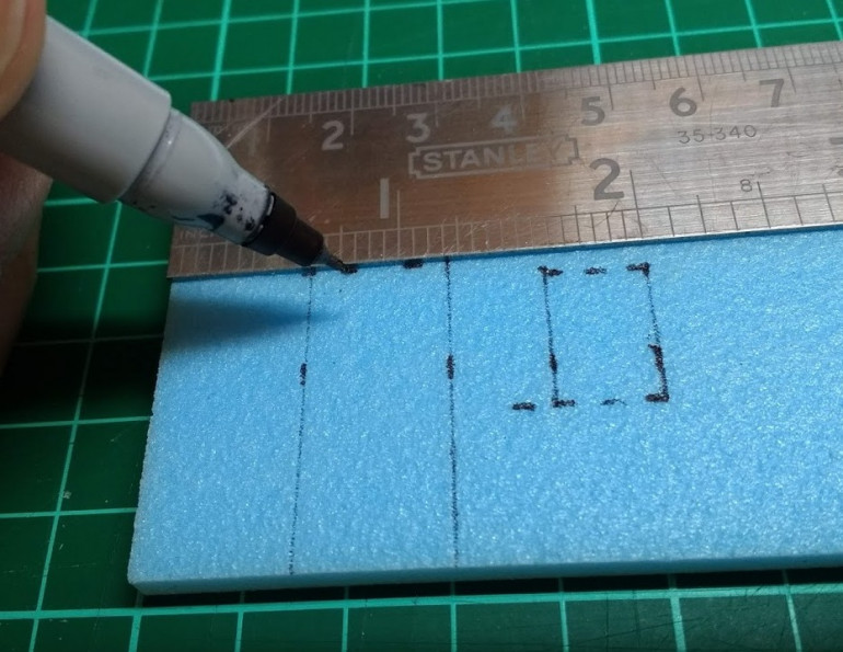 Next I sketch in the lines for doors and windows, a ruler and a set square help to keep everything in line
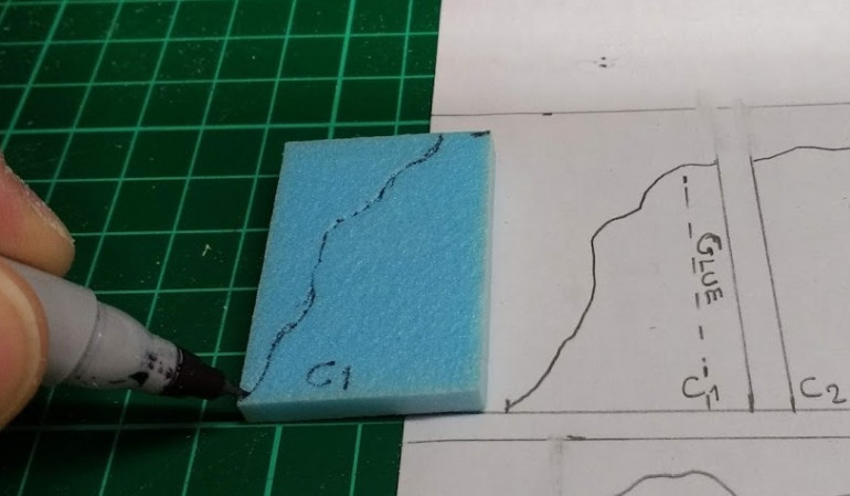 Then add in the cut line for the collapse damage, this doesn’t need to be an exact copy of the plan, ‘close enough is good enough’
Next I will start cutting in the damage and carving the brickwork
Step the first, I Have A PLAN...
Over the years I’ve bought terrain in various scales that looked great to start with but once on the table there was an annoying scale discrepancy or placing figures in/on the terrain didn’t work very well. I’ve had several pieces that were just too small to get a unit of figures in without piling the figures up tight together, I never liked the look of it.
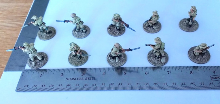
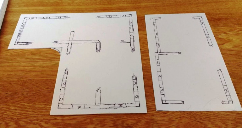
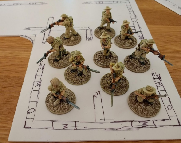
The main game for this terrain will be Bolt Action, so to start, I decided to measure up just how much floor space a full section of infantry takes up when set out according to the ‘one inch rule’, ie; figures can be spread out up to one inch apart in the same unit to minimise damage from area effect HE hits. A unit spread out like this needs quite a bit of floor space; in two ranks 9” x 3” = 27 square inches or in open skirmish order 6” x 6” = 36 square inches. This is going to make for some large buildings, so I will have to accept a bit of ‘bunching up’ of figures but I still want them to look like a deployed unit and not a gang of sardines all crammed in together.
After working out how much floor space, I sketched out a few floor plans on some bits of card to see how the unit would fit and tried it with the figures.
Then I sketched out some wall plans based on the measurements from the floor plans. I decided to make the walls 50mm high before I start adding damage from the collapsing/erosion. To work out the dimensions for doors and windows I measured up a few figures; the average across the shoulders was 10mm so I made the doors 15mm wide. Average height without the base was 30mm so I made the doors 32mm high. For the windows I measured a kneeling figure aiming and a standing figure aiming so I will be able to place figures with weapons pointing out of the windows, the lower ledge is 15mm from the floor and the top edge 30mm. I made the windows 10 or 12 mm wide randomly.
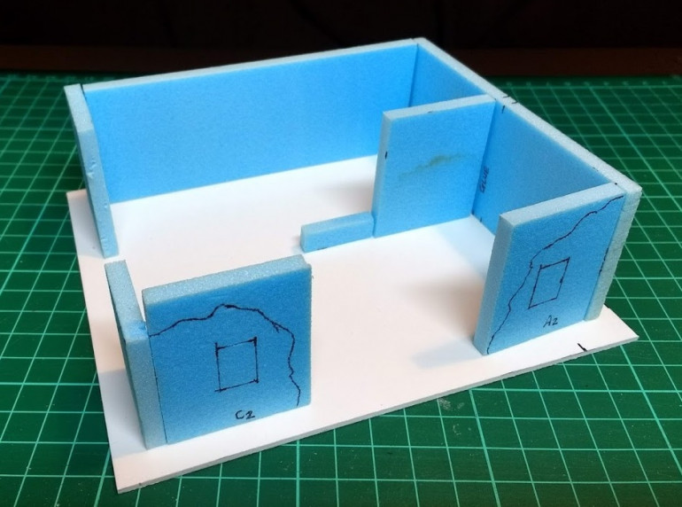
Before I get too deep into cutting and gluing I decided to try making a prototype test piece to try out the materials and techniques I want to use. This is how that went
