Entropy City: Making a Wargame
Faction Focus: Mutiny
Dirt bikes were the one bike style that didnt really have a HELPFUL sterotype surroundind then, besides either farming or motorcross neither of which I found inspiration in (except for wouldnt jumps be cool). But this is where its fun to have a pop culture background, see one of the first suggestions Id had back in the day was that it should have a Mad Max vibe and whilst I didnt want that entirely over the game lord knows those games exist already. Its much like although I didnt touch on it in the previous entry racing itself wasnt the focus on this game so many sports bikes specirfically a racing thing didnt fit.
The initial thought.
My earliest thoughts were around a cult that was attempting to portray itself as something less dangerous, as most of them generally do. Perhaps filled with emmewbrs that dont entirely realise what theyre a part of, some that do and revel in it whilst others and somewhat nieve, less of a choice and more brainwashing. I liked the idea of mixing in punk and goth scenes as its so very different so what the other groups represented, the city has failed them and so theyre seeking a lifestyle they see saving them from what the city has done, its the victims of the cities fall being used by som pretty unsavoury people, the reasons why they cant be trusted I feel is something Id like to reveal at a later stage. Their main overaching leader is a rather charismatic man named Jeremiah, kind’ve has the way of making anyone smile, if it wasnt for his charm he’d almost make your skin crawl.
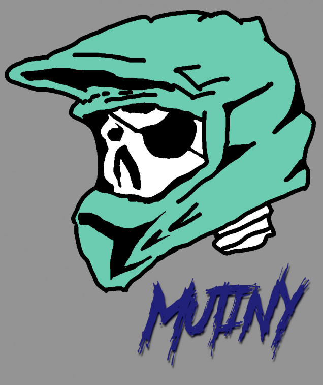
The original vision for the logo was somewhat thrown together from a few idea’s.
I mean theyre like anarchists and theyre trying to be pirates, oh and they ride dirt bikes, what if that was thier logo.
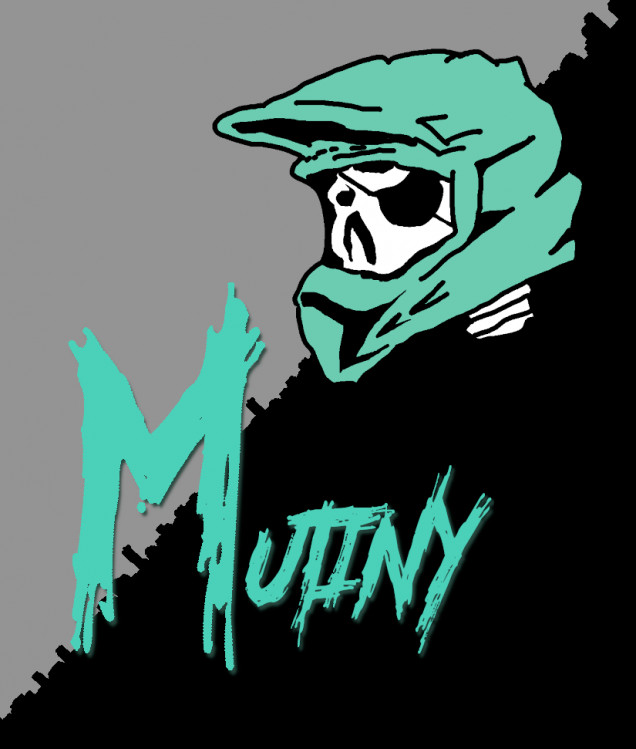
I thought it was so clever, ironically probably the logo I did the most orginal work on (especially as someone who cant draw) but the more time has past the more I HATE this image. It just doesnt feel like a faction logo, it feels like a logo drawn by a kid, no other groups are centred around the types of bikes they ride its just silly. What if I throw some more anarchist ideas in there?
Its the black and grey divide what a cool idea but its the city skyline.. God this felt like i was trying hard, way too hard this was the point where I completely scrapped the entire idea and went back to scratch for an entirely new concept for their logo.. I mean their a cult right it should be some symbology they can twist into meaning something it doesnt right?
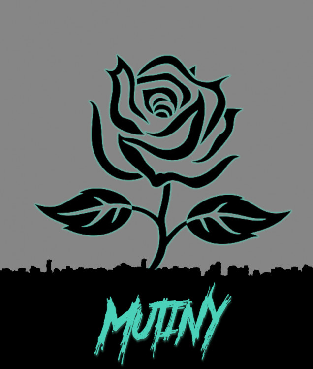
So we’ve gone back to borrowed assets until i can get a paid artists here but I feel much happier with the black rose as a symbol of the group, black roses are famously a sign of mourning especially in pop culture, come join us in your mourning we will help you survive after what the city did to you and your family.. Join us..
But you know what else the black rose is famously hatred and anarchism, this is where I feel the vision fits with the cult itself, granted its not perfect but Im very happy with the symbology itself.
































2024-11-12 Your project has been visited by the unofficial Hobby Hangout. Huzza!