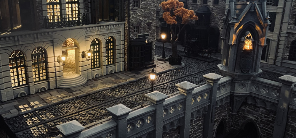
It's going to be something...
Colour Test
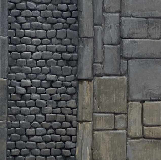
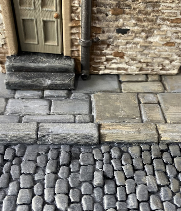
I knocked up a small sample piece from the Stormcrow range to test out some colours on. The sample has cobblestone and flagstone elements so I can see how different colours look next to each other.
Initially, I went with a grey primer and painted the cobblestones black. After that, I used a wet brush to highlight grey colours, using lighter greys on the flagstones. It didn’t look too bad, but it didn’t feel right. it looked too cold for what I was after.
I then approached it a little differently and used more browns and earthy colours to wet brush over the primer and I got a much warmer look.
I then added some simple ‘scuff marks’ to try to make it look a bit weathered.
I think I will probably use a brown primer rather than grey on the flagstone areas to help create a distinctive difference between textures whilst, hopefully, getting it to feel like the colours don’t clash with each other too much.
Thoughts?
Of course, the base terrain has to fit and feel at home with the current buildings which I plan to incorporate into the layout.
The look I am aiming for is that these streets are lived in and in constant use whilst also being able to represent something gloomier should the need arise.
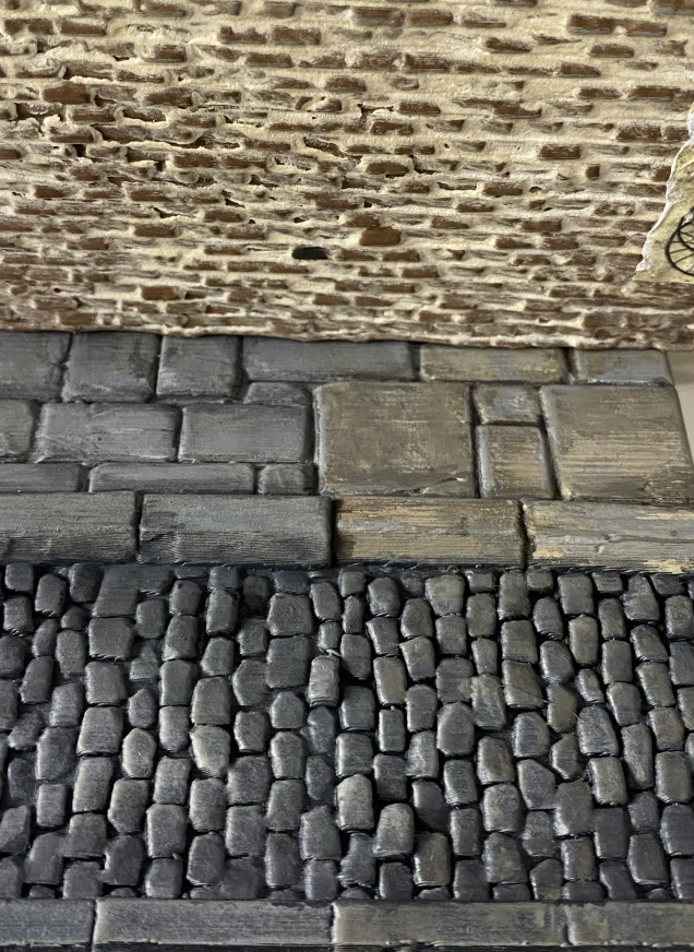
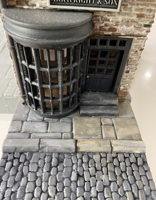
I took one of my buildings and placed it on the sample board piece to see if the colours would work together,
Even then it was worth remembering that my buildings also have other colours on them, it’s not just about the brickwork fitting in. So, I tested out some other views of building to see if the colours I had used would work.
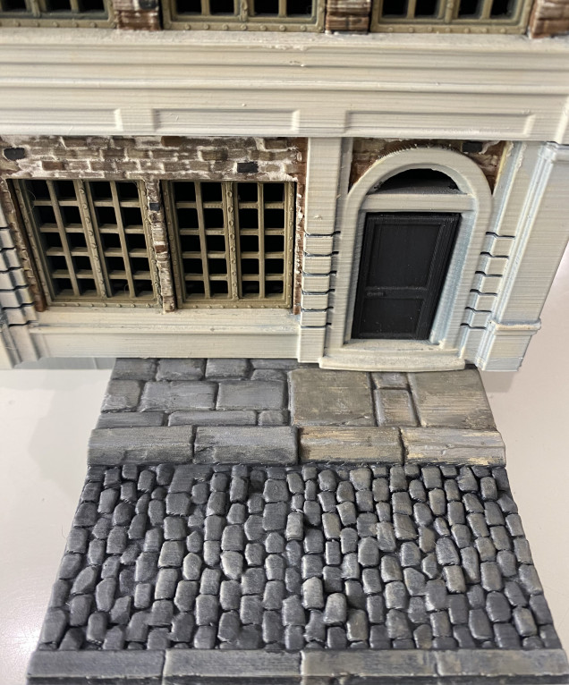
I also have some more ‘fancy’ buildings that have large areas of an ‘off-white’ colour on them. So, whist at it I thought I should probably put them against the floor tile too,
So that is where I am currently at. Any thoughts, ideas or suggestions are very much welcome.
Cheers.



























































Leave a Reply