Demonsub goes all in with Sláine
The Fomorians
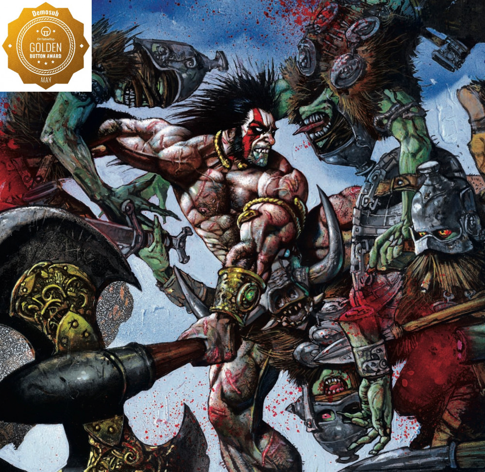
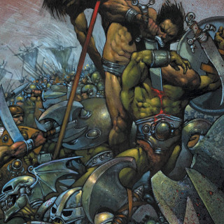
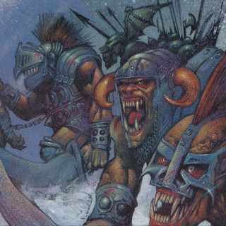
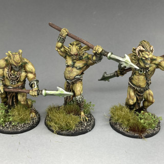
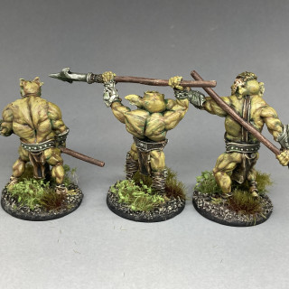
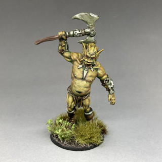
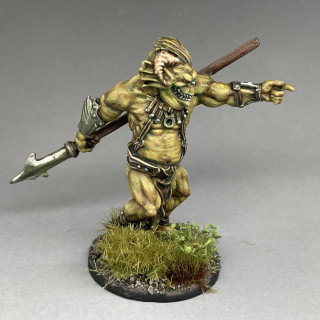
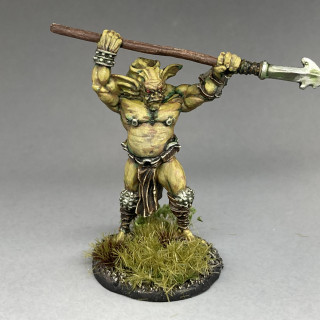
I was at first unsure what colour to paint these. I thought the smooth green that the Warlord Studio miniatures were painted didn’t seem right or really very accurate to how they appear in the Horned God graphic novel. I imagine they were painted like that to make them stand out from the other factions and to differentiate them on the box.
Looking at a few panels from the Horned God was confusing as sometimes they appeared green while other times almost flesh colour.
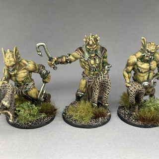
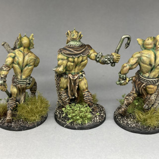
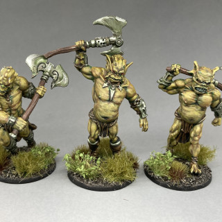
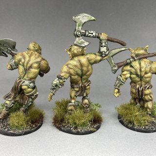
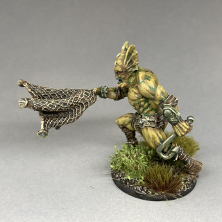
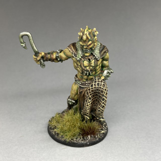
I decided to go for a blend of both, adding green and then brown to the colours while getting lighter. While the eventual look of the models are quite different in colour to either way they appear in the comics I’m quite happy with them.
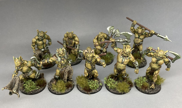 I took the green concept further by adding a small amount of green to most of the colours I used, even giving the metallics a green glaze to give an almost otherworldly look.
Fomorians with nets.
Fomorians with axes.
Fomorians with spears.
I just have one more model to paint from the initial release of Sláine miniatures as well as a few more pieces of terrain then I’ll be all done for now.
Also I’ll be playing another game this coming weekend, so I’ll try to take a few photos and maybe do another battle report.
































Superb colour you have there. I agree with you about the Warlord studio scheme. It is a bit too “GW Ork” for my taste. As you say, despite not being an exact copy of any of the various skintones in the graphic novels yours have come out with a fantastic look all of their own. They look nastier and more brutish than mine which is very appropriate. Bravo!
Thank you.
lovely colour scheme!
Thank you.