


![TerrainFest 2024 Begins! Build Terrain With OnTableTop & Win A £300 Prize! [Extended!]](https://images.beastsofwar.com/2024/10/TerrainFEST-2024-Social-Media-Post-Square-225-127.jpg)


Marvel: Crisis Protocol

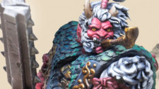
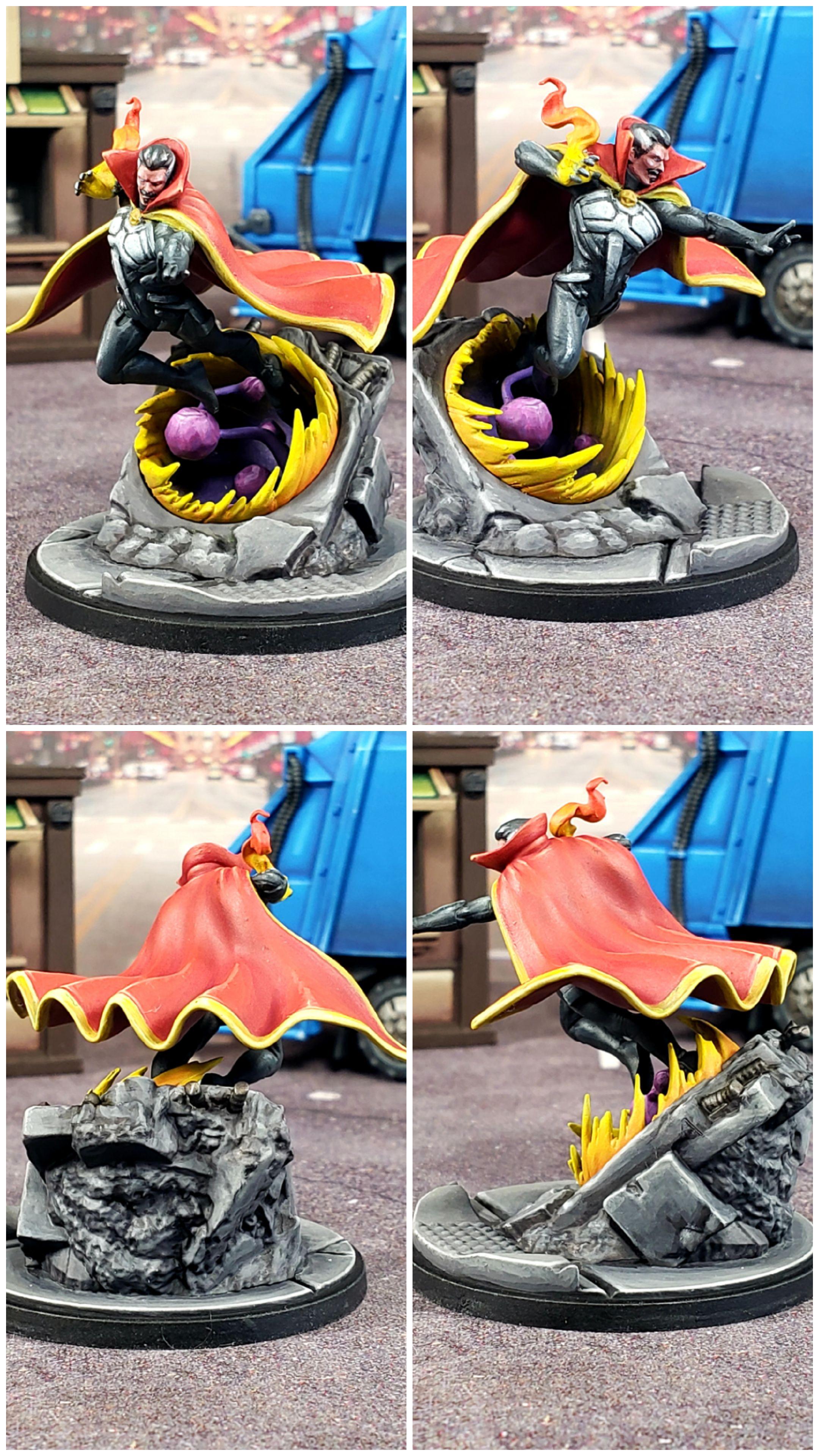
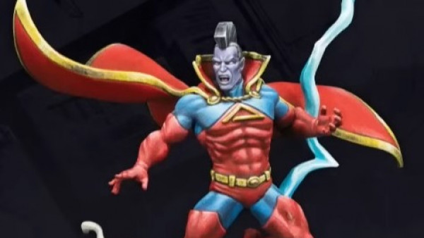
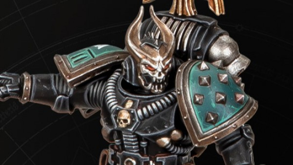
Doctor Strange, Sorcerer Supreme.
 Doctor Strange, Sorcerer Supreme
Painting Doctor Strange this time around makes me realize how little I really understood painting yellow and red the first time I painted Doctor Strange. Which is weird (or perhaps I should say strange? ba-dum tiss), because at the time I painted the first Strange I felt like I had those colors down fairly well, so it’s not a lesson I thought I needed to learn. Makes me glad I have another copy of the first Strange so I can do a repaint.
Come to think of it, this model represents every “problem color” I’ve had to struggle through in this project. The list of models where I really didn’t know what I was doing while painting black is a long list and it’s only relatively recently that I feel like I’ve figured out how to do the color justice. Yellow is a recipe that I had a decent formula down when I was using GW paints, but I had to relearn it using different colors when I switched to Scalecolor. White was a color that I was entirely dependent on the GW base of Corax White until I learned about the Scalecolor NMM mixes of Black, Anthracite Grey and White Sands, which I now use to do all my whites, greys and blacks. Ever since then doing those colors is now so much less effort and far more fun. Finally red is a color that I really struggled with figuring out how to highlight as it’s really easy to accidentally make it pink or make it orange and just like with painting black, the key is less paint and very targeted, sparse highlights.
I shudder to think of how bad this model would look had it been in the core set and been one of the first models I painted on this project.
At the time of writing this, the only thing I look at and think “I could’ve done this better” is I didn’t even bother with an OSL effect for his flames and honestly it never even occurred to me while I was painting him. Same goes with the portal, which easily could’ve been used to make some cool underlighting effects. It makes me realize that despite my progress, I’m still not thinking about my paint jobs very deeply before I dig into them. However, this might be due to painting him in an assembly line manner while I painted my other Convocation characters. Perhaps that’s the real drawback to doing things assembly line; you spend less time thinking and planning out your paint jobs and even if what you paint is well executed, you miss out on paint choices that really could’ve elevated the paint job.


Leave a Reply