
Bot War - Cult of the Destroyer
Yellow, my nemesis..... we meet again
The plan
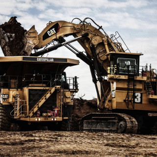
So the theme of the bots are creation, construction, earth, rock, stone, and powerful. Instantly my mind thinks of that well known warm yellow construction company and heavy plant vehicles. Yellow and black are just synonymous with that type of machine.
Yellow and black also being hazardous, as seen on insects and other reptiles/animals.
It would mean that I have to once again tackle yellow paint, joy, but at least this time it should look worn and weathered as opposed to shiny and new.
Research
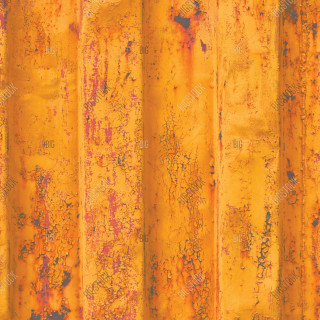
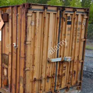
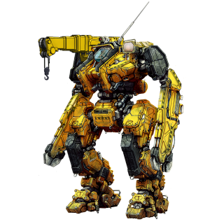
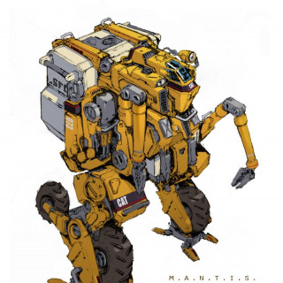
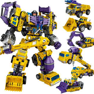
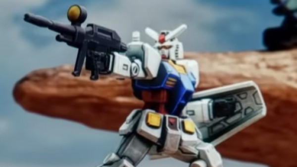
It didn’t take me long to then plan out a colour scheme using these colours that I could use through the bots. I also couldn’t ignore some some classic civilian mecha tropes that use these schemes, as well as a certain toy line.
The following images are reference only, and are not my own, just results from Google to help visualise the scheme in my head .
Test piece
Unfortunately one of the pieces I received for Destroyer got banged up in transit, but with impeccable customer service a replacement part was shipped to me, meaning I had a spare bit that I could use to practice my scheme on.
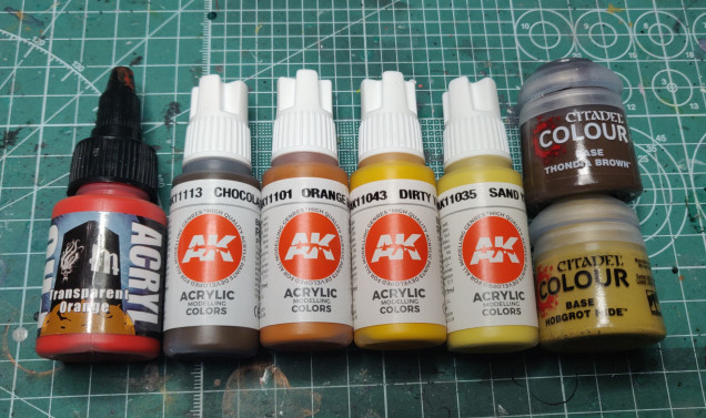
Looking through my paint collection, I pulled the following which I hoped would give me decent coverage (as yellow is notoriously bad for it), create depth and warmth, and also work well as glazes. At this point I’m not worried about a matte or satin finish, its only a test piece and final pieces will be matte varnished at the end.
Chosen paints:
Monument Pro Acryl:
- Transparent Orange
AK Interactive 3rd Gen:
- AK11113 Chocolate
- AK11101 Orange Brown
- AK11043 Dirty Yellow
- AK11035 Sand Yellow
Games Workshop Citadel Colour:
- Thondia Brown
- Hobgrot Hide
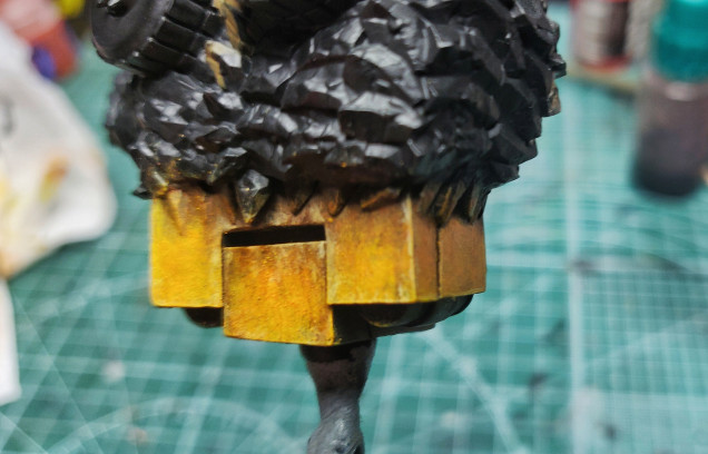
Working over a Badger Stynelrez Black primer, I used the Citadel Thondia Brown as a basecoat for all parts I wanted to be yellow. Over this I stippled AK Orange Brown roughly so that there wasn’t an even coating and it started to build texture. Next was a stipple of AK dirty yellow and citadel Hobgrot Hide.
It wasn’t a formulaic process by any means, I went back and forth through the colours to create saturation and randomisation.
I then applied a very very thin glaze of the Transparent Orange from edge to recess. I also went back in with AK chocolate brown to add shadow and streaks.
The edges were picked out in sandy yellow again for a lighter highlight. And a small glaze work in a little from the edge back to the edge to create a lighter gradient.
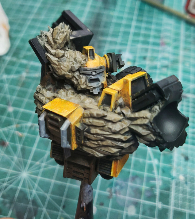
After this I blocked in some basic rock colours (which is the same as my other projects and will be the same as the bases these will stand on) and some black & grey elements to see how they look next to the yellow.
Overall I’m happy with the test.
I think it works, and is something I can paint that won’t get boring. By making it look dirty and weathered I can get away without having to focus on a clean flat yellow. No doubt this scheme will evolve, but I’ve got a starting point and that’s the main thing for now!








































Leave a Reply