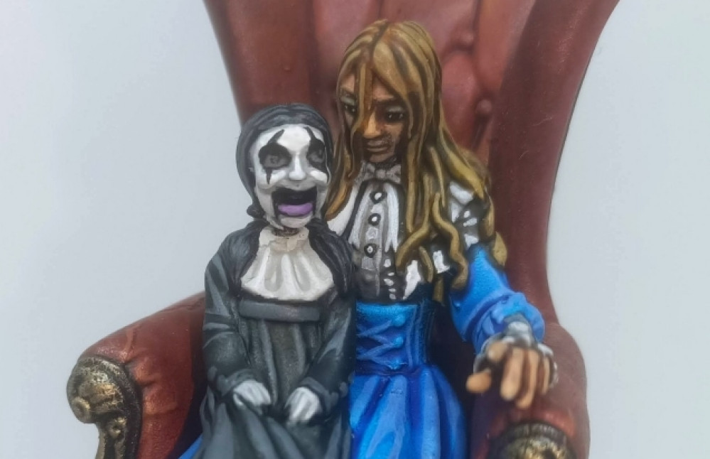
Little Alice
Slap on some paint
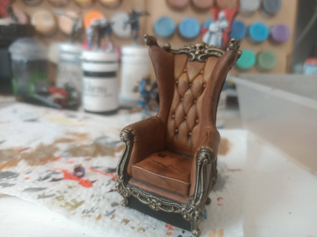
Painting the armchair was great fun. It was also pretty simple too; the legs and arm embellishments were painted black, then heavily drybrushed with (retributor) gold. The leather was just flooded with snakebite leather contrast paint, then each of the edges where the leather pushed in towards the buttons was edge highlighted with a pale brown.
Where I’d rushed and whacked on the white zenith a little too heavily along one arm (and the seat) then failed to let it fully dry before flooding with contrast paint, the underlying white primer cracked. I decided I liked the effect and – in Bob Ross style – set about celebrating, instead of trying to hide one of those happy little accidents. The edges of the cracks were highlighted, the same as the folds around the bottons, to give an aged, worn, leather look.
I repeated the highlight effect anywhere on the model where the leather appeared to crease or fold (around the fronts of the arms, for example).
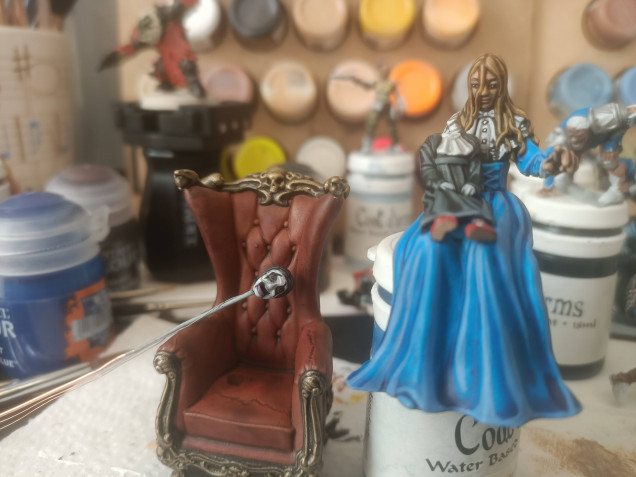 (at this point, I felt that the brown leather and muted tones of the doll were just a bit "boring" so slapped on a wash of red ink, to make the chair look more like an old Chesterfield and increase the contrast between the chair and the blue dress, thanks to a maroon-tint to the "leather")
Contrast paints are like a revelation for me. They speed up my painting (marginally) but more importantly than that, they make painting fun again. As you layer the stuff on, good and thick, you can see all the shadows and details on the miniature being picked out.
I help this effect by priming my models black, then applying a white zenith highlight (using Halfords car paint primer if you’re interested). It makes the darkest recesses of the shadows all the darker, while helping to push the raised edges to a brighter colour.
Even though the effect is quite eye catching, I always prefer to add some layering on the highest points, of a colour “two shades up” from the base contrast colour (one shade up and the effect is too subtle).
This creates a very stylised “cartoony” look. It’s one I spent a long time fighting, but have since learned to embrace my painting style – no creamy smooth blends here; stark contrast changes and a cell-shaded cartoon-look will do me just fine!

















![TerrainFest 2024! Build Terrain With OnTableTop & Win A £300 Prize [Extended!]](https://images.beastsofwar.com/2024/10/TerrainFEST-2024-Social-Media-Post-Square-225-127.jpg)








Leave a Reply