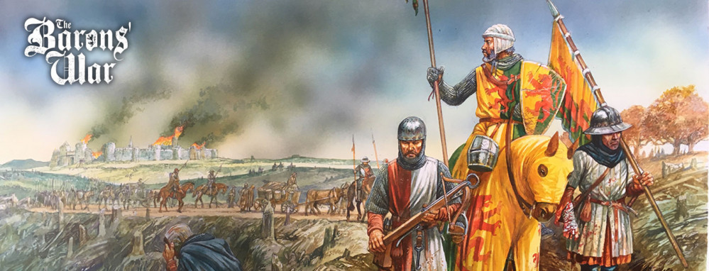
PanzerKaput Goes To Barons' War
Heraldry and Shields Designs
Tincture is the limited palette of colours and patterns used in heraldry. The need to define, depict, and correctly blazon the various tinctures is one of the most important aspects of heraldic art and design.
Development and history
The use of tinctures dates back to the formative period of European heraldry in the twelfth and thirteenth centuries. The range of tinctures and the manner of depicting and describing them has evolved over time, as new variations and practices have developed.
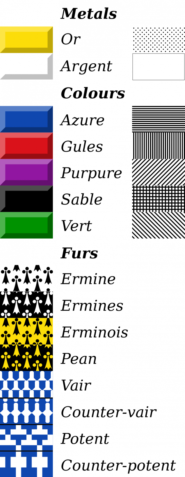
The basic scheme and rules of applying the heraldic tinctures dates back to the 12th century. The earliest surviving coloured heraldic illustrations, from the mid-thirteenth century, show the standardized usage of two metals, five colours, and two furs. Since that time, the great majority of heraldic art has employed these nine tinctures.
Over time, variations on these basic tinctures were developed, particularly with respect to the furs. Authorities differ as to whether these variations should be considered separate tinctures, or merely varieties of existing ones. Two additional colours appeared, and were generally accepted by heraldic writers, although they remained scarce, and were eventually termed stains, from the belief that they were used to signify some dishonour on the part of the bearer. The practice of depicting certain charges as they appear in nature, termed proper, was established in the seventeenth century. Other colours have appeared occasionally since the eighteenth century, especially in continental heraldry, but their use is infrequent, and they have never been regarded as particularly heraldic, or numbered among the tinctures that form the basis of heraldic design.
Frequency and national variants
The frequency with which different tinctures have been used over time has been much observed, but little studied. There are some general trends of note, both with respect to the passage of time, and noted preferences from one region to another.
In medieval heraldry, gules was by far the most common tincture, followed by the metals argent and or, at least one of which necessarily appeared on the majority of arms. Among the colours, sable was the second most common, followed by azure. Vert, although present from the formative period of heraldic design, was relatively scarce. Over time, the popularity of azure increased above that of sable, while gules, still the most common, became less dominant. A survey of French arms granted during the seventeenth century reveals a distinct split between the trends for the arms granted to nobles and commoners. Among nobles, gules remained the most common tincture, closely followed by or, then by argent and azure at nearly equal levels; sable was a very distant fifth choice, while vert remained scarce. Among commoners, azure was easily the most common tincture, followed by or, and only then by gules, argent, and sable, which was used more by commoners than among the nobility; vert, however, was even scarcer in common arms. Purpure is so scarce in French heraldry that some authorities do not regard it as a “real heraldic tincture”.
On the whole, French heraldry is known for its use of azure and or, while English heraldry is characterized by heavy use of gules and argent, and unlike French heraldry, it has always made regular use of vert, and occasional, if not extensive, use of purpure. German heraldry is known for its extensive use of or and sable. German and Nordic heraldry rarely make use of purpure or ermine, except in mantling, pavilions, and the lining of crowns and caps. In fact, furs occur infrequently in German and Nordic heraldry.
Metals
The metals are or and argent, representing gold and silver respectively, although in practice they are often depicted as yellow and white.
Or (Ger. Gelb, Gold, or golden) derives its name from the Latin aurum, “gold”. It may be depicted using either yellow or metallic gold, at the artist’s discretion; “yellow” has no separate existence in heraldry, and is never used to represent any tincture other than or.
Argent (Ger. Weiß, Weiss, Silber, or silbern) is similarly derived from the Latin argentum, “silver”. Although sometimes depicted as metallic silver or faint grey, it is more often represented by white, in part because of the tendency for silver paint to oxidize and darken over time, and in part because of the pleasing effect of white against a contrasting colour. Notwithstanding the widespread use of white for argent, some heraldic authorities have suggested the existence of white as a distinct heraldic colour.
Colours
Five colours have been recognized since the earliest days of heraldry. These are: gules, or red; sable, or black; azure, or blue; vert, or green; and purpure, or purple.
Gules (Fr. gueules, Ger. Rot) is of uncertain derivation; outside of the heraldic context, the modern French word refers to the mouth of an animal.
Sable (Ger. Schwarz) is named for a type of marten, known for its dark, luxuriant fur.
Azure (Fr. azur or bleu, Ger. Blau) comes through the Arabic lāzaward, from the Persian lāžavard both referring to the blue mineral lapis lazuli, used to produce blue pigments.
Vert (Fr. vert or sinople, Ger. Grün) is from Latin viridis, “green”. The alternative name in French, sinople, is derived from the ancient city of Sinope in Asia Minor, which was famous for its pigments.
Purpure (Fr. purpure or pourpre, Ger. Purpur) is from Latin purpura, in turn from Greek porphyra, the dye known as Tyrian purple. This expensive dye, known from antiquity, produced a much redder purple than the modern heraldic colour; and in fact earlier depictions of purpure are far redder than recent ones. As a heraldic colour, purpure may have originated as a variation of gules.
Stains
Two more tinctures were eventually acknowledged by most heraldic authorities: sanguine or murrey, a dark red or mulberry colour; and tenné, an orange or dark yellow to brownish colour. These were termed “stains” by some of the more influential heraldic writers, and supposed to represent some sort of dishonour on the part of the bearer; but in fact there is no evidence that they were ever so employed, and they probably originated as mere variations of existing colours. Nevertheless, the belief that they represented stains upon the honour of an armiger served to prevent them receiving widespread use, and it is only in recent times that they have begun to appear on a regular basis.
Sanguine or Murrey, from Latin sanguineus, “blood red”, and Greek morum, “mulberry”, one of the two so-called “stains” in British armory, is a dark red or mulberry colour, between gules and purpure in hue. It probably originated as a mere variation of one of those two colours, and may in fact represent the original hue of purpure, which is now treated as a much bluer colour than when it first appeared in heraldry. Although long shunned in the belief that it represented some dishonour on the part of the bearer, it has found some use in the twentieth and twenty-first centuries.
Tenné or tenny, from Latin tannare, “to tan”, is the second of the so-called “stains”. It is most often depicted as orange, but sometimes as tawny yellow or brown. In earlier times it was occasionally used in continental heraldry, but in England largely confined to livery.
Furs
The use of heraldic furs alongside the metals and colours dates to the beginning of the art. In this earliest period, there were only two furs, ermine and vair. Ermine represents the fur of the stoat, a type of weasel, in its white winter coat, when it is called an ermine. Vair represents the winter coat of the red squirrel, which is blue-grey above and white below. These furs were commonly used to line the cloaks and robes of the nobility. Both ermine and vair give the appearance of being a combination of metal and colour, but in heraldic convention they are considered a separate class of tincture that is neither metal nor colour. Over time, several variations of ermine and vair have appeared, together with three additional furs typically encountered in continental heraldry, known as plumeté, papelonné, and kürsch, the origins of which are more mysterious, but which probably began as variations of vair.
Ermine
Ermine (Fr. hermine, Ger. hermelin) is normally depicted as a white field powdered with black spots, known as “ermine spots”, representing the ermine’s black tail. The use of white instead of silver is normal, even when silver is available, since this is how the fur naturally appears; but occasionally silver is used to depict ermine. There is considerable variation in the shape of ermine spots; in the oldest depictions, they were drawn realistically, as long, tapering points; in modern times they are typically drawn as arrowheads, usually topped by three small dots.
Vair
Vair (Ger. Feh) derives its name from Latin varius, “variegated”. It is usually depicted as a series of alternating shapes, conventionally known as panes or “vair bells”, of argent and azure, arranged in horizontal rows, so that the panes of one tincture form the upper part of the row, while those of the opposite tincture are on the bottom. Succeeding rows are staggered, so that the bases of the panes making up each row are opposite those of the other tincture in the rows above and below. As with ermine, the argent panes may be depicted as either white or silver; silver is used more often with vair than with ermine, but the natural fur is white.
When the pattern of vair is used with other colours, the field is termed vairé or vairy of the tinctures used. Normally vairé consists of one metal and one colour, although ermine or one of its variants is sometimes used, with an ermine spot appearing in each pane of that tincture. Vairé of four colours (Ger. Buntfeh, “gay-coloured” or “checked vair”) is also known, usually consisting of two metals and two colours.
Several variant shapes exist, of which the most common is known as potent (Ger. Sturzkrückenfeh, “upside-down crutch vair”). In this form, the familiar “vair bell” is replaced by a T-shaped figure, known as a “potent” due to its resemblance to a crutch. Other furs sometimes encountered in continental heraldry, which are thought to be derived from vair, include plumeté or plumetty and papelonné or papellony. In plumeté, the panes are depicted as feathers; in papelonné they are depicted as scales, resembling those of a butterfly’s wings (whence the name is derived). These can be modified with the color, arrangement, and size variants of vair, though those variants are much less common. In German heraldry there is also a fur known as Kürsch, or “vair bellies”, consisting of panes depicted hairy and brown. Here the phrase “vair bellies” may be a misnomer, as the belly of the red squirrel is always white, although its summer coat is indeed reddish brown.
-
Kürsch
Other tinctures
Several other tinctures are occasionally encountered, usually in continental heraldry:
- Cendrée, or “ash-colour”;
- Brunâtre (Ger. Braun), or brown, occasionally used in German heraldry, in place of purpure;
- Bleu-céleste or bleu de ciel, a sky blue colour intended to be lighter than azure;
- Amaranth or columbine, a strong violet-red, found in at least one grant of arms to a Bohemian knight in 1701;
- Eisen-farbe, or iron-colour, found in German heraldry; and
- Carnation, often used in French heraldry as the colour of flesh.
The heraldic scholar A. C. Fox-Davies proposed that, in some circumstances, white should be considered a heraldic colour, distinct from argent. In a number of instances, a label or collar blazoned as “white” rather than “argent” appears on a supporter blazoned argent or or. The use of “white” in place of “argent” would be consistent with the practice of heraldic blazon that discourages repeating the name of a tincture in describing a coat of arms, but if it were merely intended as a synonym of “argent”, this placement would clearly violate the rule against placing metal on metal or colour on colour (see below). This difficulty is avoided if “white” is considered a colour in this particular instance, rather than a synonym of “argent”. This interpretation has neither been accepted nor refuted by any heraldic authority, but a counter-argument is that the labels are not intended to represent a heraldic tincture, but are in fact white labels proper.
Proper
A charge that is coloured as it naturally appears is blazoned proper (Fr. propre), or “the colour of nature”. Strictly speaking, proper is not a tincture in itself, and if, as is sometimes the case, a charge is meant to be depicted in particular colours that are not apparent from the word “proper” alone, they may be specified in whatever detail is necessary. Certain charges are considered “proper” when portrayed with particular colours, even though a range of different colours is found in nature; for instance, a popinjay proper is green, even though wild parrots occur in a variety of colours. In some cases, a charge depicted in a particular set of colours may be referred to as “proper”, even though it consists entirely of heraldic tinctures; a rose proper, whether red or white, is barbed vert and seeded or.
Blazon
In heraldry and heraldic vexillology, a blazon is a formal description of a coat of arms, flag or similar emblem, from which the reader can reconstruct the appropriate image. The verb to blazon means to create such a description. The visual depiction of a coat of arms or flag has traditionally had considerable latitude in design, but a verbal blazon specifies the essentially distinctive elements. A coat of arms or flag is therefore primarily defined not by a picture but rather by the wording of its blazon (though in modern usage flags are often additionally and more precisely defined using geometrical specifications). Blazon is also the specialized language in which a blazon is written, and, as a verb, the act of writing such a description. Blazonry is the art, craft or practice of creating a blazon. The language employed in blazonry has its own vocabulary, grammar and syntax, which becomes essential for comprehension when blazoning a complex coat of arms.
Other armorial objects and devices – such as badges, banners, and seals – may also be described in blazon.
The noun and verb blazon (referring to a verbal description) are not to be confused with the noun emblazonment, or the verb to emblazon, both of which relate to the graphic representation of a coat of arms or heraldic device.
Blazon is generally designed to eliminate ambiguity of interpretation, to be as concise as possible, and to avoid repetition and extraneous punctuation. English antiquarian Charles Boutell stated in 1864:
Heraldic language is most concise, and it is always minutely exact, definite, and explicit; all unnecessary words are omitted, and all repetitions are carefully avoided; and, at the same time, every detail is specified with absolute precision. The nomenclature is equally significant, and its aim is to combine definitive exactness with a brevity that is indeed laconic.
However, John Brooke-Little, Norroy and Ulster King of Arms, wrote in 1985: “Although there are certain conventions as to how arms shall be blazoned … many of the supposedly hard and fast rules laid down in heraldic manuals [including those by heralds] are often ignored.”
A given coat of arms may be drawn in many different ways, all considered equivalent and faithful to the blazon, just as the letter “A” may be printed in many different fonts while still being the same letter. For example, the shape of the escutcheon is almost always immaterial, with very limited exceptions.
The main conventions of blazon are as follows:
- Every blazon of a coat of arms begins by describing the field (background), with the first letter capitalised, followed by a comma “,”. In a majority of cases this is a single tincture; e.g. Azure (blue).
- If the field is complex, the variation is described, followed by the tinctures used; e.g. Chequy gules and argent (checkered red and white).
- If the shield is divided, the division is described, followed by the tinctures of the subfields, beginning with the dexter side (shield bearer’s right, but viewer’s left) of the chief (upper) edge; e.g. Party per pale argent and vert (dexter half silver, sinister half green), or Quarterly argent and gules (clockwise from viewer’s top left, i.e. dexter chief: white, red, white, red). In the case of a divided shield, it is common for the word “party” or “parted” to be omitted (e.g., Per pale argent and vert, a tree eradicated counterchanged).
- Some authorities prefer to capitalise the names of tinctures and charges, but this convention is far from universal. Where tinctures are not capitalised, an exception may be made for the metal Or, in order to avoid confusion with the English word “or”. Where space is at a premium, tincture names may be abbreviated: e.g., ar. for argent, gu. for gules, az. for azure, sa. for sable, and purp. for purpure.
- Following the description of the field, the principal ordinary or ordinaries and charge(s) are named, with their tincture(s); e.g., a bend or.
- The principal ordinary or charge is followed by any other charges placed on or around it. If a charge is a bird or a beast, its attitude is defined, followed by the creature’s tincture, followed by anything that may be differently coloured; e.g. An eagle displayed gules armed and wings charged with trefoils or (see the coat of arms of Brandenburg below).
- Counterchanged means that a charge which straddles a line of division is given the same tinctures as the divided field, but reversed (see the arms of Behnsdorf below).
- A quartered (composite) shield is blazoned one quarter (panel) at a time, proceeding by rows from chief (top) to base, and within each row from dexter (the right side of the bearer holding the shield) to sinister; in other words, from the viewer’s left to right.
- Following the description of the shield, any additional components of the achievement – such as crown/coronet, helmet, torse, mantling, crest, motto, supporters and compartment – are described in turn, using the same terminology and syntax.
- A convention often followed historically was to name a tincture explicitly only once within a given blazon. If the same tincture was found in different places within the arms, this was addressed either by ordering all elements of like tincture together prior to the tincture name (e.g., Argent, two chevrons and a canton gules); or by naming the tincture only at its first occurrence, and referring to it at subsequent occurrences obliquely, for example by use of the phrase “of the field” (e.g., Argent, two chevrons and on a canton gules a lion passant of the field); or by reference to its numerical place in the sequence of named tinctures (e.g., Argent, two chevrons and on a canton gules a lion passant of the first: in both these examples, the lion is argent). However, these conventions are now avoided by the College of Arms in London, and by most other formal granting bodies, as they may introduce ambiguity to complex blazons.
- It is common to print all heraldic blazons in italic. Heraldry has its own vocabulary, word-order and punctuation, and presenting it in italics indicates to the reader the use of a quasi-foreign language.
-
Quarterly 1st and 4th Sable a lion rampant on a canton Argent a cross Gules; 2nd and 3rd quarterly Argent and Gules in the 2nd and 3rd quarters a fret Or overall on a bend Sable three escallops of the first and as an augmentation in chief an inescutcheon, Argent a cross Gules and thereon an inescutcheon Azure, three fleurs-de-lis Or. Arms of Churchill.





























Leave a Reply