Raiding the Dusty Wastes
See his name and know your better
I’ve been holding off this entry away from the project until it was ready. I’ve wanted to make this a bespoke fighting force. That may seem crazy as I’m literally using mass produced plastic figures and numerous other elements that could be slapped together and reproduced. Well, what can’t be redone as an original idea, is creating banners and demarcation for my warlord with his name done in calligraphy.
I have thought about the best way to multipurpose this force, should I decide to play plain old Saga, and translated the name of my guy into Arabic from English to place it on command banners akin to what medieval Arab forces might’ve used.
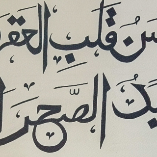
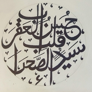
Using Google Translate I threw in Hasn Heart of the Scorpion, Master of the Desert and got a quick result. I am an amateur linguist, having done translation/transcription professionally in the past but no longer, and I know these things can be tricky but I trust it from my limited knowledge. From there I went to Fiverr in search of a calligrapher to write out what I wanted. This wasn’t too hard as I wasn’t looking for awesome results as I knew there would be some forgiveness found in how damn small the details would be. On the contrary, knowing that there is a lot of detail that can be put into work, I had all the diacritics put into the writing. The fancy whoop-dee-doos all over the place in fancy written Arabic denote vowels and other inflections beyind the consonants of every character. Making this a formal banner I decided that would be the route to take.
I was inspired to take such measures by the owner of Little Big Men Studio from all the written pieces on flags. Its an effort he’s done to bring us all great products that we might take for granted which I can say is a pain considering graphic design. These days he’s been overworked and, after reaching out and not hearing back from his workload, I decided to plan out my standards.
The two lines of “Hasn Heart of the Scorpion” ( حسن قلب العقرب )and “Master of the Desert” (سيد الصحراء) I had written separately and then combined in a circular manner. With each section I figured I could work with bits and pieces like lance pennants and other large flags that go flapping in the wind. Overall the presentation of the name with some wiggle room as to how it gets shown off is less stressful by avoiding the absolute need for the one piece to be perfect.
I’ve also taken inspiration from Lloyd in his presentation to Gerry on banners using Photopea but I have neither the confidence nor patience to play with the tool at present. I need to figure a means of getting the transfers printed once I get the rest of the design work settled. That really should have been something planned out ahead of time but like the rest of this project its a haphazard and blissfully organic development.















![TerrainFest 2024 Begins! Build Terrain With OnTableTop & Win A £300 Prize! [Extended!]](https://images.beastsofwar.com/2024/10/TerrainFEST-2024-Social-Media-Post-Square-225-127.jpg)









Leave a Reply