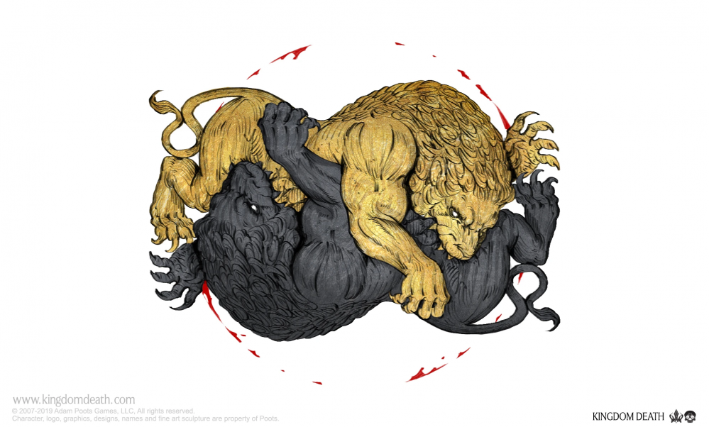
Breathing Life into Kingdom Death
Into the darkness
Hello all
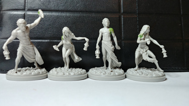
So I’ve had my Kingdom Death set sitting around since the kickstarter and finally got a game in with it earlier this year. The game was a lot of fun even if all our poor survivors were eventually wiped out. In retrospect I think a big part of their dying was due to the embarrassment of being used as bare plastic (what self respecting mini wants that?). So now it’s time to remedy that.
The KD models really are pieces of art in themselves with personality and story just about oozing out of them. One of the key elements to the narrative and the models is the lanterns they use to navigate the land of darkness they’ve found themselves in. My intent is to stretch out from my usual painting method and go for a more stylized effect centered around the lanterns, the little light they provide and the oppressive darkness that surrounds our intrepid survivors.
First some model prep though. For as great as these minis are they often have some…interesting…join points. Some are tucked away quite well but others can be odd shapes or gaps that stand out pretty predominantly.
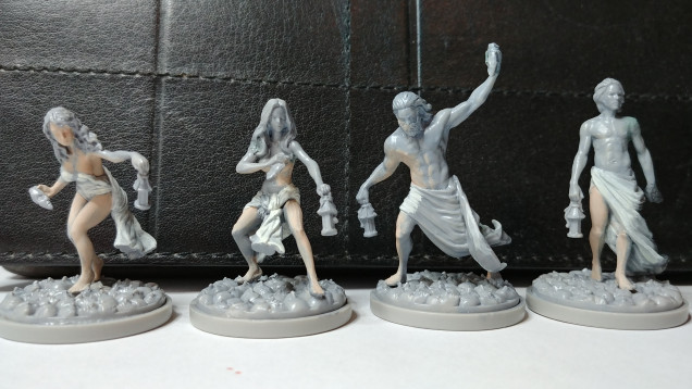 After priming I blocked out the areas the lantern light would hit with Fair Shadow - 09046 and Linen White - 09061
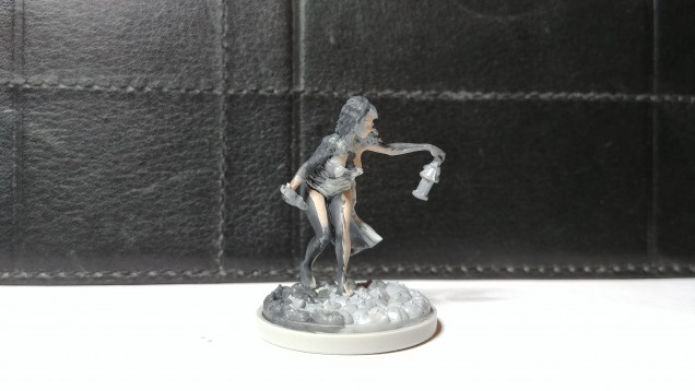
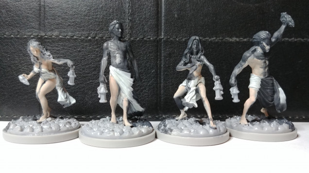 Here I've covered the unlit portions with Faded Black - 09657. As you can see many of the models don't have a lot of direct light.
Based on the lack of light on three of the minis I’m going to have to rethink how I lay these out a bit. My original plan was a hard contrast between lit and not lit but I may need to soften that a bit to include a partially lit area. What I might do is reserve color for the fully lit areas, grey for the partially lit and black for the rest. I’ll try working that up a bit and update.





















It’s a great game to get into if you can find the time. The models are fun to paint too.
For your next campaign I recommend taking any upgrades that grant more endeavours and using them to breed like rabbits. Your population are essentially the HP of your settlement and you can expect a lot of them to die.
Agreed, population is key. We had a pretty good main group going but had selected the innovation that made for stronger young but less likelihood of having them (basically For Sparta!). That crippled our ability to get more survivors and once our main group eventually cracked that was the beginning of the end.
Had a fun time and some lessons learned for next time 🙂
I love the approach you’ve chosen to do with these, it’s an unusual scheme from what I’ve often seen on Kingdom Death, I don’t know if this will help but here is someone approaching comic book shadows that has that harsh black, https://www.youtube.com/watch?v=3OeEbv_Ramk&ab_channel=EpicDuckStudios
Looking forward to your next update.