Romano-British for Dux Britanniarum
Numeri Group Three - clothing decorations
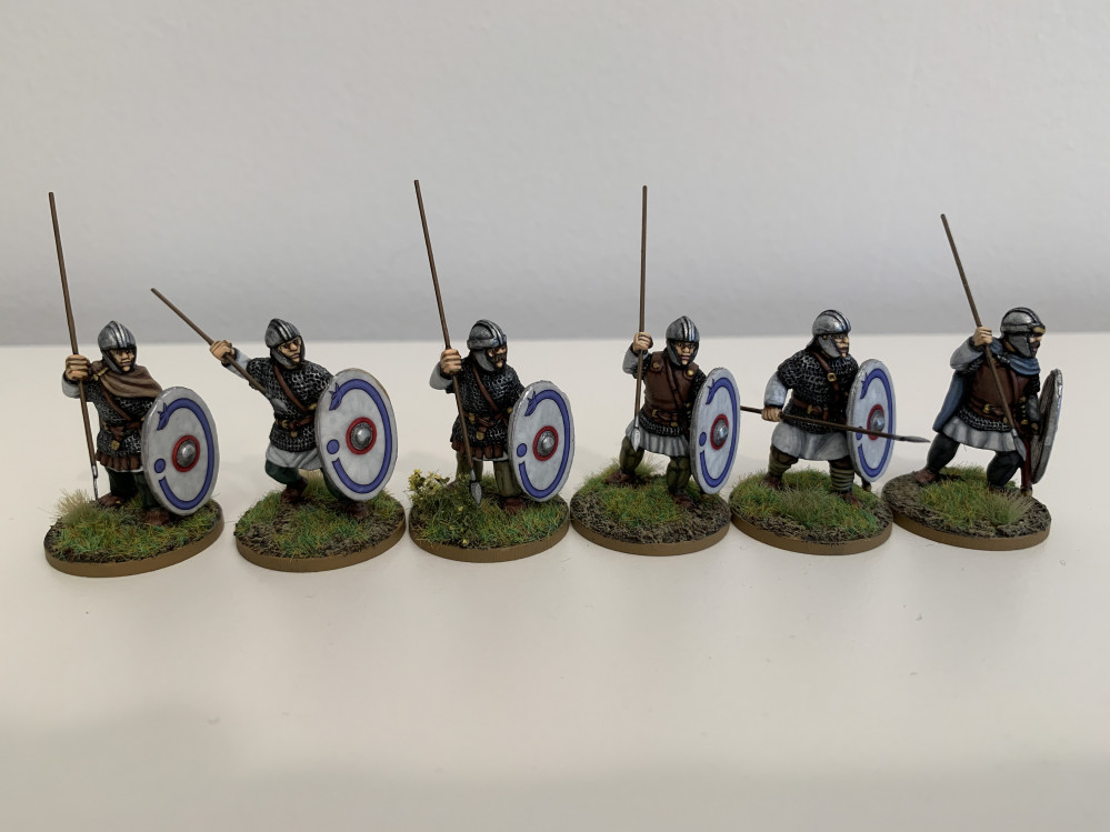
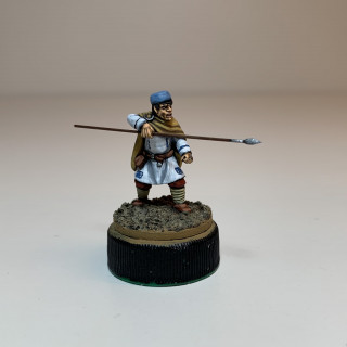
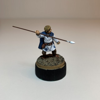
The third Group of Numeri is close to completion, just awaiting its shields. I mentioned in an earlier post that I wanted to try out some decorative elements on the clothing for these miniatures, to make it look like thy might be more well-to-do townsfolk or traders. A lot of the sources I’ve looked at depict embroidered rondels on the lower halves of tunics, combined with coloured strips running across the shoulders and down the front and back, so I thought I would give that a go. They are easier to see before the shields are attached, hence discussing them before they are finished.
The first mini has light blue decorations against a white background. They tend to fade away on him, probably because the blue isn’t strong enough to compete against the yellow ochre cloak and the light blue Pannonian cap.
Interestingly, the same colour seems to stand out more when applied to his companion in a blue cloak, possible because they complement each other.
With both these figures I built up the colour in three layers, which in hindsight was completely unnecessary and didn’t improve the effect. As you’ll see later in this post, I think I got a better effect by applying a colour straight over a black outline.
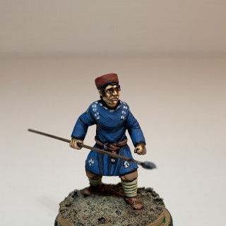
At first, I wasn’t sure about the figure in blue with white decorations. I originally thought I would do the decorations in Grey and leave it, but the effect was too subtle. The addition of White with a tiny hint of Grey brought it out a bit more.
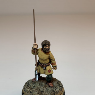
The figure in the Yellow Ochre tunic is quite pleasing, but I think the decorations would look better with a more obvious black undercoat to define them.
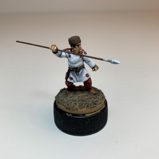
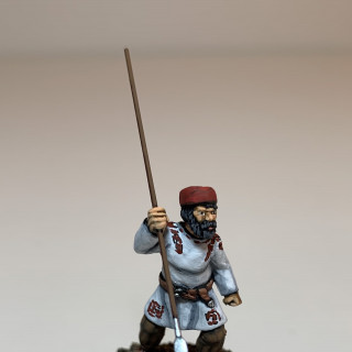
The final two figures are, I think, the most successful. I think it’s no coincidence that aside from the White tunic, the only other colours on these models are browns or reds, which either complement the decorations or at least do not actively compete with them for the eye’s attention.
In terms of technique, in the case of every figure, I outlined the pattern in Black very crudely. However, for these last two figures I only added either one or two layers of colour over the top, taking care not to completely obscure the black. This gives an impression of depth to the pattern.
I’m being hyper critical in this post and the reality is that I’m very happy with how they’ve turned out and will happily be fielding them as they are. However, one of the great benefits of the OTT project system is that you can record your thoughts immediately and revisit them to remind yourself of what worked well and what not so well.























Leave a Reply