Crazyredcoat's Crazy Compendium of Collected Creativity
Contrast as a tool.
GW’s Contrast range has been around for quite some time now and it is something of a shift in painting. Regardless of people idolising or lambasting it, I find it very useful in my painting for a variety of reasons and thought I’d make a post about how I use it while going through the painting of skin on a Sister of Slaughter from GW’s new Underworlds team.
I find the first thing that is important it understanding the paint itself. It can be used for all sorts of things, but it is definitely a type of paint I recommend experimenting with and trying out before you decide how you want to use it for painting. One of the best videos I have seen, recently, is actually this one by Duncan Rhodes:
It’s a good introduction and, in my opinion, more useful than the official GW videos as they tend to just go over what paints they use more than how they are used. As you can see from many projects on the site, Contrast, when used properly, really can speed up army painting and for many that is all they are looking for; fast ways to get armies down for playing. Perfectly reasonable way of doing things. GW seemed to focus on this element of the paints, but as Duncan shows in his video there’s more to it than that.
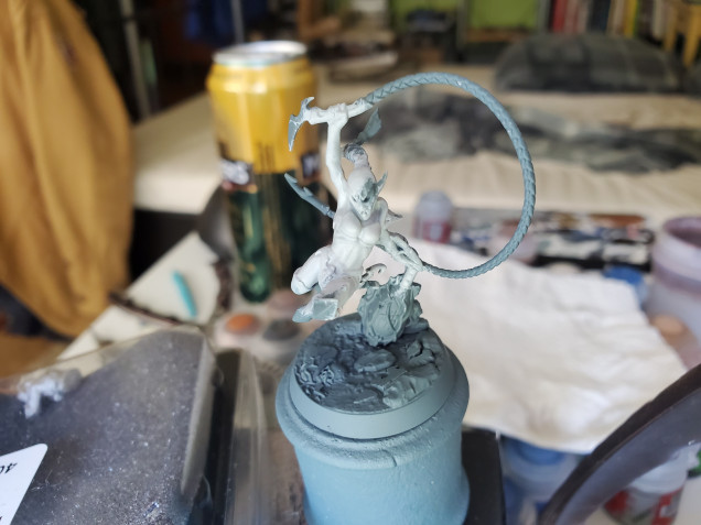 Contrast can be used over any colour, and I like to experiemtn from time to time with what I can achieve, but for the 'standard' use you want nice solid, bright basecoats. I've used Grey Seer here, but Wraithbone works just as well.
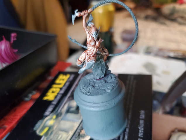
I tend to use Contrast for skin for a variety of reasons. Primarily because it works quite well, and turns out nicely and, in the case of fighters, the little bit of ‘ruggedness’ that can come from it can work quite well to show people stuck in a warzone. If you look at my earlier posts, you will notice that the Contrast alone is what I used for my Umbers, but for Cersei and more courtly people I go for a little bit more. But before we get to that, let’s look at just the Contrast. (For anyone wondering, I used Darkoath Flesh here as it is the ‘brightest’ colour they have in the range…I think.)
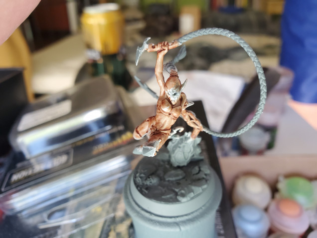 This is with a single coat, but any patches I missed I just went back over that area once it was dry and it looks fine. This is a perfectly reasonable look for the tabletop and really did take no time at all to do. I even find that the Contrast dries quite quickly, too.
The angles on the pictures aren’t the best; I took them from a bad angle, to be honest… One of the really great things about this, though, is just how much of a base it creates to work up from. In this way, you could get a whole army done quickly for that tournament you want to attend, but there is more you can add afterwards, and fairly easily. This is basically what I do with certain minis, particularly with skin tones. You really can add just a little touch of brightness to a character’s face, or a flowing cloak, or anything else you may have painted with the Contrast. Particularly with newer painters, you can get really nice bases down easily and quickly and then take your time working and practicing on details.
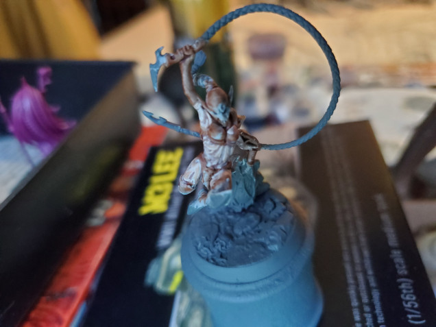
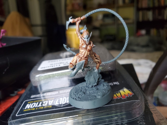 Simply adding in a 'frist' highlight with Kislev Flash already helps build on the definition created by the Contrast.
With just one more step you’ve improved the look. You could try doing this on a whole bunch of minis, get used to the motions and steadiness and in no time at all your highlighting skills are much improved. Remember that no one is a master painter when they take up a brush for the first time and with Contrast being so quick and simple, it’s really not too time consuming to patch up any mistakes here and there. Once you get the hang of it, you could always go the the next stage and try some more focused highlights.
This takes a little more practice, again, to get used to. Just remember, though, that I have (a) been painting miniatures for close to 14 years, and (b) still make mistakes all the time. In fact, I found here that my highlights seemed to ‘jump’ to quickly for my liking, so in order to help blend that in, I used a different technique of glazing the skin. While there are lots of glazes out there, I actually chose to make a glaze from my Pallid Wych Flesh so as to make sure that I was not going any brighter than my highest highlight. To make a glaze is quite simple; Put a bit of your chosen colour on a palette and then add three or four brushfulls of the medium of which ever brand you are using (Lahmian Medium for the GW paints, for example). The important thing here is that having the paint too thin is better than too thick. Once you’ve done this, just cover the whole area with a thin coat of the glaze and leave to dry. It gently blends the colours together and slightly shifts all of the colours to the colour of the glaze that was used.
You may also notice that the one arm was never highlighted and that was because it’s actually a glove and I didn’t notice, but it does show the difference quite nicely. So remember that Contrast is a useful tool, but just how useful and where it sits in your repetoire is really down to personal taste. Experiment a bit with it, see where you like it and where you don’t and, most importantly, remember that;




















































Leave a Reply