
Infinity
Photographic woes
I thought I put this to bed ages ago. As you will have seen for a long time, I have been trying to take Photo’s with a black background. This is a pain as I cannot take pictures at home during the day, I paint mostly during the night, taking photo’s eats into painting time. I don’t have a dark room in which to do this and do not have black out blinds.
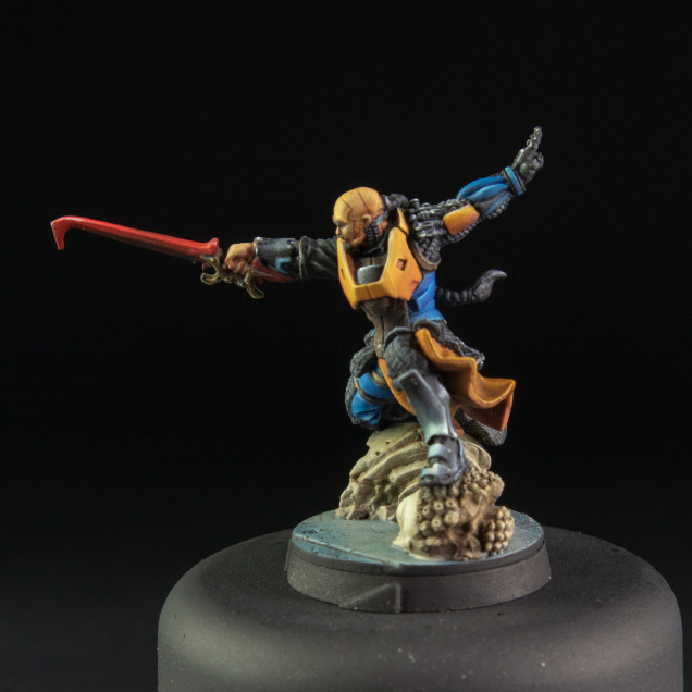
I got a fair comment on social media which was that my pictures were under exposed. After reviewing the said pictures, some of them are under exposed in relation to the model. this was caused by my hunt to get a black background. I started taking photo’s for the background and not the model. Funny because that should never be the aim of taking a photo.
I had no plans to paint models for a few days so I decided to take a deeper look into this and reflect about the photo’s of my models.
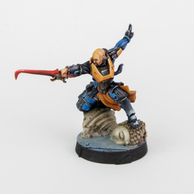
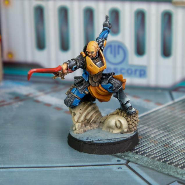
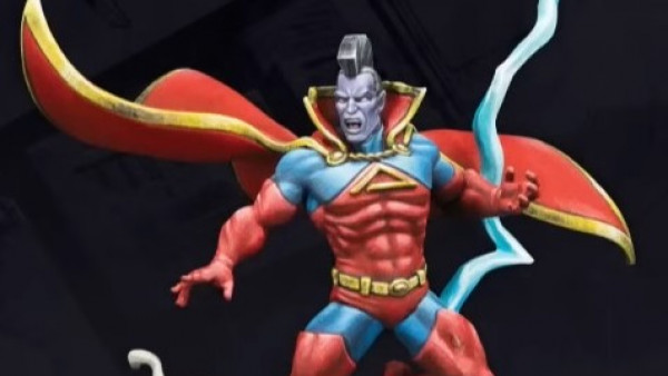
I took 3 photos with 3 backgrounds of one model. One white, one black and one in situ I tried to compare them to what I though. I correctly exposed them for the model and not the background. I also then asked for feedback to see what one people preferred and why.
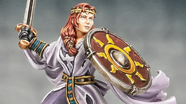
The feedback I got was slightly mixed but almost everyone disliked the white background. Someone suggested more depth of field and they preferred the in situ, which I agree with to a point. I done this and kind of like the result. The good news is I can take this kind of Photo at any time of the day. The other feedback I received was the background helps drive the narrative of the model. While I agree with this, I can’t agree on this model as it came with a Buddha base. I can only imagine a comic book entrance of a champion falling from the sky on a Buddha only to have it smash when it lands and the hero ends up on top of the Buddha drop canister, now broken.
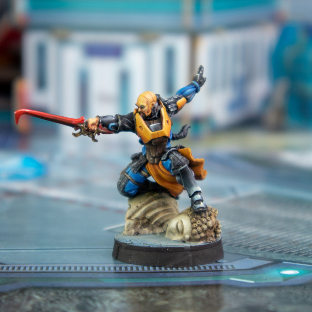
I took another photo taking this feedback into consideration
The downside of more depth of field is it’s harder to get the full model in focus, especially when you have dynamic models like this. It’s not a deal breaker though.
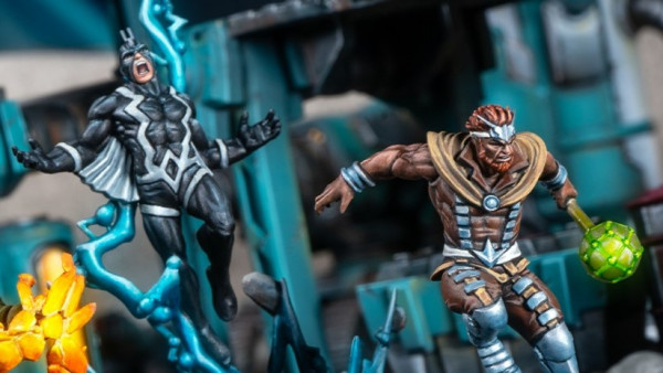
I found myself wondering. What is the point of taking the pictures of the models? This was not a woe moment but one of self-reflection. I paint because I enjoy it and want to get better. The Photo’s I take are to record it so I can look back and remember what was done and how far I have come since taking the photo. But that is not all. I also want the photos to drag me back in time, not only to the painting but to the playing. As I do not often photograph tables with my models on it, I miss this though I am usually too busy playing. I guess the models should be photographed around the things I would see on the table as this does invoke more of that feeling for me. The photo with scenery around it worked for me but I still want the focus to be on the model.
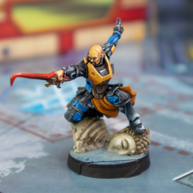
After some self reflection on this image. I liked it but the background clashed a little. One more picture, this time actually choosing the colour in the background instead of “that will do”
I think this will be the style of image I will be taking moving forward. This means I may need to make a couple of things to help this along, which is another project (just an extension of this one).
As far as all of this goes, I do think this is 100% personal taste I don’t think anyone should dictate to you how to photograph your models if your happy with them. As hopefully you have seen above I was not very happy with the results I got after looking at them with a more critical eye. I think I just needed to reassess why I am taking the pictures. I also think I need to reduce the number of pictures. One back and front should do at the most flattering angle.
More to come but with hopefully, pictures I am happier with. If you want to leave your opinion, please feel free I am still open to suggestion. This for me is very subjective apart from the under exposed models and some of my dodgy focusing at 2am.




















![TerrainFest 2024! Build Terrain With OnTableTop & Win A £300 Prize [Extended!]](https://images.beastsofwar.com/2024/10/TerrainFEST-2024-Social-Media-Post-Square-225-127.jpg)






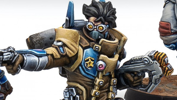
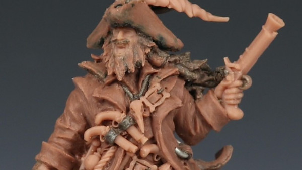



And here I was just thinking you’d jack up the “exposure” option on your iPhone after you take the pic the way I lazily do. I admire your commitment. I actually think all three are an improvement and let me see and appreciate your painting more fully. I also concur that your final concept image is brilliant. (I will say I have gone off black for my pics and settled on gray. It’s not nearly as good as your thematic staging but I think it’s much better than black, particularly if a mini is largely black). Yet again, keep up… Read more »
If you are going to make a change why not make it as positive a change as you can. Still don’t think this is the way I will be taking pictures in 5 years but it’s time for an update. Pictures are very much an afterthought for me as they are for so many people, but this I could have done with less of the amount of effort it takes to do the black out (if I have the backdrop). I really need to nail the focus and the exposure, with this background it should be easier to get the… Read more »
I like the black most – it gives the “sharpest” impression. In the in situ images I don’t like shiny mat, in my case it drags away focus from the mini (more than actual colourful background). I’m shit in photography so can’t offer much feedback, but my particular camera uses greys to set the white balance, that’s why I photograph my minis against grey sandpaper (it is very mat) and only in daylight. Do you use any post processing on the photos? As for purpose of miniature photos I’m with you, I always take four “technical” shots and occasional “in… Read more »
I do have a good camera and can take reasonable non miniature related photo’s. My setup also includes 2x 135W energy saving bulbs. My wife and some others just clubbed in for a new lens for my birthday. Only taken one test shot with it on a model and it looks good. As for post processing, I do use Lightroom to import the raw files into I tend to fix any exposure levels and crop and use it to export to Jpg. I have tried one unpublished photo of me doing everything possible to make the “best image” I could… Read more »