Crazyredcoat's Crazy Compendium of Collected Creativity
They've gone to plaid!
Hopefully most of you get that reference. If not, watch Spaceballs. Herein lies the tale of the tartan. So if you look back to the research post, there were several examples of the tartan used by the Sutherlands and it actually looks more green than blue, so I naturally started with a blue basecoat. There is a very good reason the this; painting a grid is a lot easier than painting a square. That may sound strange, but it is true. So let’s get started with the blue!
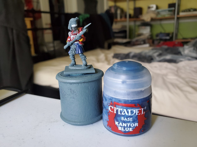 A nice solid basecoat of Kantor Blue is the starting point. Make sure it is nice and solid and be careful of any jacket tails or bits and bobs that you already painted. This is actually why I left the backpack and many of the accoutrements until after the kilt.
And at this scale you can’t see anything else so we’re done here with the kilt!
Okay, so that’s bollocks. Next we’re going to add the green. Basically, we’re going to be drawing a grid. You can do this in one go, but here I chose to do the up and down stripes first to set the distances before adding in the lateral ones. We’re I being smart, I would have actually have let the paint stay a little transparent to have a nice easy buildup of colour where the lateral and vertical bands meet. I was not smart. Loren Green was the colour I chose here, but something with a touch more yellow in it may have been a closer match.
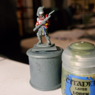
Now we need the detail work, and this is the tricky part. It takes a steady hand…something mine quite often isn’t. First thing to do is to outline the squares with the grey that is shown in the previous visual references. If I’m honest, I was not totally happy with the contrast here and it may be difficult to see in this light. I’m hoping it looks better in the morning with natural light. I followed the same policy of vertical lines first, but this time we only wanted to outline, but a fairly thick one. Hopefully you guys can see it in this image…
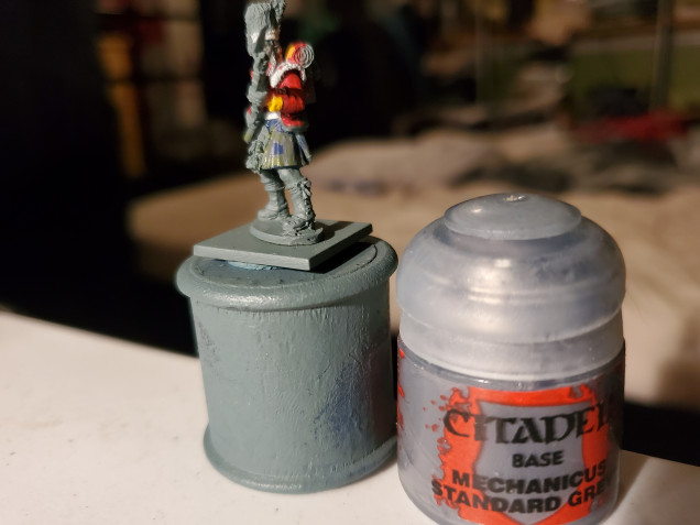 Not the contrast I was hoping for, but if I had gone for that touch more yellow in the green it may have showed more. Adeptus Mechanicus Grey here.
Then the final fine black lines. I actually did alright with these. Again going one way than the other worked very well here.
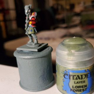
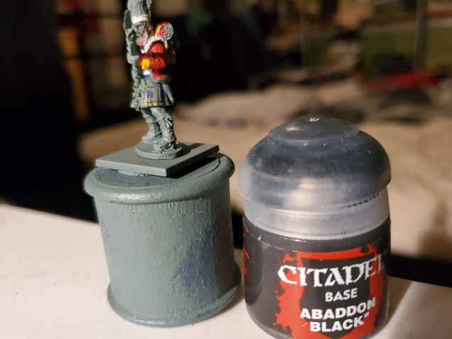
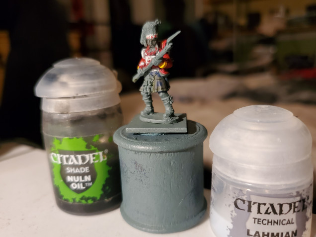
Next was time for some shade paints…but a from-the-pot nuln oil would have overpowered the pattern, I thought, so I made a 2:1 mix of Lahmian Medium to Nuln Oil. It’s subtle, but added enough that I chose not to attempt highlights. My hands are just not that stable most days. Forgive me.
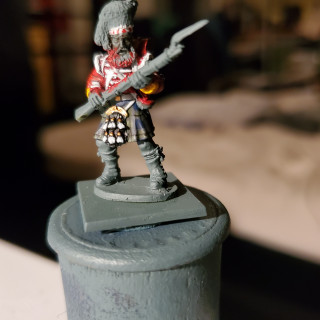
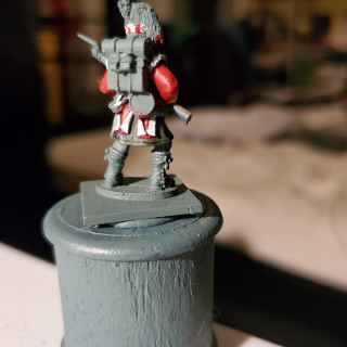
All that was left was the sporran, which was mainly Black Templar Contrast with gold and white details picked out. I’m rather happy with the final product and I think I can now safely move on to the accoutrements with all the other parts out of the way.





































Leave a Reply