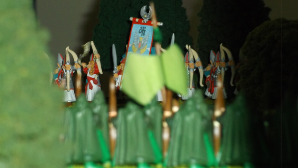
The Great Grey Massacre.
Playing with the Rainbow and Settling on a Colour Scheme.
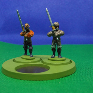
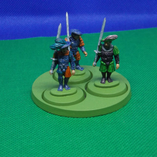
This stage was all about experimenting with all the different colours in the Contrast range. With that in mind I set about five Landsknechts by Warlord Games from a free sprue on Wargames Illustrated (they should number six. Alas the only two left on the rack with zweihander were damaged). These were all based on Citadel 25mm bases.
The varied, bright and oft garish schemes of these seemed perfect to play around with all the different colours without being tied to a specific scheme for an entire unit.
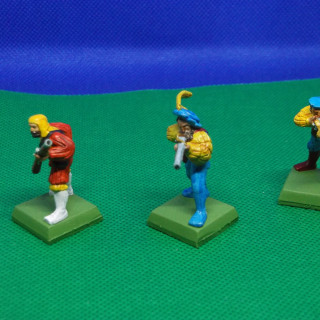
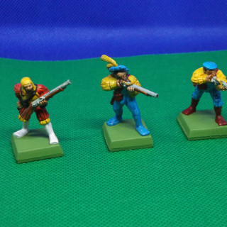
In similar vain (well identical vain given the historical period they were inspired by) are three Empire Hand gunners from the Warhammer Fantasy 6th Edition Box Set. With these I wanted to play around with the brighter colours. I particularly wanted to see just how bright Talassar Blue actually is and to investigate my concerns over the muted tones Blood Angels Red and Iyanden Yellow came out on some of the previous models and my colour charts/testers I made.
The First one in Red and Yellow was basecoated Wraithbone. I tried the Apothecary White Contrast on the boots/lower legs of on this one. The effect was okay but not what I wanted being in every case I have used it a light grey rather than white. Albeit I am yet to use it over a White basecoat. I had however seen several Youtubers such as Miniwargamer Jay drybrush white over the top. This is the first time I have used that teach on a miniature.
The others were basecoated Wraithbone and Greyseer respectively so that I could get a side by side comparison of the differing effects.
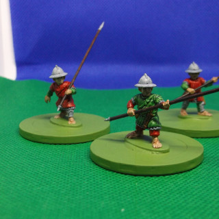
In addition there were five Halfling Infantry from Wargames Atlantic. My free gift from the Great Wargames Survey. I really like these and they accompany nicely the Zombie Halflings. These are based on Poker chips.
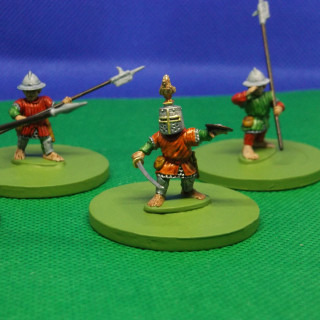
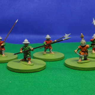
Having a bit more experience of the available colours in the range. I wanted to trial the scheme I intend to use for half of the Test of Honour Boxed set. Red is definitely going to be the armour colour I just was not sure whether to use black for the other areas or green.
Behold the Knights of the Golden Coq! The Knights Errant are all painted in Contrast paints. The Knights Marshal metal parts were painted Citadel Color Ironbreaker with a wash of Space Wolves Grey Contrast. The Gold on the Helmet trim is 90s Citadel Color Shining Gold. The Test of Honor Katana trim and the Golden Coq crest are Citadel Color Retributor Armour. The Katana was then given a crude highlight of Shining Gold and the crest was dry brushed with shining gold. This is only the second time I have used the dry brushing technique on a model. Having previously only used it on terrain projects I was pleased with the results.






































Leave a Reply