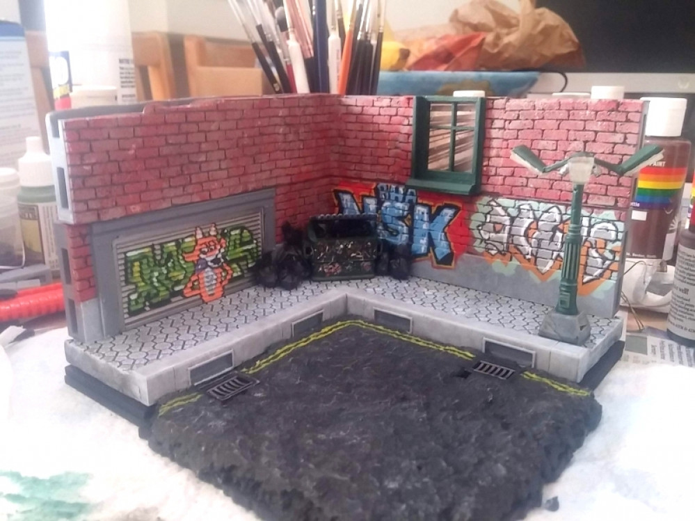
Titan Forge Cyberpunk March Diorama
Adding tiny details
In the last “diorama” I made for the Titan Forge competition in Feburary, I focussed very much on animatronics – making some bellows move and a couple of flickering LEDs look like a flame being fanned, and a tiny smoke machine blowing smoke out of the chimney….
Technically, is was quite impressive. But as a diorama it was a little… well, lacking, to be honest.
One of the things I’ve tried to focus on this time around is adding life to the model, by including little details that could otherwise be overlooked (I must admit to my wife being a massive influence and it’s she who pointed out this kind of stuff in the first place!)
For example, to me, a brick wall is a brick wall. You paint it red and maybe run a bit of colour inbetween the bricks to indicate motar. Easy peasy. And you’re done!
It was Nick that made me slow down, painting the brick wall in a series of layers – a grey base, with the brick surfaces lightly sponged with brown paint. Then a heavy “sponging” (that’s a word, right?) with a reddy-orange. Just when I thought it looked done, she insisted on a lighted coat of dabbed black and a final dusting, here and there, with cream.
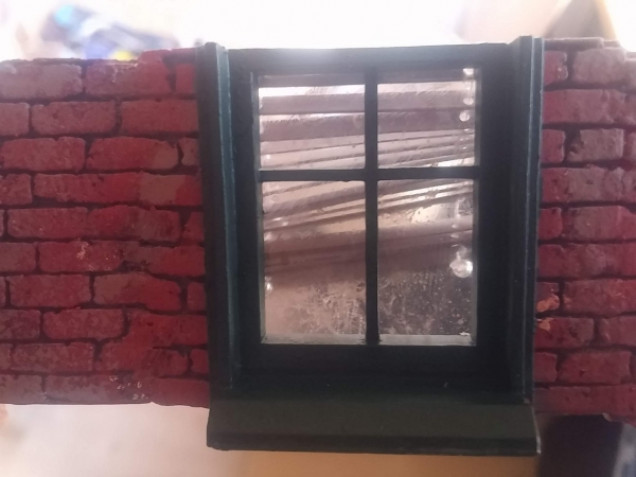
A brick wall isn’t necessarily just a brick wall, either: “Why not put a window in there? Just to break things up a little…”
So I printed a window frame. And painted it green. And added tiny details like edge highlighting; surely that was enough?
“Why not put some acetate on the back, so it looks like glass?”
So I did.
“Why not flick some ink at it, so simulate dirt and grime – this is an inner city diorama isn’t it? And that window is above head-height, so probably wouldn’t get cleaned all that often?”
So I did.
“Here, I built a little venetian blind you can hang in that window. It’s a bit run down and crooked, as I reckon the people who live there don’t take much care of the place anyway…”
I’ve been learning this week that it’s the tiny details that create the story in any model world. If it were left to me, I’d have a diorama set in an inner city, against some brick walls.
But, thanks to the influence of my wife, it’s set in a run-down part of town – the graffiti-strewn walls and piles of uncollected rubbish that litter the streets really set the model in an undesirable, slightly dodgy part of the city.
The grimy windows and broken blinds set it in an area where the neighbours have given up all pretence of aspiration – they are stuck in a run-down part of town and no longer care for the environment they are in. When characters are added to this diorama, these tiny little details all add – consiously or subconsciously – to their backstory, giving the scene extra depth and reason.
I feel like I’ve learned a lot this week!


























Kudos to the wife!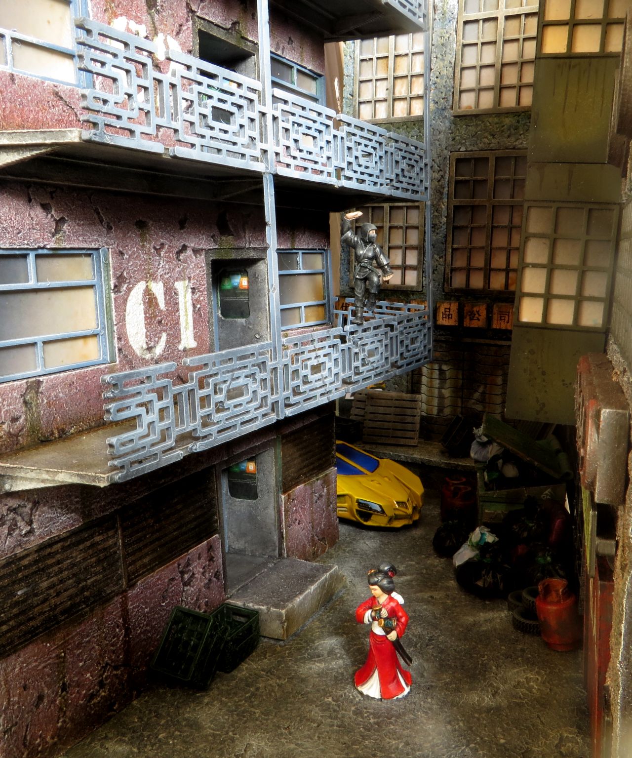 ).
).
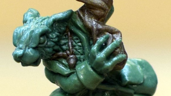
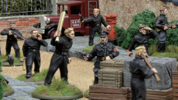
To make glass look even more dusted you may spray acetate with mat varnish (and even add a drop of some umber or green ink. Hope you won’t mind if I give my work as example:
That looks amazing. I’m still struggling to get the more “realistic” look on my minis. Same with my characters – they’re very “clean” and cartoon-like. It’s not actually a style I particularly like – it’s just what comes out of my paintbrush!