Learning Photoshop with Valour and Victory
Updated ZANU
With some Advice from Jim I made a few changes
Login or Create a FREE Account To Click This Button

With some Advice from Jim I made a few changes
Supported by (Turn Off)

3
Sqwürmish Brings Vast Grimm Sci-Fi Skirmishes To Kickstarter

2
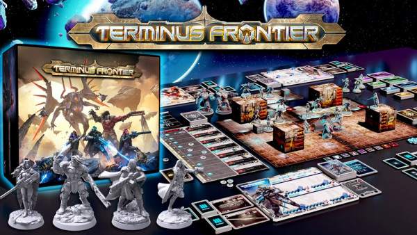
Dive Into New Sci-Fi Board Game Adventures With Terminus Frontier

3
Themeborne Tease Brand New Fantasy Project, Chronicle!

2
TTCombat’s Striketeam Commander Coming Soon To Kickstarter

5
Cado & Companions Get New Warhammer Age Of Sigmar Minis

7
Check Out New Warlock Showdown In New Warmachine Boxed Set

5
New Paul Hicks Late Romans Coming To Footsore’s Range

3
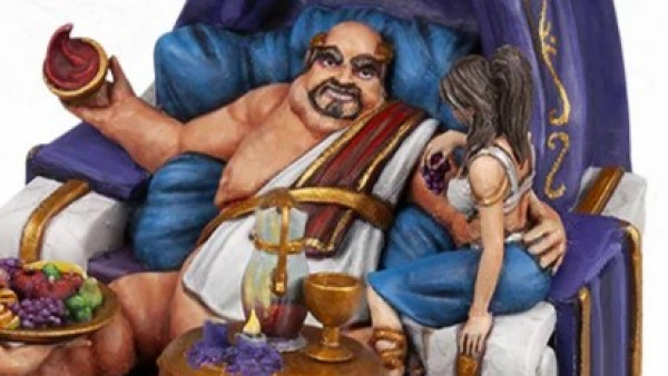
Revel In Excess With Carnevale’s New Pinnacle Of Affluence


1
Raise The Citizenry With North Star’s Muskets & Tomahawks Minis

4
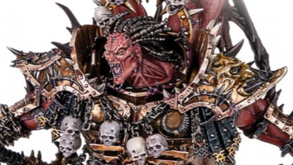
Angron Transfigured & Lotara Join Warhammer: The Horus Heresy

7
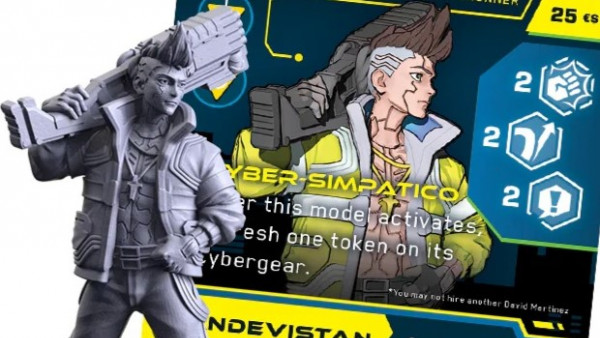
Bring Cyberpunk Edgerunners To Monster Fight Club’s Combat Zone

10
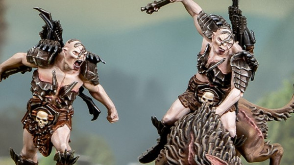
Let The New Bolg Hunt In Middle-earth Strategy Battle Game

2
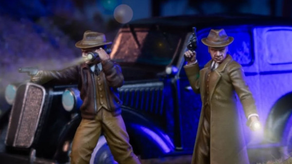
New Detectives & Police Solve Mysteries In Spectre Cosmic Horror!

0
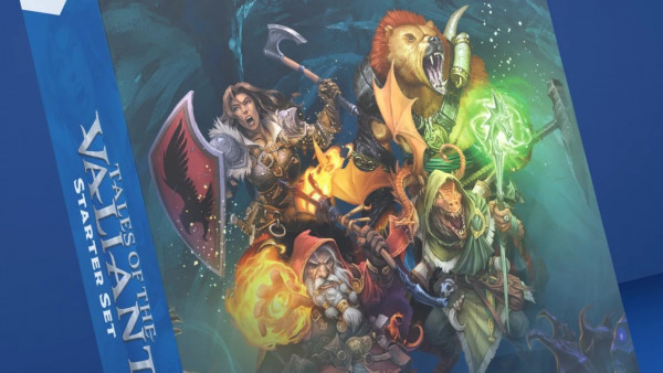
Pre-Order Steamforged’s New Tales Of The Valiant RPG Starter Set

6
Keep An Eye Out For Khurasan’s Leviathans Range Coming Soon

7
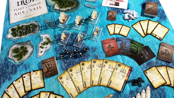
Grab Pre-Orders For Firelock’s Oak & Iron 2nd Edition Core Box

4
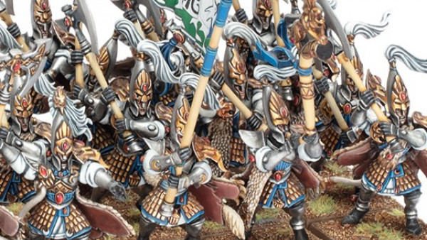
High Elves Make Their Mark On Warhammer: The Old World Soon

4
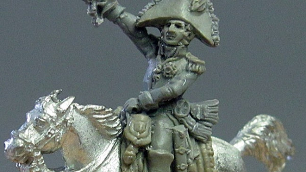
General Baqusitere Leads New AB Figures 18mm Scale Releases

1
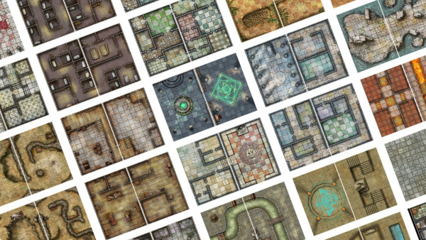
Battle In Cells, Shrines, Streets & Sewers With Loke BattleMats

5
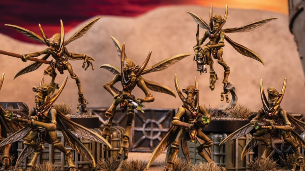
The Geonosians Buzz Into Star Wars: Legion With New Set

4
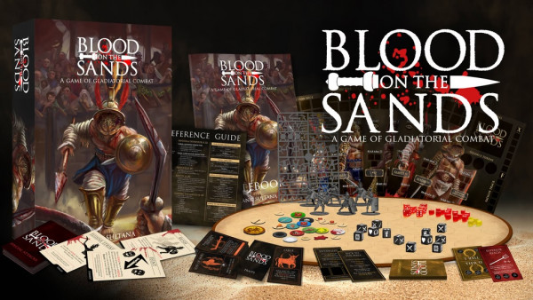
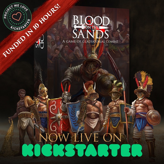
Gladiatorial Combat! Blood On The Sands Kickstarter Now Live

2
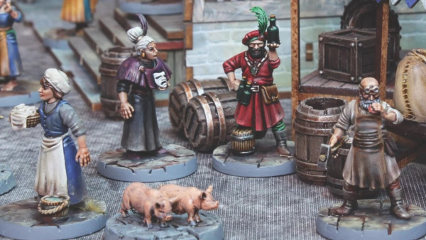
Get Your Fantasy Guards & Villagers From Wargames Atlantic

4
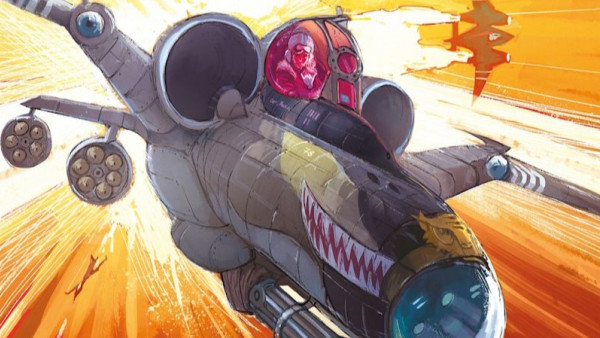
Osprey Games Unveil More Miniature Wargames For 2025

3
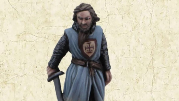
Fight For Jerusalem With Footsore’s New Medieval Characters

2
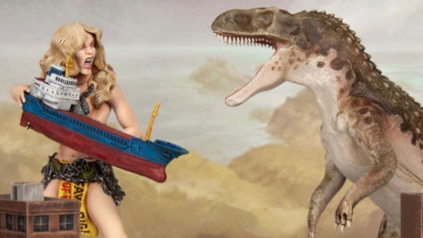
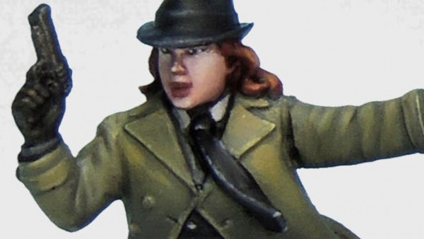
Government Agents & Strange Creatures For Crooked Dice’s 7TV

11
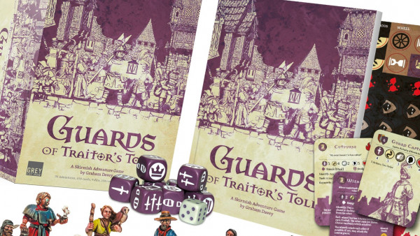
Guards Of Traitor’s Toll Starter Set & More Pre-Orders Now Live

1
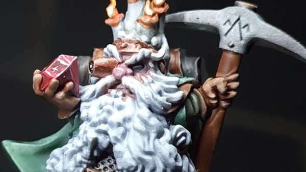
Delve Just Deep Enough With Warp Miniatures Dwarven Offering

4
Kromlech’s World War II Historical Range Returns To Webstore
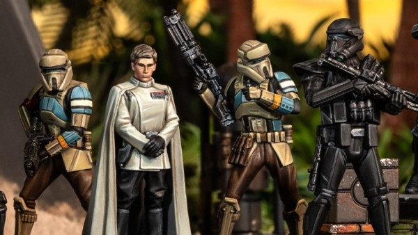

5
Go Rogue With More New Star Wars: Shatterpoint Squad Packs
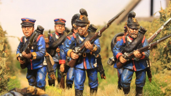

6
Pre-Order The Perry’s New 28mm Bavarian Infantry (1870-71)
News, Rumours & General Discussion
News, Rumours & General Discussion
News, Rumours & General Discussion
Painting in Tabletop Gaming
News, Rumours & General Discussion
News, Rumours & General Discussion
News, Rumours & General Discussion
News, Rumours & General Discussion
Painting in Tabletop Gaming
News, Rumours & General Discussion
Painting in Tabletop Gaming
News, Rumours & General Discussion
Painting in Tabletop Gaming
Historical Tabletop Game Discussions
3D Printing for Tabletop Gaming
Painting in Tabletop Gaming
News, Rumours & General Discussion
News, Rumours & General Discussion
Terrain & Scenery in Tabletop Gaming
News, Rumours & General Discussion
Copyright © 2025 Beasts of War Ltd.
All trademarks and images are copyright of their respective owners.


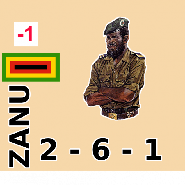
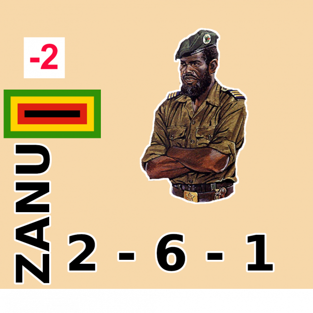
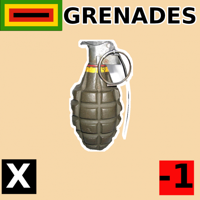
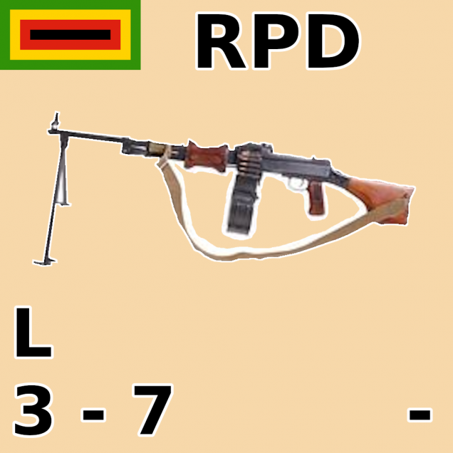
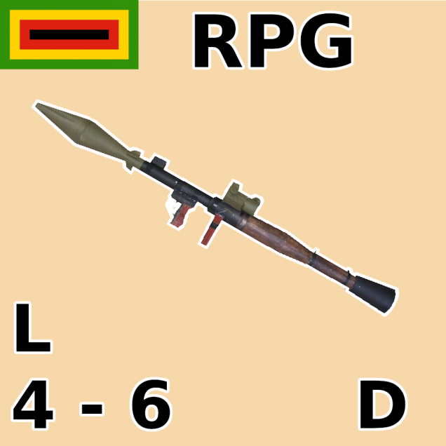
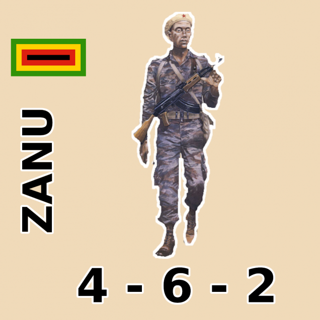
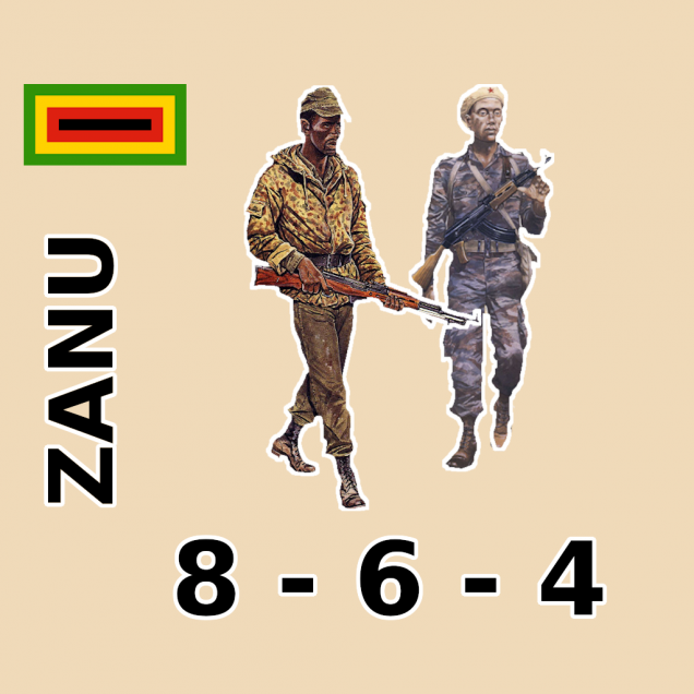
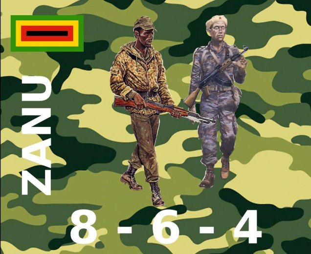
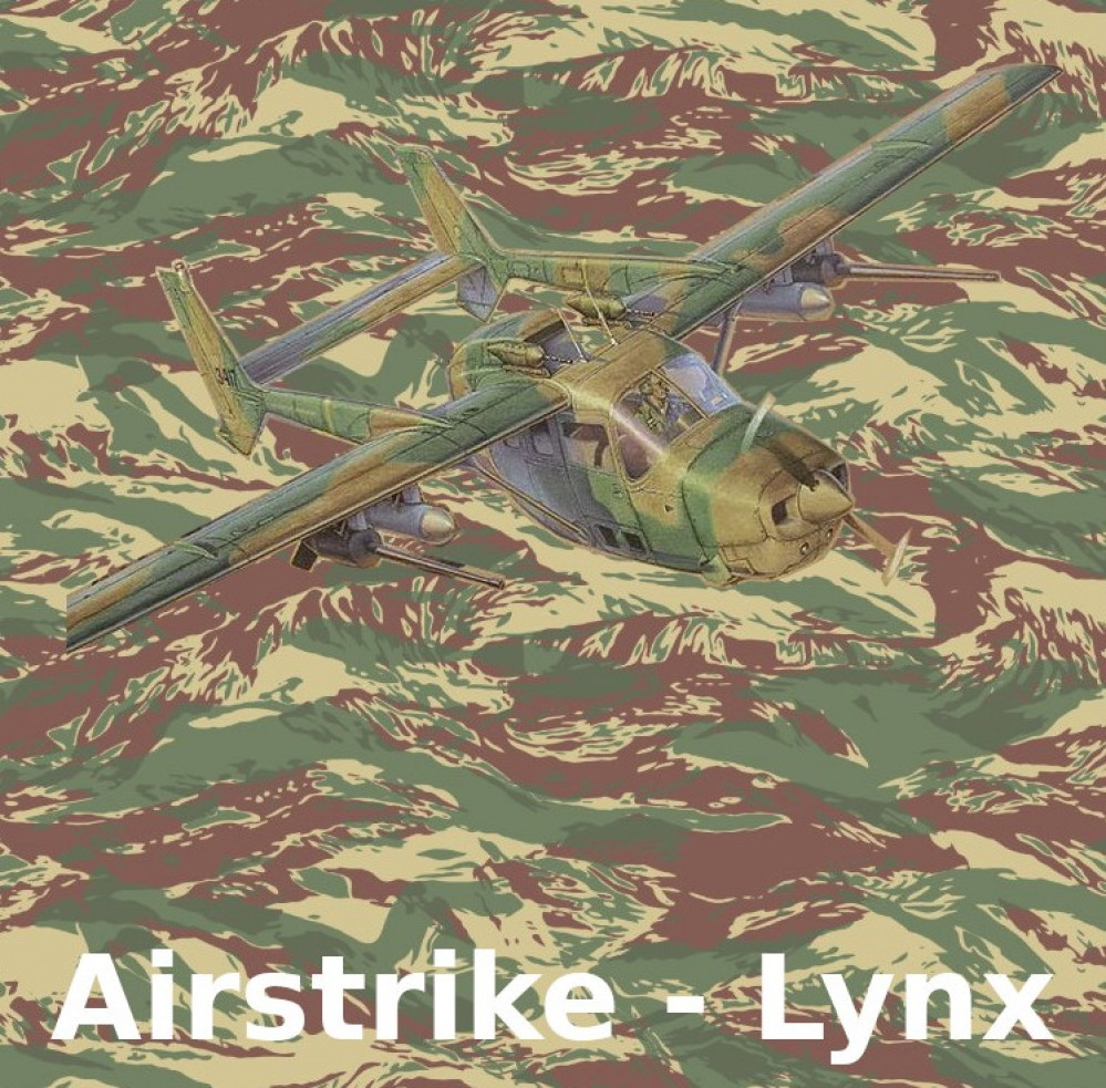
Looking better. The monotone background and the white outline definitely makes the token easier to read. If you like the camo background, maybe try making it semi transparent to mute the colours a bit?
To me the text on the infantry and officer tokens looks a bit ‘squashed up’ around the bottom left, maybe try moving the flag to the top right corner to give it a little more symmetry?