Spring Clean Double header
Adding the grimdark feel
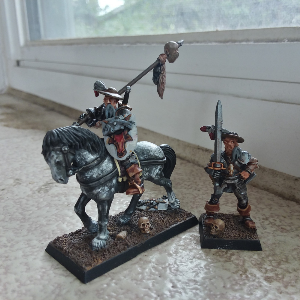
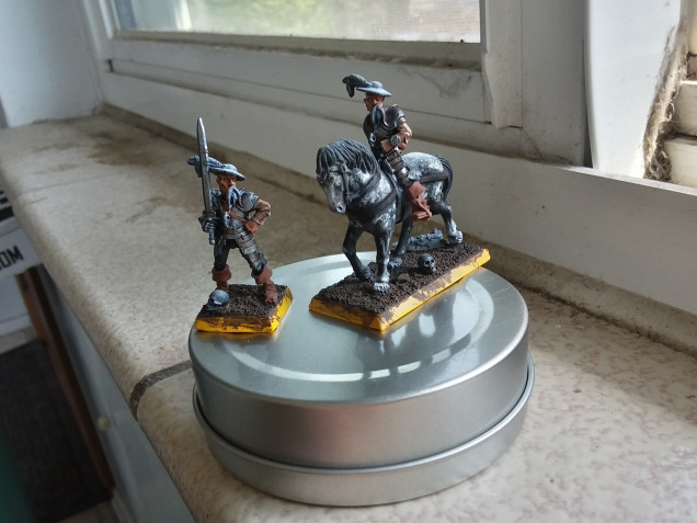
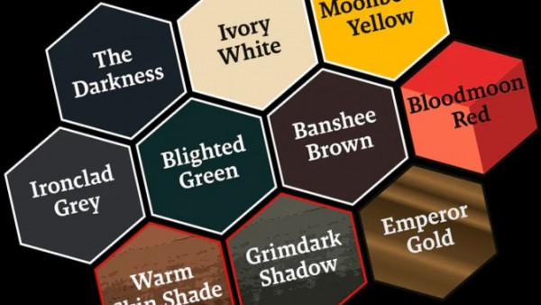
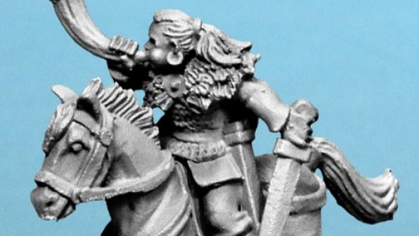
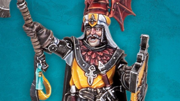
So it seemed to me that the images of the Wandering Knight that I saw were a bit too bright for my tastes. Thinking back to Mordheim and the gritty nature of the art within the box set book, also in the Town Crier issues, there was definitely some decisions needed as far as the color palette. I’m generally using Vallejo and Reaper paints with GW washes without much care to get wrapped up with specifics. I’m having too much fun with the organic approach.
After completing the horse’s skin I figured that sealing it with a gloss coat would be best to avoid messing with the dry pigment/light paint work. This also allowed me to worry less about the finished metallic paint for the armor and other bits minus pot helmet to be done later. This turned out to be a good idea to then cover the mane and tail with a wash of GW’s Nuln Oil and keep the underlying highlight. The horse would act as a muted bright feature to the general dark tones of the tack and gear of the knight. I really wanted to try and keep the brilliance of the metallics a bit lower as blazing silver or the like would overpower the rest of the chromatic paint. With that I tossed on a little bit of Reikland Fleshshade to add wear aside from hitting the visible skin.
In general the future aspects of the figures I anticipate to be bringing up the interest level are the weapons and shields that I need to affix to the figures, the painted highlights and the final basing details.





![TerrainFest 2024 Begins! Build Terrain With OnTableTop & Win A £300 Prize! [Extended!]](https://images.beastsofwar.com/2024/10/TerrainFEST-2024-Social-Media-Post-Square-225-127.jpg)










Leave a Reply