


Adventures in Burrows & Badgers


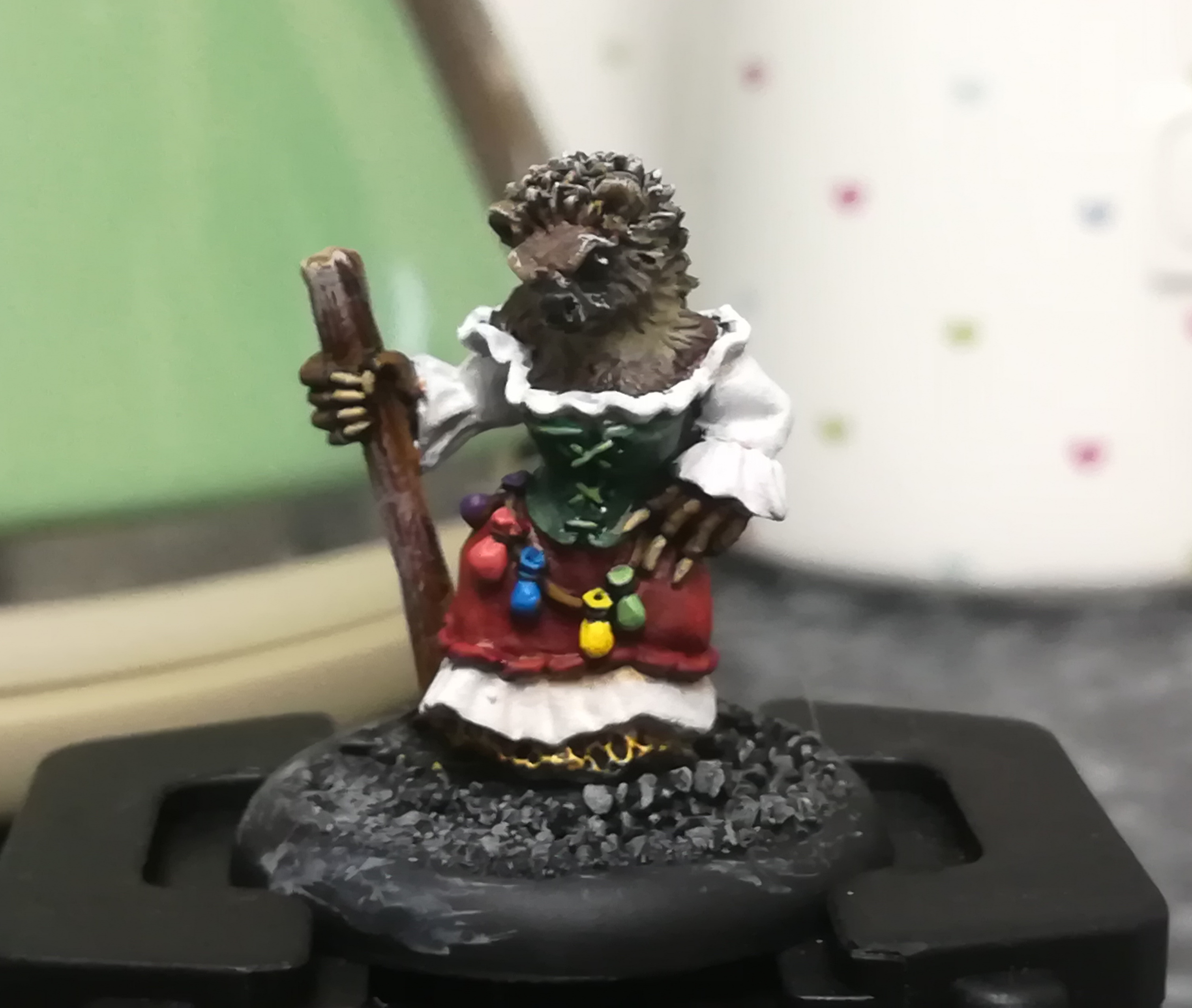
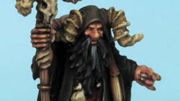
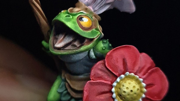
Auntie Claws
A step-by-step of dubious quality
Since this is the first mini I’ve painted since I started this project log I thought it was only fair to try and do a step-by-step on my process of painting up the hedgehog alchemist from Oathsworn.
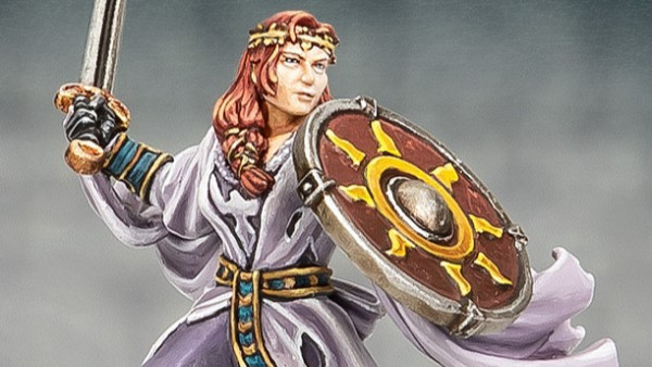
Named by Jeff on the Burrows and Badgers Facebook group (cheers!), Aunty Claws is a grumpy-looking hog with a big stick and a bigger dress on.
It’s a lovely sculpt. I did originally buy her as a replacement magic user but looking closer at the details on the model- a bit of chainmail poking out under the skirts, an angry expression and a sturdy-looking staff- has got me wondering whether she’d make quite a good hitter instead. My warband is certainly a bit light in the muscle department.
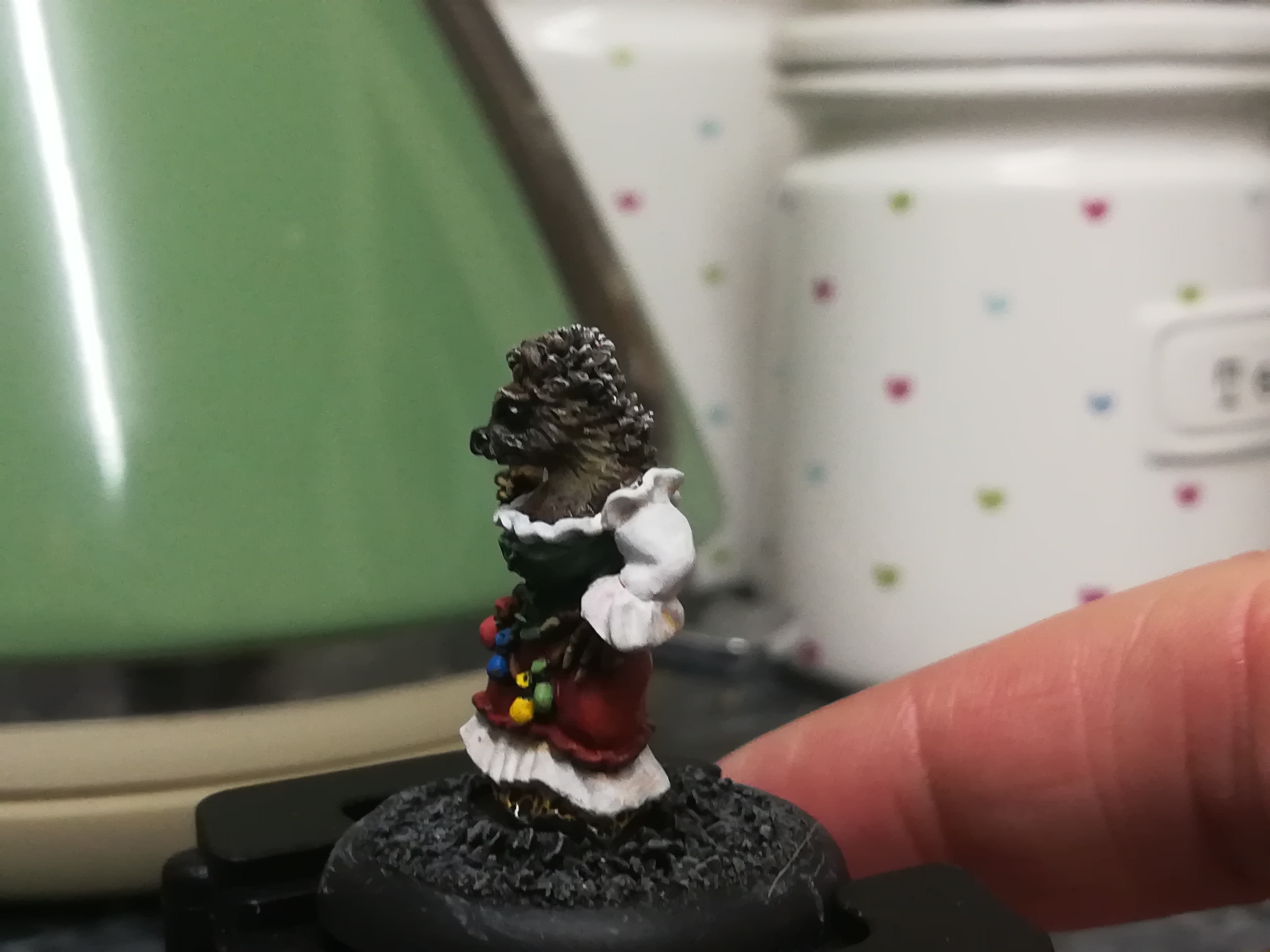
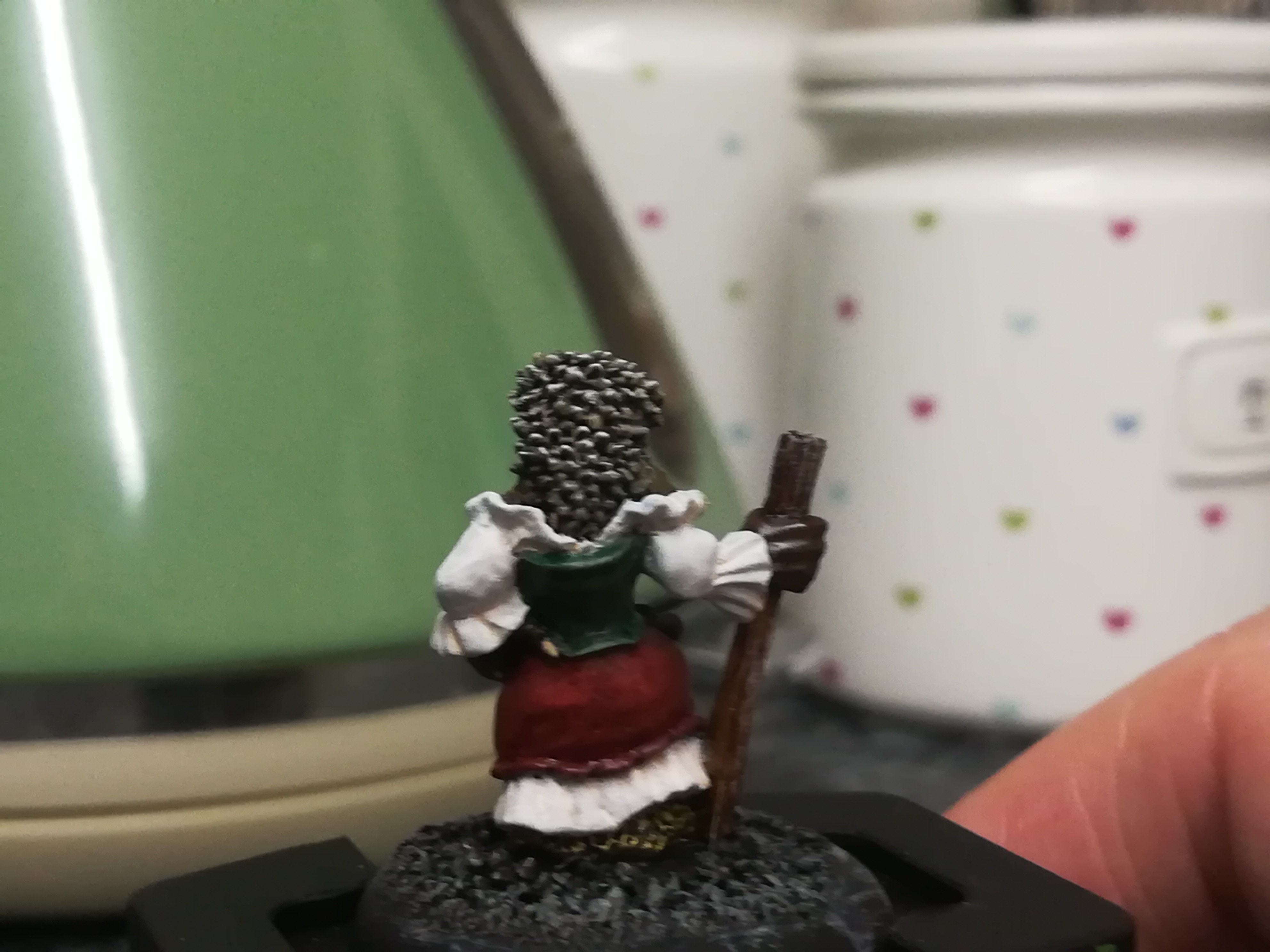
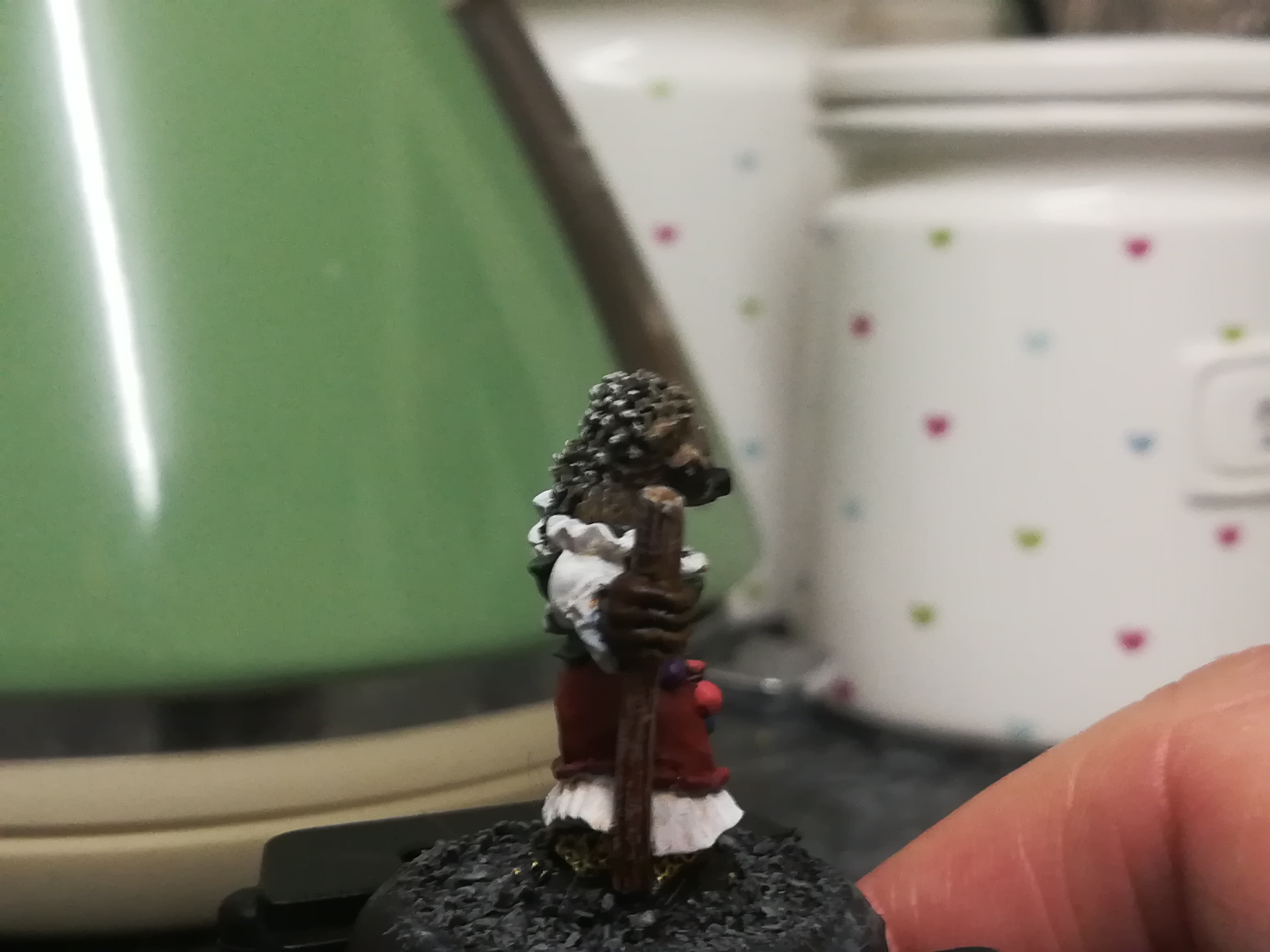
I’ll try to explain my process for the painting with accompanying photos. I’m afraid the lighting and my phone camera were both rubbish so hopefully the pictures won’t be too gruesome.
 Basecoat
Priming
Pretty ordinary step here.
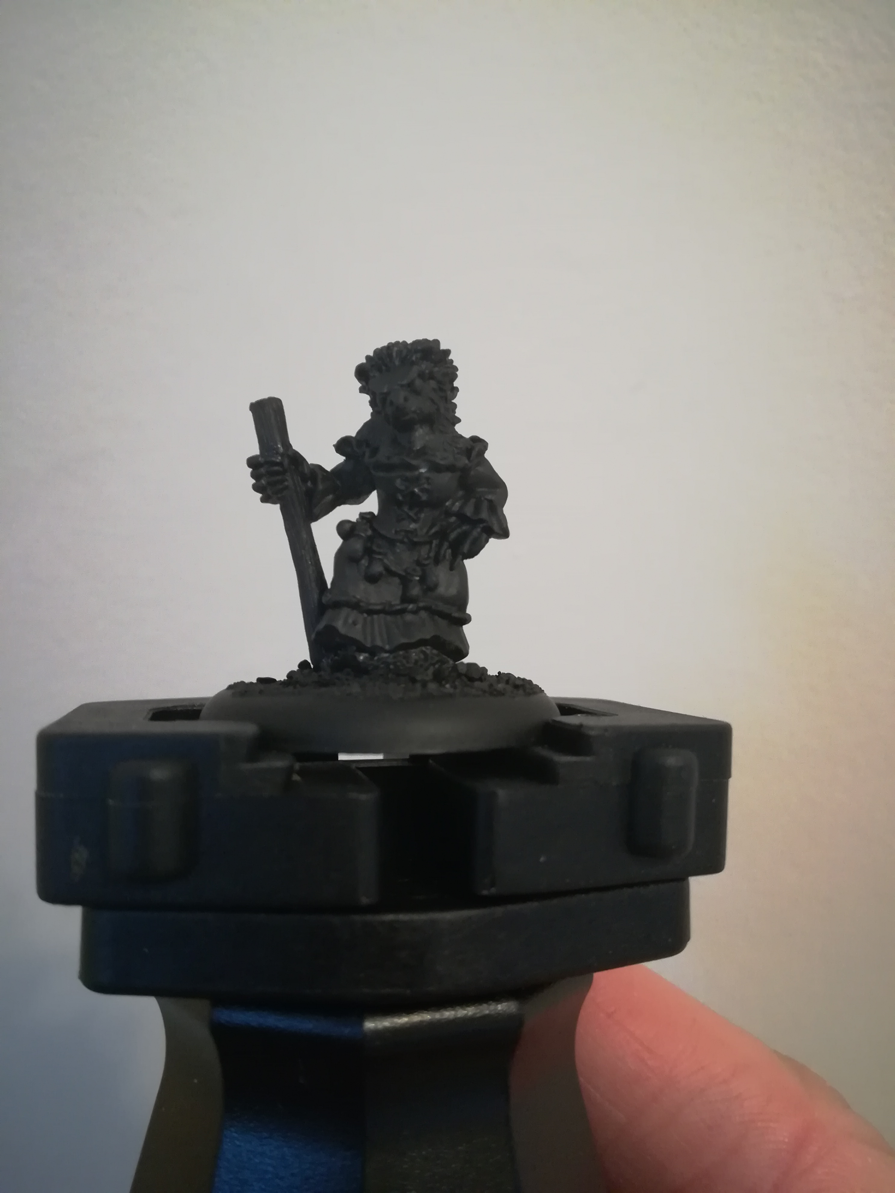
To prep the model I removed mold lines (very very few, mostly found by running my finger over the model and looking for sharp bits that shouldn’t be) missing one on the skirt, typical.
Next I glued down the integrated base onto the 30mm round base supplied – it’s one of the recessed ones so we can flatten it out somewhat with little effort.
Next a bit of PVA and some grit to finish the base.
Once that was all dry basecoated with the pretty bog standard GW black primer. I don’t have a wonderful set-up for priming so I did have to go back in with a brush and get some of the nooks with some Abaddon Black.
 Blocked out colours
Base layers
I always start a mini by trying to block out the base colours for larger areas. Not only does this make me take time to really look at a sculpt and see details or edges I might miss but it also lets me preview my colour scheme!
I don’t brush it on particularly carefully but I do thin the paint to make sure I can get it to flow on nicely. After all, we’re trying to provide ourselves with a base on which we’re going to apply more colour.
When you apply this base layer, especially with the paint thinned, it may take two or three coats to get a good coverage, let the previous coat dry for a few mins before you come back to it to prevent introducting lumpy bristle marks!
For this step miniature I used:
- Ceramic White – controversial, more on this later
- Waaagh Green
- Khorne red
- Bestial Brown – Mournfang Brown these days
- Scorched Brown – Equivalent new shade is Rhinox Hide, I have loads of old paints that are still going strong.
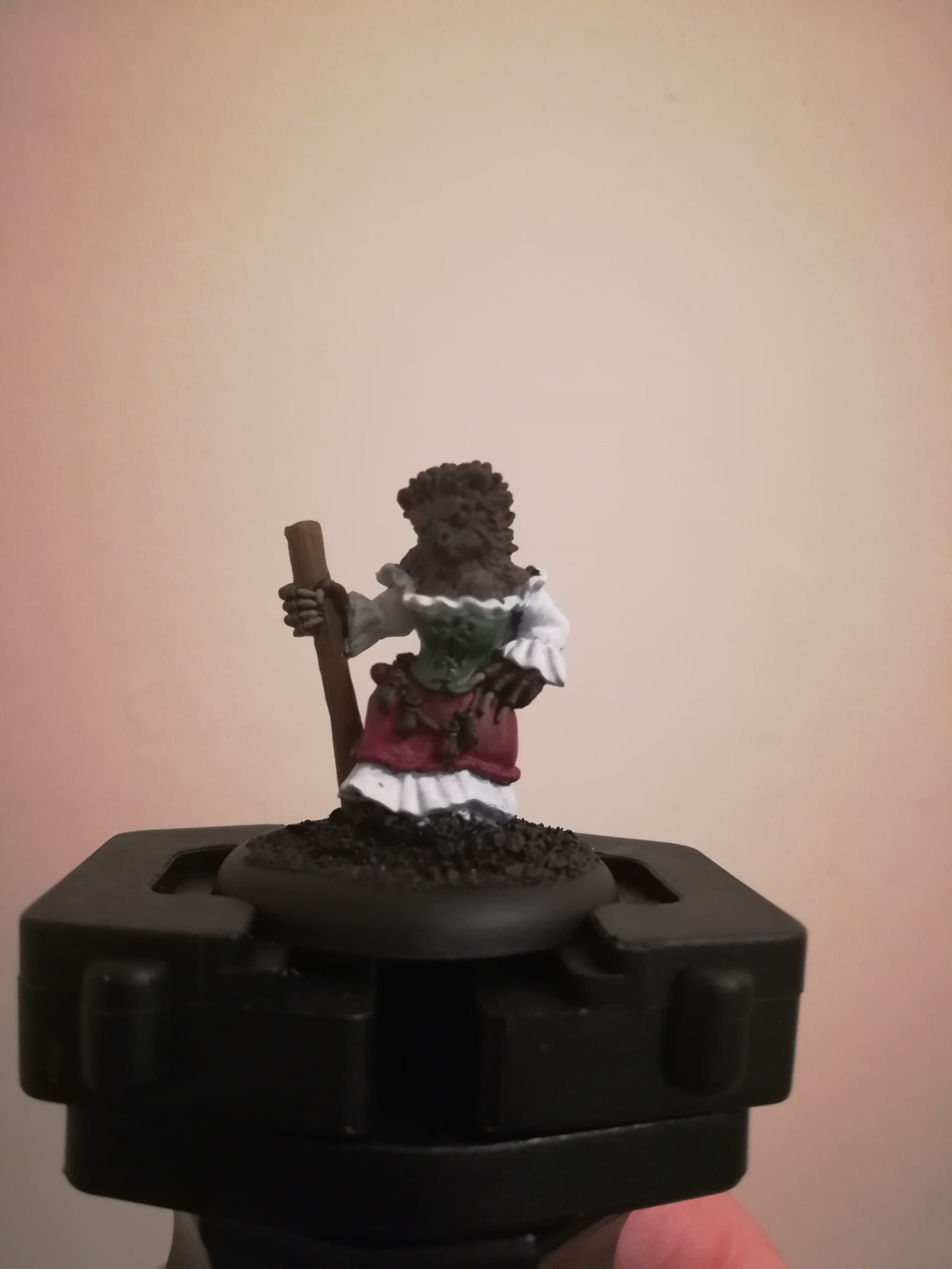
 Washes on
Washes
Once the base layers are looking good with no obvious thin patches looking a bit dark I moved on to a quick wash over those areas.
I didn’t wash the white (yet!) because I wasn’t really sure what I was going to do here. I’d already gone in at max brightness so didn’t leave myself much room for manoeuvre. We’ll talk about that in a bit.
For the bodice and skirt I went for washes in the same hue as the layer, it helps further deepen the colours and helps to make them look a bit more natural.
You’ll want to play with the amount of wash on your bristles, everyone has accidentally flooded a miniature with a wash and had to quickly draw it back off using a bit of paper towel or a dry brush! Having said that if you do get a bit much on then wait a sec until the brush is clearing and come back and gently draw it out from where it’s pooling.
Since we’re going to layer up you can’t go too wrong, just avoid getting any of that wash on the white. It’ll show up ridiculously brightly and make you panic.
On this model the most effective wash was probably the brown, it settled nicely in the fur details and into the spines and brought a lot of the detail out.
The pictures aren’t wonderful but hopefully you can make out the difference.
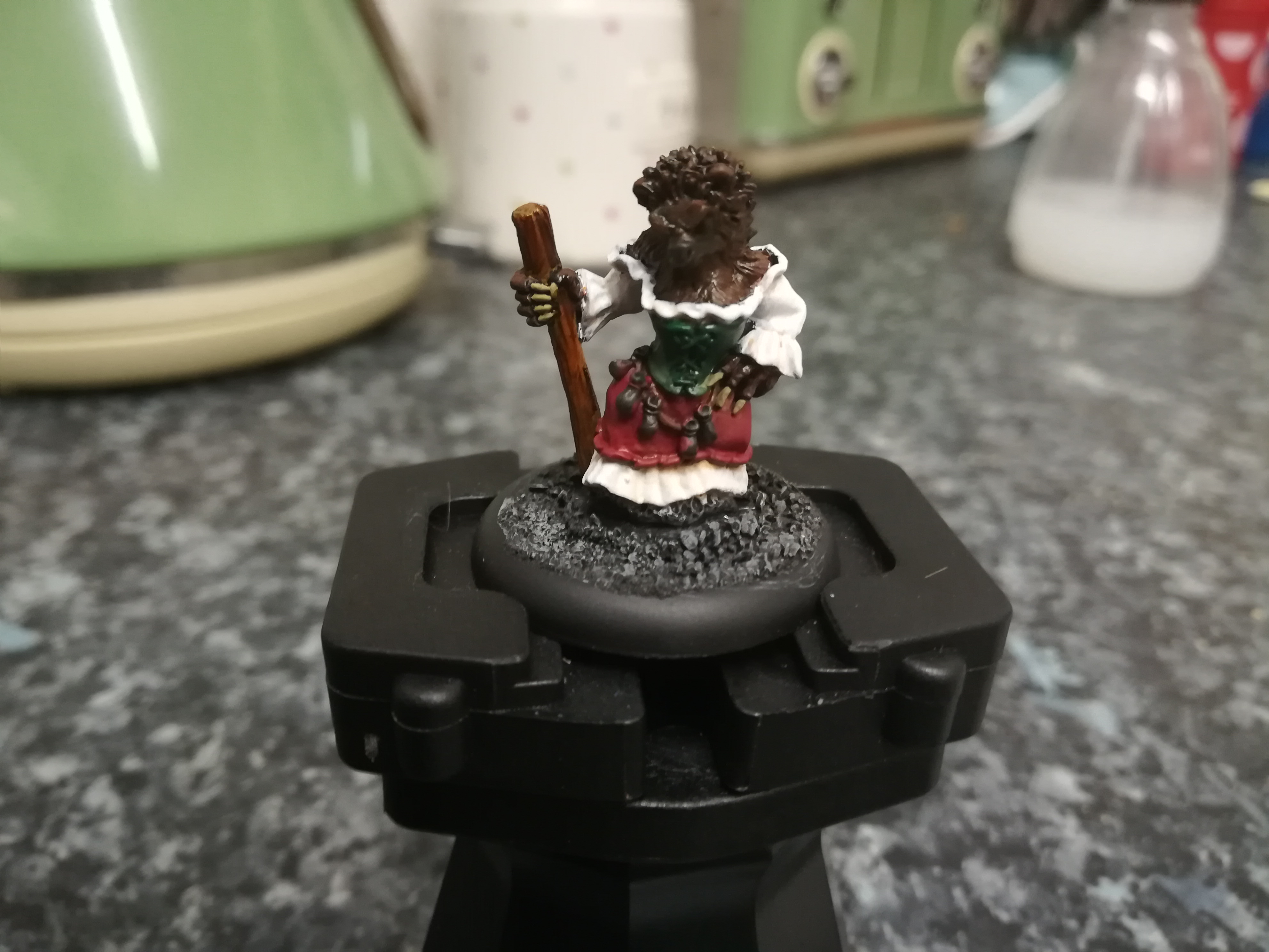
 Layering up!
Layers
Next step was to apply some layers to the model. This step seems like a big leap and maybe I should have stopped frantically painting to take more photos but we’ll muddle through!
Really though I only used two layer colours on the bodice, skirt and fur respectively.
Each colour had a thin layer of the base colour again to bring the higher and flatter points back up from the wash. Going back on with the same colour was a revelation to me when somebody suggested it; I always assumed I’d have to go to a lighter shade immediately.
Partly this takes off the sheen of a wash and allows you to bring the layer as close as you’d like to the washed area. For some models where you don’t want wash in anything but the deepest recesses a light swipe of the bristles can really work.
For this one I actually wanted the washes to play a big part in the colour so I used the base colours to bring up only the highest and flattest points of the clothing, being careful to avoid my precious white!
For the fur I tried to emulate the colour of a british hedgehog. They have a black nose and very dark fur that runs along the nose and cheeks a short distance. Then it blends into fairly light-coloured brown fur round the edges of the face.
After that hedgehog spines are acually very dark, near black, with beige/white tips to them which is basically a mini painters dream because a bit of dry brushing will sort those out with very little drama.
Once that first layer was appied on each I went back with a lighter shade.
For the bodice I went with Warboss Green which, if you know your GW greens, isn’t a particularly light colour for a top layer/highlight. This was intentional because I really wanted the white to stand out from a distance (mission accomplished, it looks ridiculous)
I very gently picked out the edges of the garment along with the stitching at the front (what do you even call that?) the effect is subtle but definitely visible.
For the skirt a tiny bit of Blood Red (Evil Sunz Scarlet now) just on the high points and again to pick out the edging on the hem. I really used a very small amount of this since I wanted the gradient but definitely not too much brightness.
The fur took a little bit longer: I wasn’t happy with the forehead ending up too bright, her pose means she’s forehead-first if you look at her on a tabletop so having a bright beacon of brown looking like a splodge didn’t work at all for me.
For the brighter parts of the fur I went in with a bit of the Bestial Brown to brighten the edges of the face plus a touch on the neck, chin and shoulders.
Once that was done I went for a very very light drybrush of Kislev flesh over the details of the face and the lighter parts of the fur. This brought up a bunch of hidden details and helped the black areas to look a bit more natural all in all. Pretty pleased!
For the spines I overbrushed (like drybrushing but a bit more soggy) the spines with the kislev flesh and then drybrushed the very tips with the Ceramic White.
I gave the staff a drybrush with Rakarth Flesh, which I also use to hit the gravel on the base so I did that too. I wanted the staff to look like it’s a bit aged and weathered, so to add a bit of beige/grey to the details gives it that look.
Once I was happy with those I picked out the leather strap for the pouches using the browns and then picked bright colours out of my collection for the pouches. These I didn’t layer or shade, just a single colour giving a pastel finish. Another chance to contrast the dark clothes and add a splash of colour.
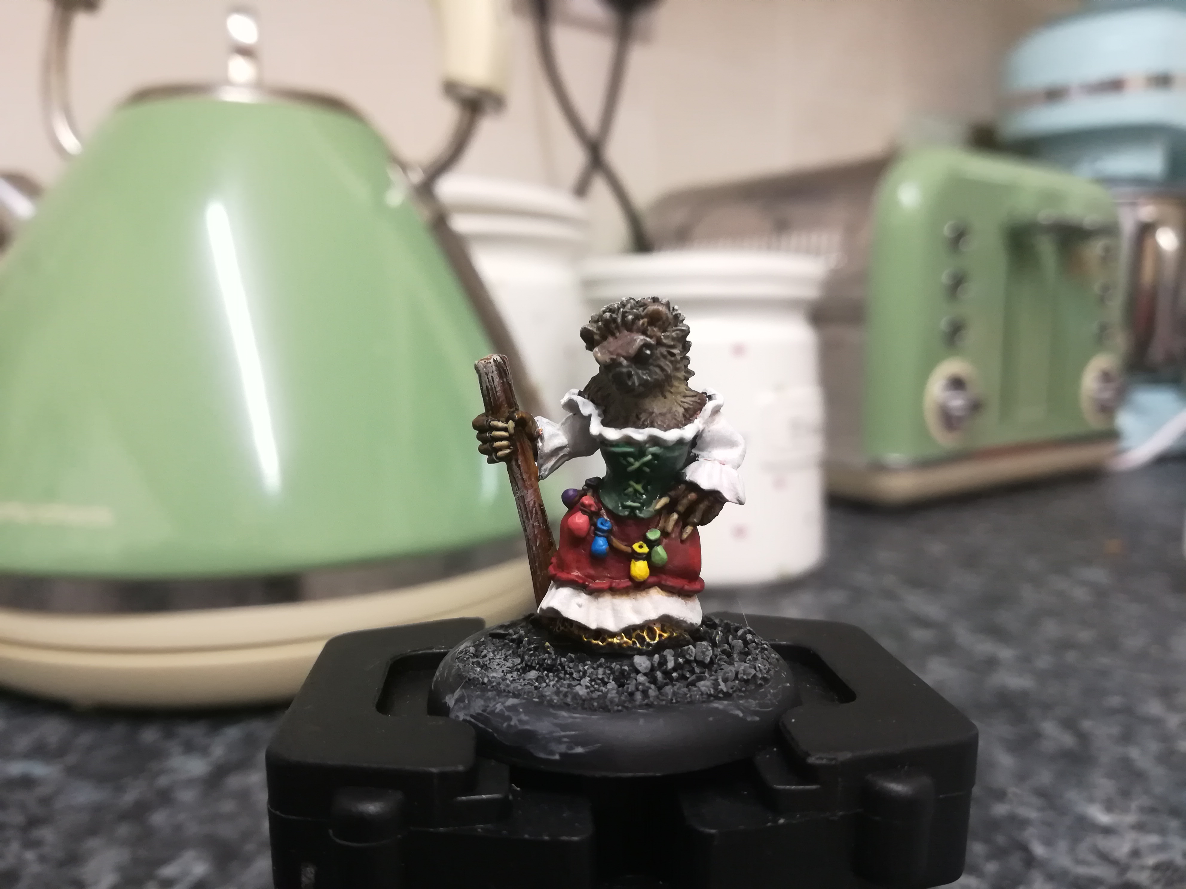
And done!
I wandered off for a bit, came back to look at my photos, saw loads of small errors and played around with things for a bit but ultimately decided I was happy with the result.
Now I mentioned that starting with the white was controversial. Basically I painted myself into a corner with that immediately where any colour or wash I added would look ‘wrong’ and that adding any shadow for contrast was instantly a nightmare.
I watered down some Flesh Wash (Reikland Fleshshade) to a ridiculous degree then applied just the tiniest most invisible amount to nooks and crannies, along seams and anywhere that might not stay that white for long.
Despite the tiniest bit it didn’t look quite right and I layered most of it back out with the white immediately. There are a very few grubby-looking spots that help break it up a little bit but I have to say I’m not disappointed at all, it’s just certainly a look! Next time I’ll start from an off white base coat and bring it up to white to go for a more ivory-looking finish I think.
Overall a lovely sculpt yet again with bags of character. I’ll be musing on who she is and what role she’ll take in my warband.


Leave a Reply