Yogie Paints Large Minis and Busts
First Competition Piece
So I’ve decided to start entering painting competitions, not so much for trying to win but mainly for getting in the community and mixing with fabulous painters and hopefully getting some great tipa from them to improve my painting.
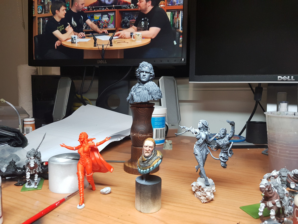
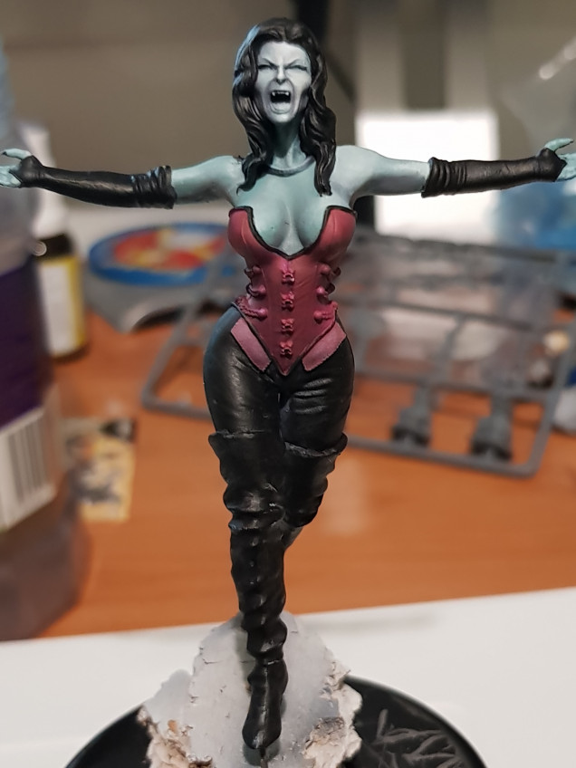
So what I decided to do was a nightime scene with the Charlotte the Vampire Queen miniature from Eclipse Miniatures.
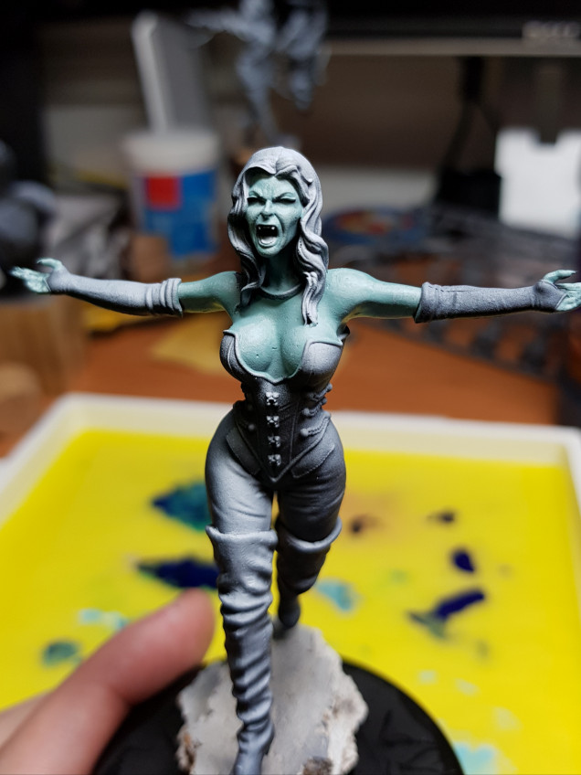
So I started off going with a bluish skintone
With the base coat down it was then time to highlight and shade the face.
Now what I decided to do was to have the light source coming from the right hand side (my right not her right). I think this creates a little more visual interest than just having the light straight one.
I also wanted to have the face as the main point of focus so this had to be the brightest part of the miniature. I was there going to bring the highlights up to white. In contrast I deliberately kept her chest and arms a slightly darker again to draw more attention to the face.
I concentrated on the right side of the forehead around the eyes, on the tip of the nose and also on the chin. The main problem that I found was trying to keep the left side in shade but also have it highlighted. I therefore highlighted it not as harshly as the other side but also concentrated the highlights on the bits not covered by the nose etc.
So I thought i was done with the skin but it’s always hard to tell as the colours surrounding the area always have an impact on the colour. Therefore the next step was to block in thr colours to determine if more highlights were needed.
After blocking in the surrounding areas I decided that the skin was a good colour and it was time to move onto the black leather components.
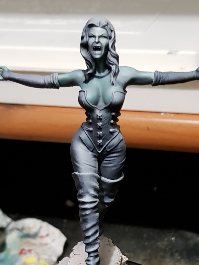
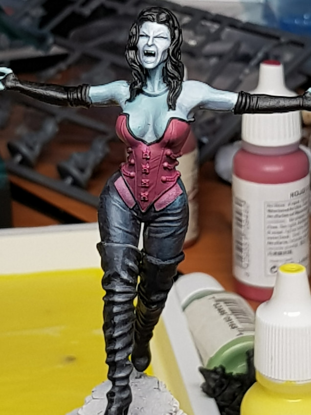
I was after shiney leather which meant that the highlights needed to be sharp and bright. However again the face was the focus so the highlights couldn’t be up to white and instead needed to be duller.
So I started highlighting with greys again concentrating on the right side with the higher highlights being towards the top of the leg as again keep focus away from the feet however I wasn’t entirely happy with it.
So I then decided to highlight the pants with blue (specifically coal black from P3) and then adding in lighter tones for a comparison to use against the boot.




















![TerrainFest 2024 Begins! Build Terrain With OnTableTop & Win A £300 Prize! [Extended!]](https://images.beastsofwar.com/2024/10/TerrainFEST-2024-Social-Media-Post-Square-225-127.jpg)











Leave a Reply