Bloom // Game Design
Rulebook Design
Hoy ahoy there friends. This is the penultimate post on the Bloom project blog. This was the final piece of the puzzle: writing and designing the rule book. This was a particularly interesting challenge since I am by no means a graphic designer. And I had to turn my day job of comprehending rules on its head to actually explain rules in an easy to understand way (a difficult challenge for an academic writer). We’ll look first at the visual style I pursued for this rulebook. Then we’ll tackle how I approached writing the rules.
Visual Style
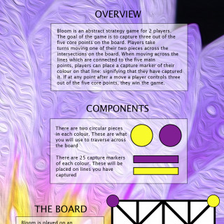
This was a difficult one and I checked out a bunch of colour palettes and looked at colour theory. But I couldn’t escape that I’d gone for two incredibly bright colours that, when put together, don’t mix with others terribly well. So to get around this I decided to use a picture of a purple and yellow flower then blur it in some way that it doesn’t detract from the text. I managed to find a beautiful picture of a purple lotus flower that had yellow stamens on the inside. To abstract it, I used the oil painting effect on photoshop that gave it a really beautiful dynamic (almost crashing my slow laptop in the process because rendering it took a while).
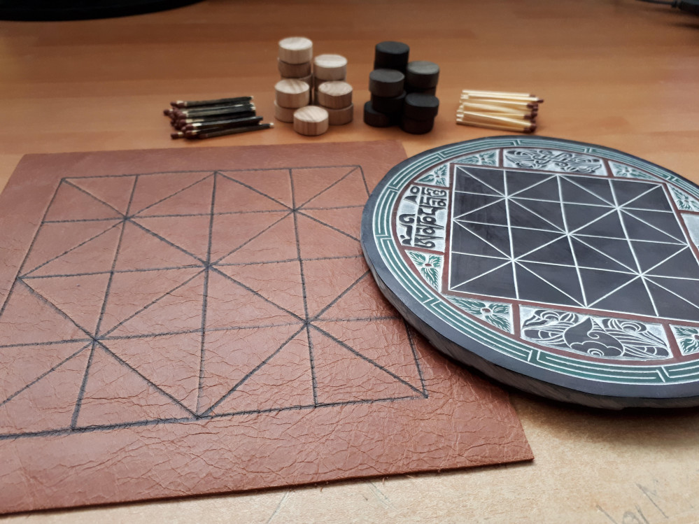
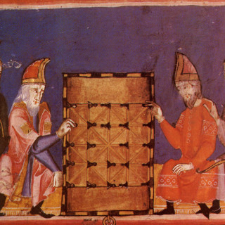
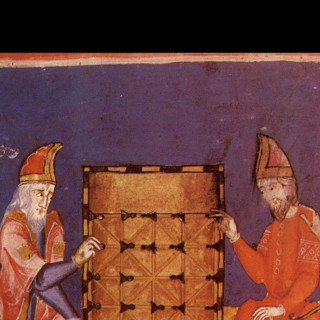
Instead of finding a different picture for each page, I just used a quadrant of the ‘lotus flower oil painting’ picture. The rulebook was only 8 pages long so there wasn’t too much repetition. On the back cover I wanted to find an old picture of an alquerque board that I’d seen in a board game history book I have. This was so I could tie the history of the Alquerque board in with the game I have made.
Layout was an interesting thought that I’d never had! I am used to walls and walls of dense, impenetrable academic prose which isn’t a great style for a rulebook! So how do you create an inviting and appealing layout for people to get stuck into? I had no idea so I just took a stab at it for the first rulebook I’d ever written (I promise the next one will get a lot more research put into it)
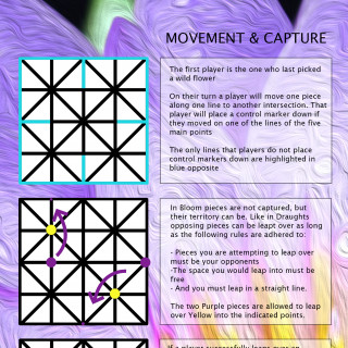
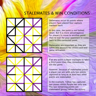
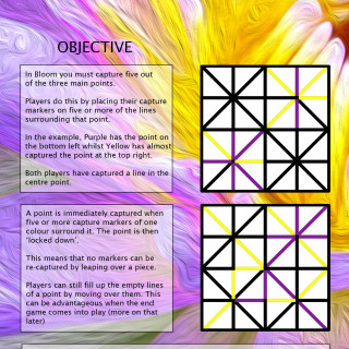
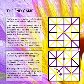
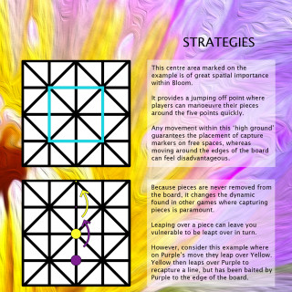
For the main layout, I decided to divide each page in half vertically. One side would be used for a text box and the other side for a visual example which would explicitly show what was described in the text box. It was a very simple approach that cut down the idea of a wall of text. In practice, I think it may prove difficult for a new reader to take time to understand what is going on in each picture. So I may use less in future rulebooks and just have one or two very well designed diagrams.
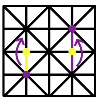
I created a template of an Alquerque board in photoshop to use in each visual example. Any time I needed to explain something I used a combination of arrows, circular pieces, and colouring in the lines with the fill tool to denote captured lines. For the text, I discovered that just putting black text on top of the image didn’t make it legible. So I needed a way to make the text legible without obscuring the pretty lotus flower in the background.
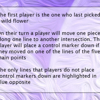
To do this I created a separate layer on photoshop above the background, created a mask and coloured in a few text boxes in pure white. Then I reduced the opacity on that layer so that it provided a transparent space for the text that didn’t obscure the background.
Writing the Rules
This was a super interesting part of the process. I’ve devoured quite a few rulebooks for both my work and for fun. There are some crucial beats I try to hit when I’m explaining the rules of a board game to people who don’t know how to play it. And this is the main structure I try to follow:
- Who are the players and is there any narrative information?
- What is the objective?
- What do the players do on their turn?
- How might they best achieve this?
I chatted to a game designer a couple of weeks ago and they validated the first point for me very well: humans follow stories much better than the explanation of abstract systems. If you can communicate a compelling reason why this is taking place then it becomes easier.
Once they understand their place within the world, foregrounding the objective is crucial as it is the direction they are moving towards. What actions they can take towards this objective starts to form a picture of where they fit into this game. But it is useful to contextualise all of this by suggesting scenarios of play and potential tactical and strategic considerations.
This is the structure I always try to keep in mind when explaining rules to people. So I made a checklist of things to include in the rulebook that aligned with these objectives:
- Overview
- Components
- Board breakdown
- How to move
- How to capture
- Point capture
- Win conditions
- Lockdown rules
- Stalemates
- Late game changes
- Strategies
- History
Because it’s only a small game and I didn’t want the rulebook to be too long I stuck to 8 pages. So there was quite a lot of information to communicate in a small space which paradoxically makes the job a bit easier. It focuses the writing and trims off the fat. Any additional or extraneous information can easily confuse people so it’s important to focus on the absolute necessities.
A couple of the categories on the checklist got trimmed a bit. The history of the board was entirely optional so I converted that to a picture on the back cover. Strategies were trimmed a little so that players could explore how to best to play the game for themselves.
I tried to pair each text box to a visual example as best as I could. But there wasn’t a lot of space for explaining the rule and then explaining what was happening in the example. This left a bit too much to interpretation for the visual example. Writing to a tight constraint suits me well since I like to write things as efficiently as possible (this project blog aside).
So that’s my rulebook! It didn’t take longer than a few days to pull together. But unfortunately, that shows! There are a couple of errors in it which are frustrating. But that just teaches the importance of having critical distance from your work. Getting something like this done as early as possible so that you can comfortably visit it a week or two later and pick out all the mistakes is so important!
Thanks so much for reading this if you got all the way down here. The last post I’ll make on this project is a final video on my youtube channel which will be a post-mortem on the design of the game, picking out what it does well and any design flaws which hinder it. So I’ll create a new post here when that uploads and embed it in!











































Leave a Reply