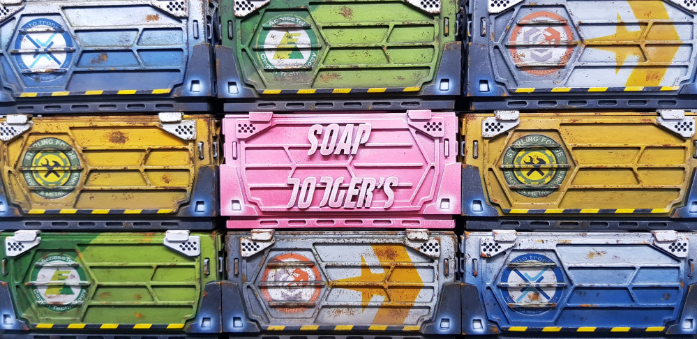
Infinity Terrain
Problems... I dont like it.
I swithered whether to put this out there as it seemed a bit negative. Criticism and self criticism if the only way to improve at something as subjective as art. It should be part of everyone’s process.
A bit of background to the above statement. The original was art and design. I love the art Marcos Hidalgo done for the original paper building. The design not as much, this is not hate. This is personal taste. A few things do not make design sense to me and break my immersion.
As I now have a 3D version of the building a few things have became apparent to me of my representation of the original work and my decisions in making this 3D.
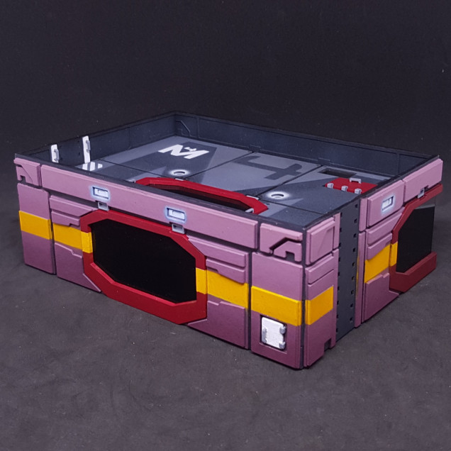
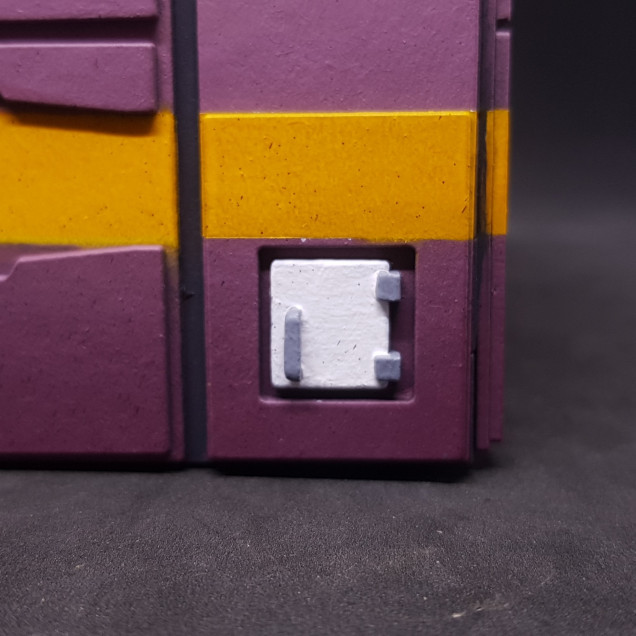 Rear first aid box - Taking this up to white from a dark plum colour is a nightmare I need to do this off model then attach it.
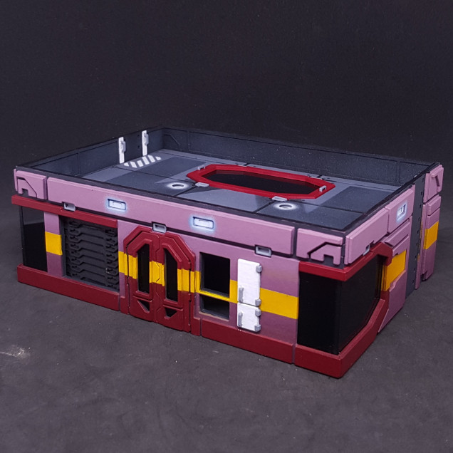
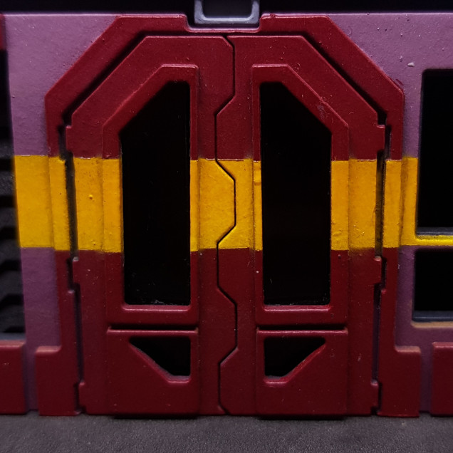 Front door - I do not like the yellow across the door. I have painted a fair few doors and I have no idea why you would put a stripe over the door. I think I will change this to a solid colour. This will also make this easier to paint.
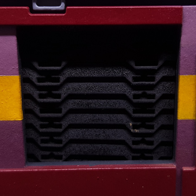 The shutters seemed to me like a great idea for them nor all to be straight or uniform. I absolutely hate this. It needs to be straight.
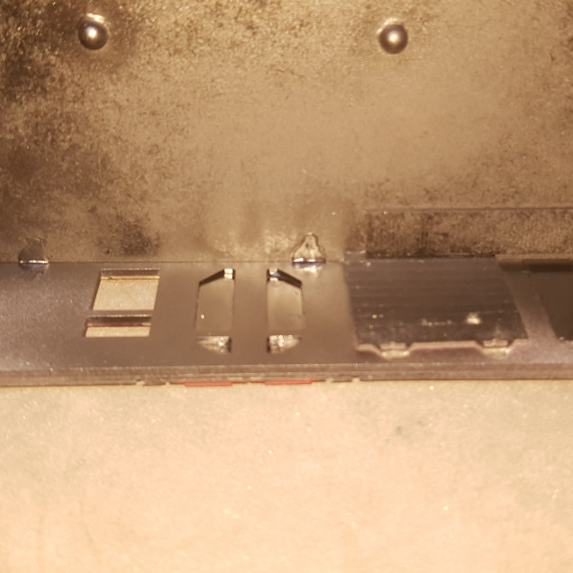 The door windows are a nightmare. They are not right. Sorry about this picture It was just all black so had to use flash. I cant make them flush the way I designed them. This needs simplified to make the end result uniform, neater and easier.
 So, Change’s to make this better for me.
- Remove yellow parts to the window and door frames (sorry Marcos!).
- Take more time in masking the yellow stripe. This may be aided by the change in the building and painting.
- May change colour of the main walls just for number 4.
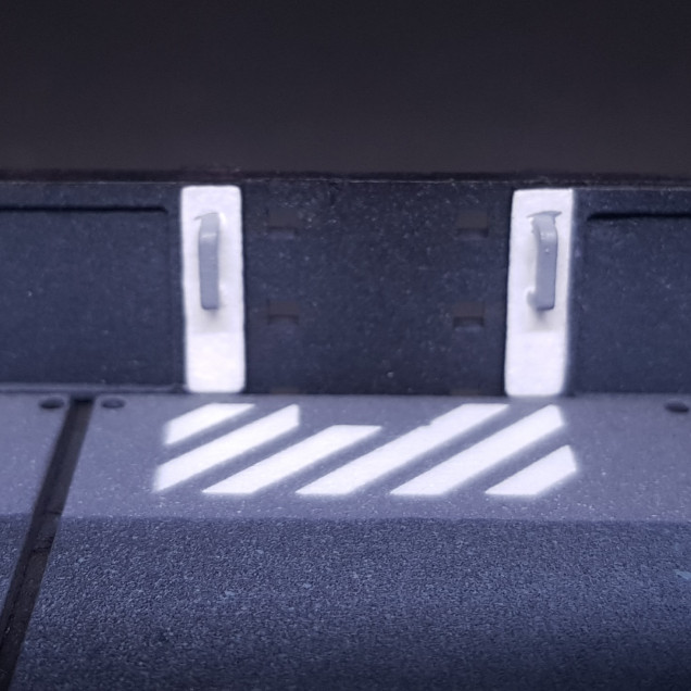
- Paint the white doors and handle sections before applying them to the model.
- Straighten the shutters.
- Redesign the doors.
- Break out the top floor section so I can reuse it.
So there’s a very positive post, Why positive? Because I will make something I am happier with as an end result by being constructively negative.
The line is drawn under painted version 1.0 Onto the changes!




















![TerrainFest 2024! Build Terrain With OnTableTop & Win A £300 Prize [Extended!]](https://images.beastsofwar.com/2024/10/TerrainFEST-2024-Social-Media-Post-Square-225-127.jpg)








Leave a Reply