
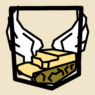
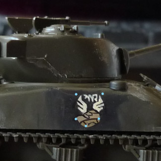
Commemorative Emblem - Amara the immortal Carrier
Painting step by step
Step 1: Grasp the basic geometry. for this emblem it would be a fitting shield form.
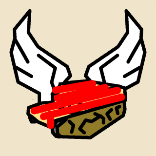
Step 2a red: Chassis the chassis should make up roughly 30-50% of the space you will occupy. the red lines indicate the first run you will take to block it out. The passengers compartment should be thought of as ~75% of size. I went with 50% for the tank and 75% for the 1cent and on the cent its much more pleasing and true to reality.
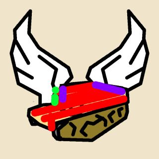
2b: vertical lines to get the edges crips. in the green area you may or may not have to extend your corrections a little. just keep in mind that the colour of the wings will be layerd over that area any how so correction might not be needed just yet
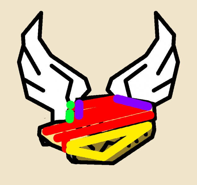 Step 3: Tracks. Pretty straight forward. just make sure you end the triangle roughly where the end of the shield would be in the middle. otherwise you will tilt the perspective.
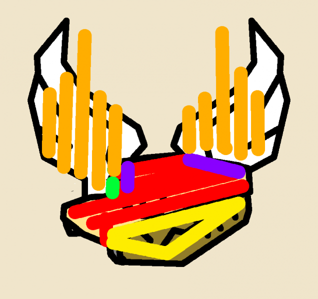 Step4: wings. the wings are straight forward. i tested half circles as a starting point but lines work far better when trying to maximize usage of space and getting it done clean. you can layer the colour pre blacklining but i would advice against to much. more layers of colour might be needed for the blackline correction
finish: black line the mode. i did it with a brush that was still to big and barely able to thin its peak down far enough. I have read good things about using aquarell pencils for blacklining so that might be worth a try.
the text is very simple version of the original punjabi becomes a tilted W going into an N into a “d” all connected via one straight line at the top. check the 1cent version for crisper lines
ਅਮਰ













![TerrainFest 2024 Begins! Build Terrain With OnTableTop & Win A £300 Prize! [Extended!]](https://images.beastsofwar.com/2024/10/TerrainFEST-2024-Social-Media-Post-Square-225-127.jpg)












Leave a Reply