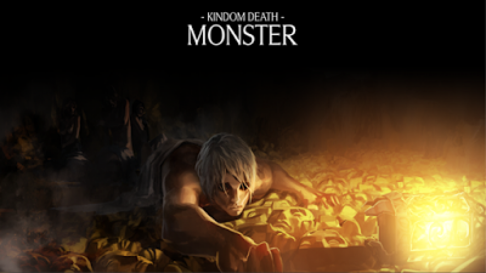
Kingdom Death: Monster
The Quarries
The White Lion will follow – I just need to get some pics.
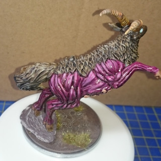
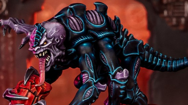
The Antelope: I think the colour scheme is pretty typical. I don’t think many people are even researching other peoples schemes – the model just seems to lend itself to a partially skinned palette! I mounted the model on the rock to help with balance (the slate is quite weighty compared to the mini) and to give the pin through the leg more depth to grip to. Overall I’m pretty happy with this one.
The Phoenix: This was probably the largest model I had built. It was great fun – apart from the 20-odd tiny hands that need gluing to the wings – what a nightmare!
I had seen some stunning dark, moody schemes, so decided to go completely the other way. It was my first real foray into extensive airbrush use. I’m reasonably happy, but still think I should have achieved a better blend. And maybe I should have used blue to yellow, rather than green to red. The base had two thin layers of cork floor tiling added to give more height. I used filler to smooth out the contours. the flock is by WWS (Summer leaf litter).


























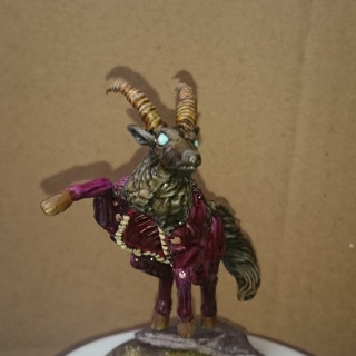
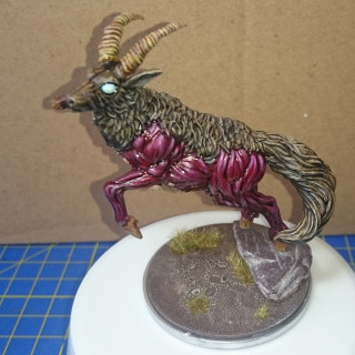
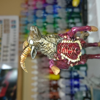
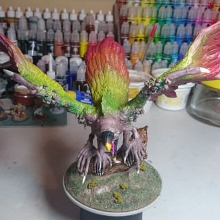
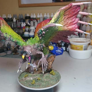
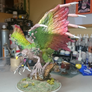



The white eyes of the antelope look really menacing. Love the bright colour scheme on the phoenix!
Thank you very much. I used Warcolours transparent white layered over blue 3. It took several layers to get it up to white!
Yeah, I was going to make a comment about the eyes as well! Really well done, as is the rest of your work ?
Thanks very much. Sorry for the slow reply – been off the site for a while as hobby time has been limited!