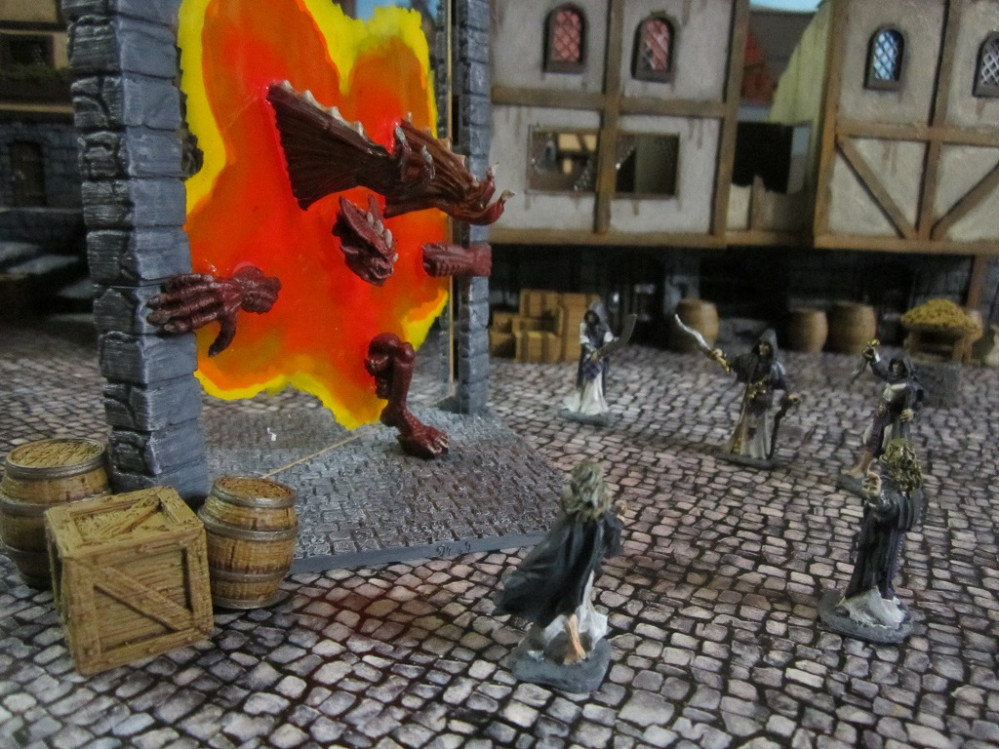
Terrain Challenge: Summoning Portal
Part 4 - Adding Colour to the Portal
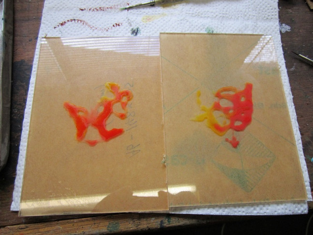
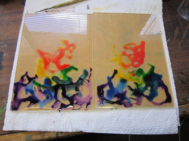
With a little practice under my belt with regard to adding ink washes directly to the plastic sheeting I decided to get stuck in to the perspex sheets for the portal itself. I began by adding a thin coating of flow improver to the centre of each sheet of perspex and then dropping of a couple of drops of yellow and red inks and moving them about a little. Idea was to get the colours to approximately line up in the same areas but with different patterns, as though the arcane energies were swirling around a little. Once this was dry I noticed that the flow improver covered areas were clearly visible where the ink had not travelled, so resolved not to use flow improver for the remaining steps.
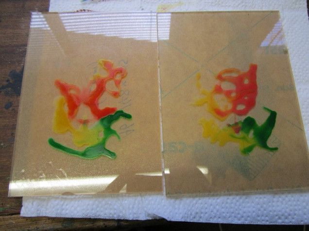
For the next part I added drops of yellow and green to approximately similar locations on both sheets and repeated the process. The absence of flow improver meant that the inks did not mix as well, leaving more defined areas of colour.
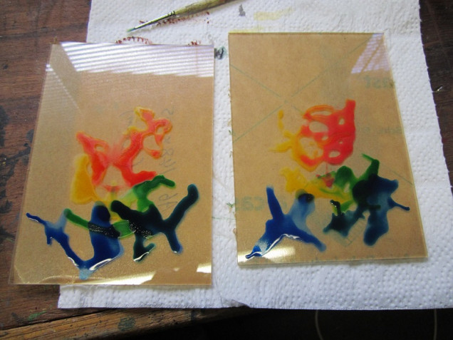
Following this was green and blue (you can probably see what’s going on here…). Again, the absence of flow improver left things with clear lines of delineation rather than blended areas. It probably didn’t help that I was letting each colouring dry completely before adding the next layer, but I was seeking to avoid all the colours running into one mess.
Final one was straight purple around the bottom of the perspex to try and fill in the area near the base of the portal frame.
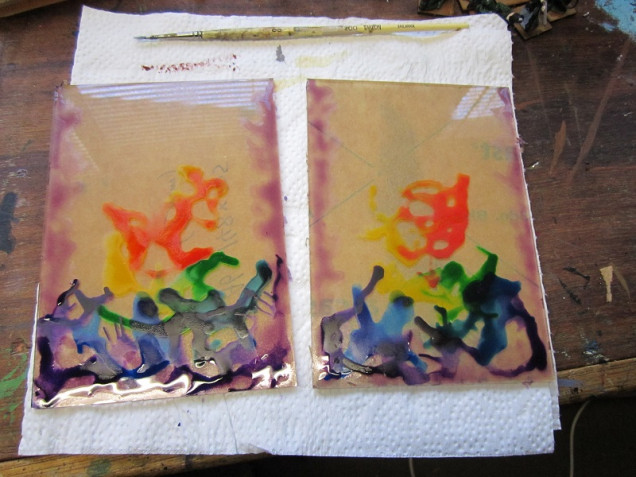
From here I mixed some purple ink with flow improver and brushed it along what would be the vertical edges of each sheet of perspex. This is where the support columns would link up to the perspex so I wanted it to look like there was some magical energy flickering off of them.
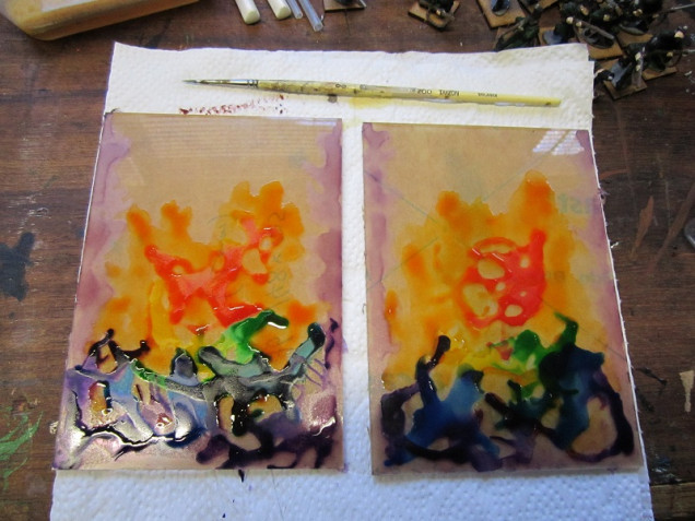
From here mixed some flow improver with red and yellow inks and brushed over the centre of the model to try and provide more coverage and hide the coat of flow improver from the initial colouring.

















































Leave a Reply