


![TerrainFest 2024 Begins! Build Terrain With OnTableTop & Win A £300 Prize! [Extended!]](https://images.beastsofwar.com/2024/10/TerrainFEST-2024-Social-Media-Post-Square-225-127.jpg)


Irregular Magazine Re-Design

Anatomy of a magazine layout
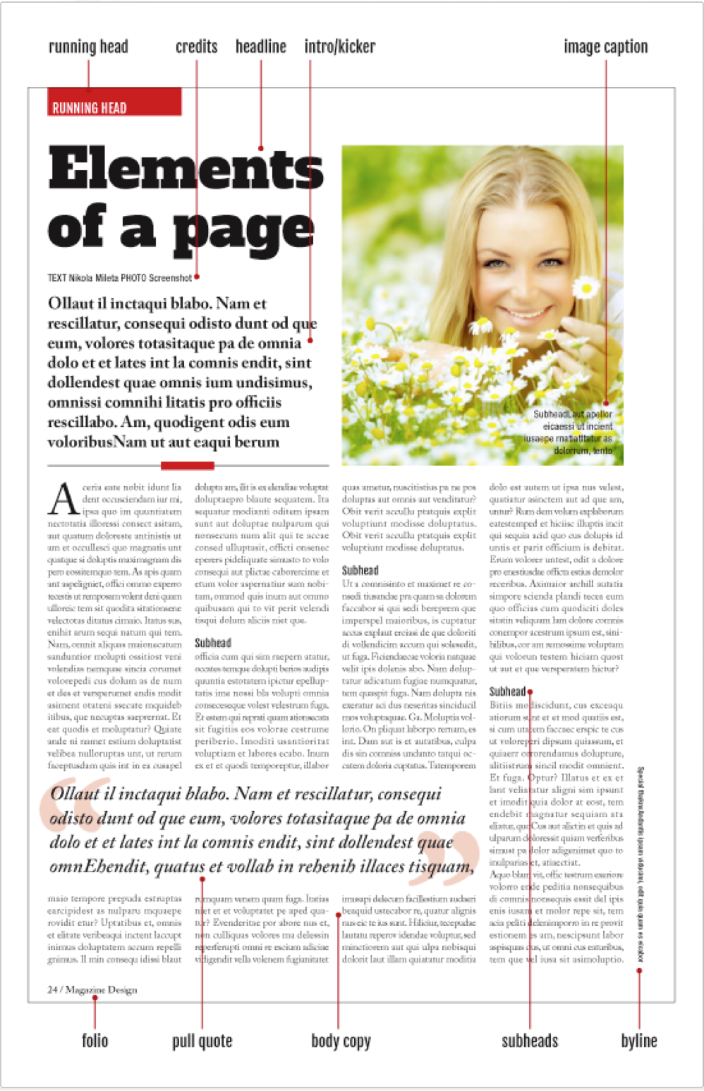
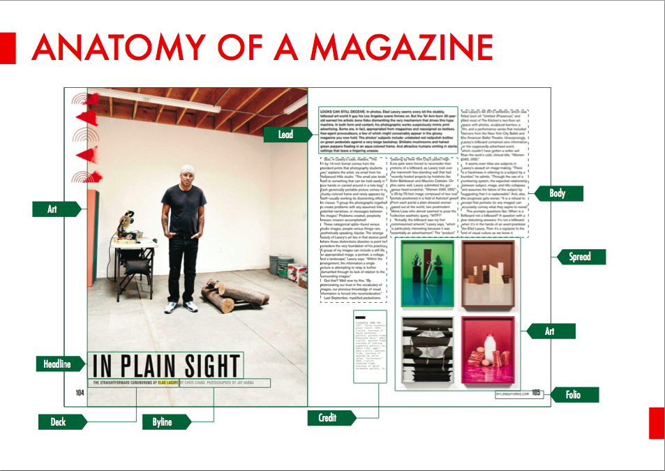
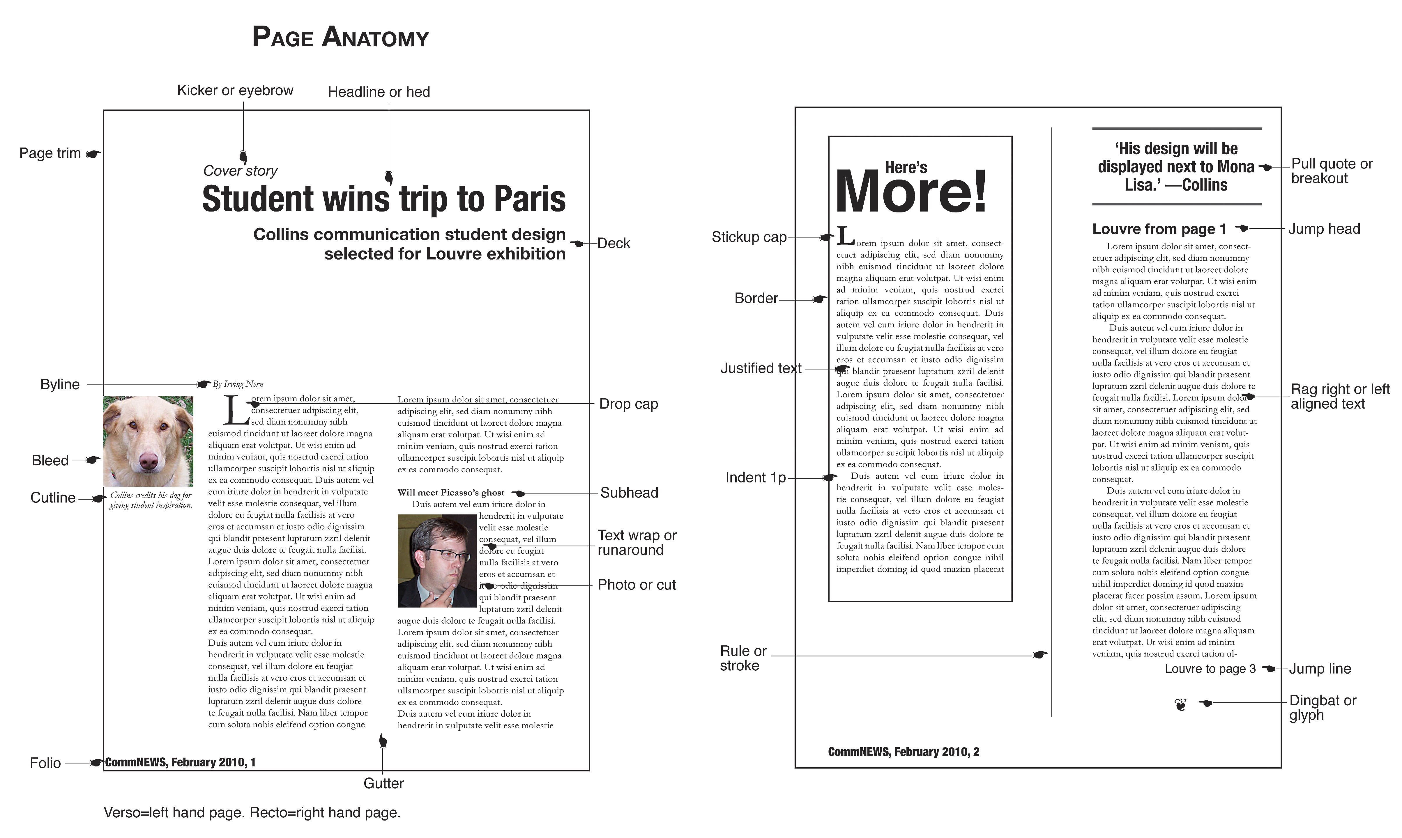
Headline: Depending on the article (feature, column or brief) and the magazine’s style, “heads” can be tightly proscribed or open in format.
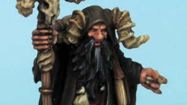
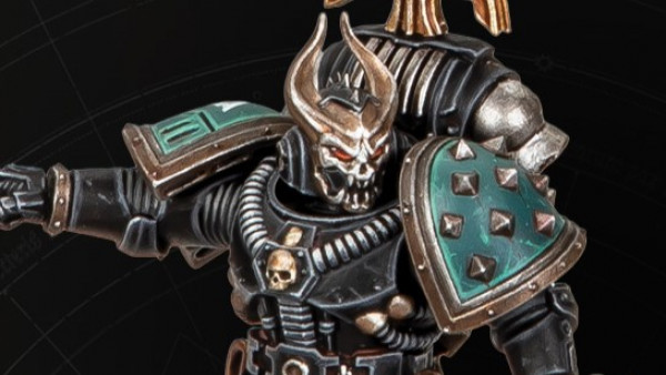
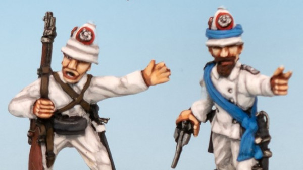
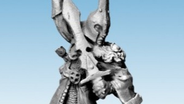
Artwork; It doesn’t matter if it’s a photo, graphic or an illustration. To a magazine designer it’s all “art.” This feature is organized around a single large photograph—an easy to parse, reader-friendly design strategy. Every extra element you throw into a layout has the potential of adding clutter and confusion unless carefully structured.
By-line: It can be here or at the end, but don’t forget it. “By” is capitalized
Deck/Kicker/Intro: Not all articles have a deck but most features do. When used, they usually are longer and provide more specific information than the head.
Body Text: Most text in a magazine is in a single size, style and leading referred to as body or text.
Drop Cap: A single large letter
Pull quote: Larger than captions, pull quotes are used to explain a photo or put words into the mouth of the person shown. Pull quotes, decks, subheads and captions all fall under the broad category of points of entry—call-out text that invites the reader into the story.
Subhead: Subheads are used to break up large chunks of text and help the reader understand what will follow. Drop caps, line returns, and dingbats are also used to subdivide text.
Caption: Almost every photo needs a caption (or pull quote) to help make the image meaningful to the reader. This one is designed, but most captions are tightly formatted.
Credits: All art, with rare exception, should be credited. Some magazines place credits at the bottom, others next to the image, If there are several images by one person, there may be a larger “Photographs by…” credit in one spot.
Folio: More than a page number, folios generally contain the magazine’s name and issue date, In the old days, the name might appear on left- hand pages and the date on the right (or the other way around) but most magazines now put all info on both pages. The folio is not a design opportunity—it should be an unobtrusive part of your layouts.
Sidebar: A small story that relates to the main text. This sidebar is set off by a coloured screen, and is on a two-column- rather than a three-column grid.
 Headline
 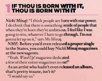 Sub Heading
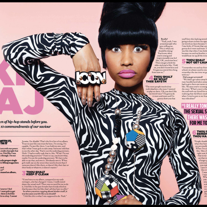 Artwork
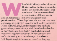 Drop Cap
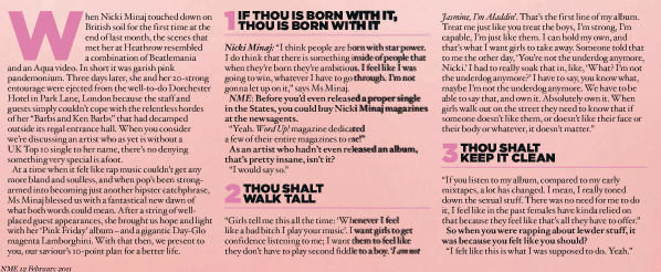 Body Text
 Intro
Intro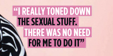 Pull Quote
 Credits


Leave a Reply