Celestial Painting Competition – Week #1 Judge’s Comments
May 11, 2018 by dracs
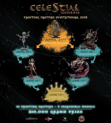
We stop in with the judges that were picked by Beasts Of War to give their thoughts on the work by the artists who are taking part in the Celestial Painting Competition which is running this month.
Firstly, however, we should introduce some of the different judges. We have Ruben Martinez (Big Child Creatives), Dave Taylor (Dave Taylor Miniatures), Angel Giraldez (Studio Giraldez), Chris Handley (Darker Days Radio), and Tomas Mennes talking to us this week about their thoughts.
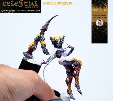
Aleksandra Cvetanovski - Zhurong
Tomas - I love the technique on this model. The armour looks nice and crisp. The metal parts are gorgeously rendered. The skin is soft and tender. And yet, somehow it doesn’t come together for me. It’s hard to put my finger on why that is. I think it’s the colors. Too many colors fighting for my attention. I know it is too early to tell at this stage, but at the moment, I am missing a focus point on the model because of that.
Chris - The metals looks vibrant and solid. There is a real substance to them, due to how the reflections have been painted. Comparatively the skin looks alive, luminous, but next to the metallics, seems to look less present - too ghostly. Either more of the yellow tones need to carry over into the skin, or blues into the metals, to help tie the parts together. Currently, while my eye should be drawn to the face it is taken to the top of the head.
Dave - I am really enjoying the great contrasts on this miniature, particularly the textural contrasts between the mechanical and biological elements.
Ruben - She has chosen a perfect miniature for her style. Aleksandra mixes the delicate forms offered by the skin and other parts formed by the metals that, in addition to composing perfectly, give it the perfect canvas to stand out pictorially and make those eye-catching NMM that characterise it. She has chosen a more "old-school" style of painting that focuses on vibrant colors and a well-crafted technique that will delight all the viewers.
Angel - The technique is very good with a very clean look. The skin is beautiful as well as the tones. The only thing that at the moment that does not convince me is the armour, but I will wait to see more for that.
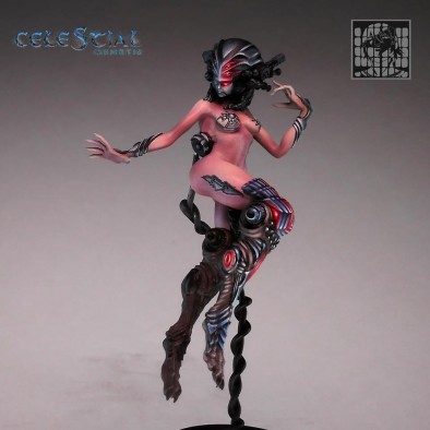
Sergey Chasniyk - Zhurong
Tomas - I’m in awe of the metal parts on this model. The legs look great with all the freehand patterns on there. I also love the converted helmet. Sadly, I think the helmet and the legs don’t really match in style. The helmet has more flowing lines and less of a pattern. Also: there is some disconnect in contrast between the armour and the skin. The skin is nice and soft (and pretty great on its own), but when put next to the starkly painted armoured parts, it looks like it is missing definition.
Chris - If we compare to Aleksandra’s version, the flesh on this one seems more solid, while still retaining the appearance of being luminous and supple. The conversion to the head is very cool. The extra eyes adding more menace to the model. But while the head, with the glowing eyes, looks great, the eye is always drawn to the knee with the array of reflections there. Perhaps the knee could have had smoother textures like the helmet?
Dave - I think Sergey has presented a very interesting WiP here. I love the look of the face/head, something very anime/’Eavy Metal in the colour composition. I’m excited to see him take the strong work across the rest of the model.
Ruben - Like Aleksandra, Sergey has opted for the same things, staying true to his technical and refined style. The slight modifications that he has made in the figure have been very intelligent since they will allow him to draw more and use the "punch" that the freehands give to the miniatures. He has opted for a dark atmosphere that makes these figures look great and is so involved in the unconscious of Sci-Fi lovers.
Angel - Precious black armour and freehands but I think the skin should go up to a lighter shade to make it more spectacular for this model.
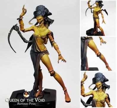
Antonio Peña - Queen of the Void
Tomas -This model looks like it is still in its early stages. I like the technique on the body, but for me, Antonio is suffering a bit from the fact that two other people have chosen the same model and when compared, I think both Fabrizio and Enrique have added more texture and character to the model.
Chris - I am really liking the colours chosen for this version. Vibrant but in a very different manner to the metallic red, or the porcelain. I would say this had more of a feeling of stone to it while retaining some more flesh like qualities. I will be more certain when I see how the face is dealt with.
Dave - I’m loving the colour choice for the legs/skin of the Queen in Antonio’s version. Beautiful blending that accentuates the smoothness of the surface.
Ruben - Antonio has chosen a very elegant and fine detail miniature that fits very much his style. There is little advanced, but in what has been shown so far, he moves comfortably as he has intelligently chosen a palette of colours to which he is already very accustomed by his previous works, which will ensure that the final result is just as surprising as these ones.
Angel - Good technique, the colours are well chosen, and it is a colour scheme that is well used by Antonio BUT I think he should risk more when it comes to the colours.
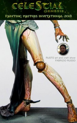
Fabrizio Russo - Queen of the Void
Tomas - This is my absolute favourite so far. I love, love, LOVE the porcelain skin. It looks strong and brittle at the same time. Like a very strong character whose best days are behind her. It gives the model a sense of mortality. Of lost power. It adds a ton of character. Like she is fighting her own doom. I am in absolute awe of how Fabrizio used his painting to add more personality to this model.
Chris - The cracks on the skin, combined with the shading, gives the skin the look of a ceramic - brittle, and perhaps ready to snap. Compared to other versions of this model he has added so much more to the model with the brush, than what was already there, it adds an extra dimension to it and creates a unique character. The skin, of course, has a reflectivity, which enhances the ceramic effect, taking on tones from the cloth, which helps unify the components of the model.
Dave - I am really excited by the masterful addition of texture to the legs of the Queen in this version, I think it immediately starts to give a sense of age to the character which will only be enhanced by the basing Fabrizio is working on.
Ruben - I love the rhythm of work that he has, and above all, the cracking effect with which he has solved those broad areas of the skin, in which he has seen intelligently the possibilities they offer to draw. They are areas that also have their meaning if they are left simply degraded as they offer a contrast with the highly charged areas that the Queen of the Void also possesses, but Fabrizio has proposed a resource that works perfectly.
Angel - A good start, one of my favourites of the contest. He has had a very good idea with the skin and the scheme is perfect!
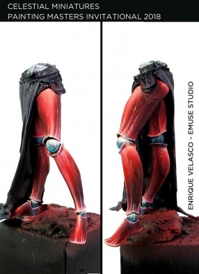
Enrique Velasco - Queen of the Void
Tomas - I really like the red metallic on the legs. The weathering is subtle but makes it look nice and used. The chrome joints nicely contrast with the colour of the legs. I am missing a bit more weathering on the feet themselves, though. They look too pristine when compared to the rest of the legs. I am missing some more scraping from being walked on.
Chris - Here we have a totally different material effect. Metallic red. There are scratches, patinas, and weathering, which gives a sense of age to the material. I love the subtle shading to the legs to give the sense of muscles that have been sculpted into the metal.
Dave - The vibrant red of the legs (which have a very “red metal” feel to them) is pairing beautifully with the blue/turquoise of the leg joints. I’m excited to see how this approach carries through to the face of the Queen.
Ruben - Enrique has always been characterised by elegance and good taste in his way of understanding modelling. He has returned to demonstrate on his version of The Queen of the Void, first, with a light but attractive modification that gives him a very interesting composition to the scene, and then, with the choice of color for the skin with that unexpected turn in red that can remember metallic muscles, that with the technique that always shows, will not disappoint anyone.
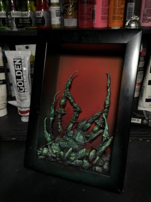
Francesco Farabi - Nüwa
Tomas - Now this is an interesting one. I love the idea of playing with a limited palette. I especially like the way Francesco is presenting this model, in a picture frame. The painting techniques echo this, making it look like 2D artwork. The fun part is where you step past the frame and suddenly realise that it is an actual model in there, not just a painting. My only critique is that I hope it will stay interesting enough to look at, with this very limited paint scheme.
Chris - The box establishes a reference frame for the lighting is different. It will need to be well executed so different aspects of the model are defined. Without other colours being used, there could be a danger that this does seem too monotone, and unengaging - but if absolute whites are used as highlightings that perhaps points of interest on the model can be well established. So far we have only seen the base though.
Dave - It’s a very interesting idea to present the miniature within a 3D frame. The red and desaturated greens provide a great contrast to each other, and it will be interesting to see what scheme Francesco uses for the miniature itself.
Ruben - Very interesting his proposal from the beginning. It is the only one that we have had the opportunity to see the final composition, since it has begun with the scenic frame of the model. A proposal that is very intelligent and at the same time risky due to the fact that it concentrates all the attention of the miniature in a single view and the additional views that a miniature scene can have are lost.
It is an effect that picks up influences from boxed dioramas and illustration, giving spectacular results. I love the way he has composed and taken advantage of other pieces of other kits, also recovering a fundamental part of the model world that is the transformation.
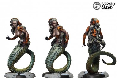
Sergio Calvo - Nüwa
Tomas -I like the muted, desaturated colors on this model. The green tail matches nicely with the skintone. I don’t know if Sergio will be keeping the hair in this white color, but I think it is fitting. With all the understated colors on the body, the orange armour pops nicely, even though it isn’t the brightest orange of itself.
Chris -While the skin is well executed, and the colour choices work cohesively together, I am left feeling there needs to be something more to make this model stand out against the rest.
Dave -Early days for Sergio’s work but I think he has done a great job of sketching out the tones and hues, particularly for the skin, hair, and armor.
Ruben - His style is based on a very quick sketching with very effective results that allow to see from the beginning almost the final result of the piece. At this point, the result may be a bit rough, but in the next steps of detailed and clean, he sure does not disappoint anyone.
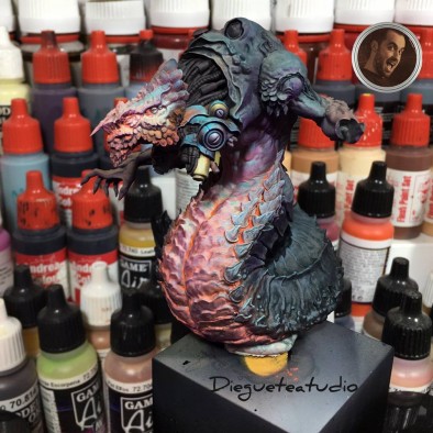
Diego Esteban Perez - X’hydral
Tomas -This one is in its early stages, but it is looking interesting. The glowing body is looking really great, with all kinds of different colours working together. I am looking forward to seeing what Diego will be doing with the rest of the model.
Chris - The use of fluorescent paint to create what I hope is some form of internal heat is interesting, and it will interesting to see how this progresses as more of the out surfaces are completed.
Dave - I’m really loving the subtle work on the texture of the belly of this beast. Using different colors to create great tonal variations is something I enjoy seeing in the work of great painters.
Ruben - Diego is in a very important phase of the process. He is investigating with the miniature. He has an idea in his head and has found the way by which to direct the rest of the work, since having focused the majority of the miniature, the rest goes on wheels. For the moment it has achieved a very interesting effect with those oranges that cut out a skin that has a lot of fleshiness.
Angel - Risky and very beautiful scheme that I want to see more of. This has really caught my attention and the next steps are going to be key.
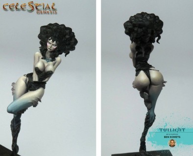
Ben Komets - Twilight
Tomas -Early stages. The skin is smooth. The face is subtle. I like it. Especially the way Ben sees to be going for a twilight-like color scheme, tying in nicely with the name of the model.
Chris - The skin is nice and smooth, cold, yet still filled with life. This is all of course to fit the theme of the model and so how this ties into the clothing/armour on the figure we have yet to see.
Dave - Even at this early stage Ben has built in some great depth of shading to the large expanses of skin, and the tight work on the focal point - the face - is masterful.
Ruben - He has chosen one of the most technical miniatures of the contest. It is very thin and small compared to others, but Ben sure takes advantage of it. He has solved in a very technical way one of the most complex parts that is the skin and especially the face, although later he may need to adjust some things. The rest of the elements after this, it is not going to be more difficult, so he goes in a good way.
Angel - Ben's style features very soft skin, this will be a great paint job!
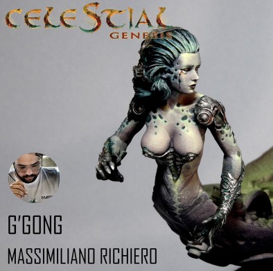
Massimiliano Richiero - G’gong
Tomas - I’m looking forward to seeing how this turns out. The little conversion is spot on. The Object source lighting on the model looks promising. I like what Massimiliano has done to the Nüwa model. The mottled skin looks great and the addition of the little, rusty tear adds a hint of sadness to the model.
Chris - So far, the skin and the pattern upon it is looking great. The contrast of the spots vs the rest of the skin, and the placement, helps define the figure more, and guide the eye to points of interest.
Dave - I think Massimiliano has done a spectacular job of conveying a real and palpable sense of sorrow on the face of G’gong already. Very impressive at such an early stage.
Ruben - Perhaps the biggest and craziest adventure of those who have entered the contest has started. This only has its merit. G'gong is a large and complicated miniature in itself, but he has not hesitated to make a more advanced composition. As for the painting, little can be guessed since the state of the process is very early, and it is such a large piece that we will take time to see more general things like the setting and the light.
So far he has done a very delicate job on the Nüwa torso that I am looking forward to seeing how she interacts with the other parts of the miniature.
Share Your Thoughts
So, that gives you some thoughts on the progress of the various painters right now. Make sure to get stuck into their group on Facebook HERE and tell the artists what you think of their work too as well as see the developments each week.
Which is your favourite project so far?





























![TerrainFest 2024 Begins! Build Terrain With OnTableTop & Win A £300 Prize! [Extended!]](https://images.beastsofwar.com/2024/10/TerrainFEST-2024-Social-Media-Post-Square-225-127.jpg)













My own painting isn’t getting any better right now through the tears I am crying.
Week #1 somegeezer’s comments: “Holy (!!!) Mamma”.
Tune in next week for more articulate critique (or likely a copy/paste job from today)
wow so many great painters that I follow for year, its great competition. superb idea.
How do they paint this way, dam they’re good….
seeing the pieces come together over the coarse is going to be as insightful as it is interesting. the work that has been done so far already promises so much. inspiration indeed for the rest of us mere mortals. The void queen by Fabrizio Russo and that incredible porcelain skin is the one that stands out for me at this stage but there’s a long way to go and there are some very interesting directions and colour palettes in the mix. it could come down to taste given the different styles on display. choosing between the more understated and subtle… Read more »
I have to agree with other comments that the porcelain skin is outstanding. It would be really useful to get judges’ comments that also tell us mere mortals how the effects are achieved and time scales. Do the painters ever scrap what they are doing and start again because the outcome doesn’t go to plan? I ask because I do like to go back to miniatures I’ve painted and repaint them or enhance them if I didn’t like a particular aspect or I want to try a new technique.
Queen of the void is up for pre order