Steampunk Lily & Alamo Airfield from Spartan Games
November 21, 2011 by brennon
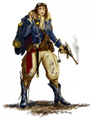
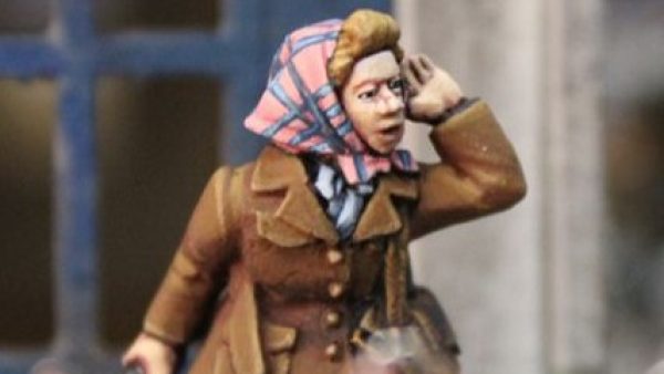
A few more goodies from Spartan Games to round off our beginner look at Dystopian Wars this week. First off, check out Lily sculpted by the guys at Spartan from some of their great steampunk concept art.
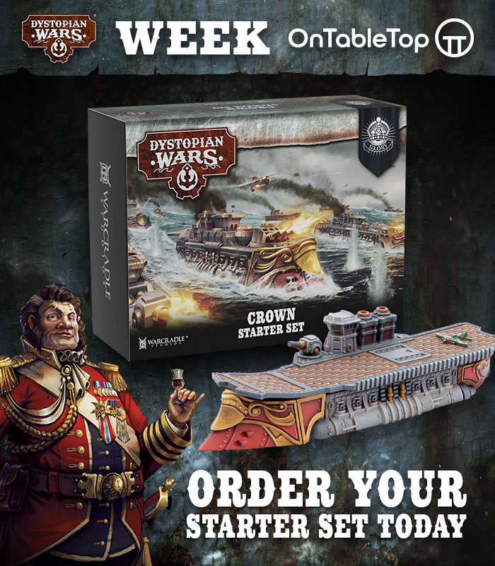
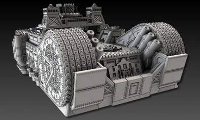
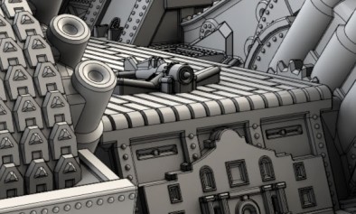
Not bad, and maybe we will actually see some more miniatures from Spartan Games showing off the characters of not just Dystopian Wars but Uncharted Seas and Firestorm Armada too. However, the theme this week from Spartan has certainly been airfields and so here is the Alamo Class Mobile Airfield for the Federated States of America...
A pretty heavy hitting piece of hardware there for the American players out there. A terrifying prospect for even the mighty Metzger robot!
Would you folks buy yourselves a Lily?

















![Very Cool! Make Your Own Star Wars: Legion Imperial Agent & Officer | Review [7 Days Early Access]](https://images.beastsofwar.com/2025/12/Star-Wars-Imperial-Agent-_-Officer-coverimage-V3-225-127.jpg)



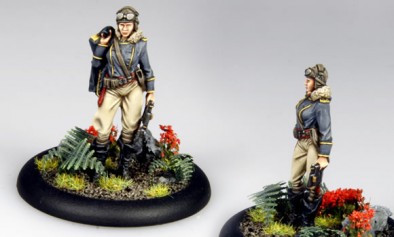
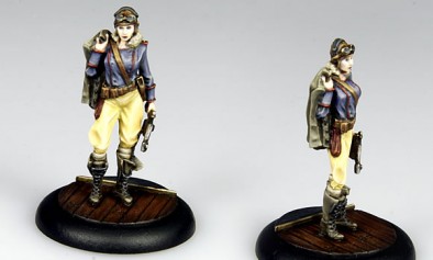
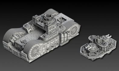






That Lily model is well painted. Now we have an small taste of what they can do in the figure area, lets hope the do more. The tank looks killer as well.
Lily would be most welcome in my valley
Especially like Lily2 and yes Brennon would consider getting her. Not sure what for yet maybe an excuse to scratchbuild something akin to the Last Exile racers!
Oooh ! I like Lily…
The uniform is smashing !
BoW Romain
Whether as a painter’s line of characters or as the first of many for a skirmish game, the ‘full size’ sculpts are welcome.
However there’s a problem with that airfield – if that’s not a dock or berth it’s on, then the treads don’t meet the ground. It may be for casting reasons but it looks like a bigger problem than the filled gaps on some of those Covenant spider tanks…
My bet is that this version is the ocean/ sea going version, and when it hits the ground, it rolls out of the sea going shell. Sort of tlike the WW2 troop carriers the marines used. The front does look a bit like a drop gate. If this is not the case, then yeah, the treads should be on the ground, but thats such a no brainer that I can’t figure that it would be deliberate… Better be some really good fluff to explain it.
Oh yeah, on the Lily model, I always appreciate when you see the 2d sketch and can compare it to the original. So for me there are 2 obvious things the sculptor could not transition. 1 – the face isn’t quite right. Mostly the nose. And the pants. The sculptor has chosen to really bunch them up at the crotch, whereas in the pic they flow over the whole model. Also the boot knife got lost in translation, and the pistol lost the Flash Gordon style feel.
It depends how closely the sculptor was told to stick to the artwork. The face I agree doesn’t match (certainly with the shading in the first painted example) but I’d say marking out the rest of the differences was nitpicking if you thought it detracted from the piece – the baggy pantaloons would be sculpted tighter to accentuate the female form at that scale, and she doesn’t have the oversized breasts found on some models to compensate. Also the pistol would be pretty delicate if it had those Flash Gordon style fins and as for the slender barrel it would end up slightly bent if cast in metal every time – you’d need brass rod.
While the sculptor should certainly be allowed to add their own interpretation to the model during the transition from 2d to 3d, I think in this case (s)he made some choices that diminished the model’s fullness of character. I don’t think it is ‘nitpicky’ to point these out. The pants are reflective of the baggy paratrooper pants of WW2, which deliberately did not bunch at the crotch, because this restricts movement. The sculptors choice to buch the pants at the crotch does not do anything to accentuate the feminine shape, but rather makes the pants simply look uncomfortable. I agree that it is nice that the sculptor did not give the mod porno breasts, but then the sketch did not give the woman huge breasts, so in this case the sculpt and the image match. The real issue with the gun is not the barrel, but rather the main body, which the sculptor actually overdetailed. Given how much detail was added, I dont think it was beyond the scope of the sculptors talent to go with the simple round shape, with a few fins. As for the barrel tip, the sculptor went with a conventional front (a section just a bit bigger than the barel), rather than the blunderbuss style flair, which I really don’t think would have been any more difficult to cast or sculpt. It’s these little bits that add character to the model. Also, I think the sculptor did not angle the piping stripes on the front of the uniform as severely as the sketch, which actually diminishes the femininity of the model (emphasizing narrower hips).
Didn’t know that about paratrooper gear – now I’m missing John’s history lessons… 🙁
I like the simpler, blockier gun barrel since it’s a Prussian model – fits with their ships being very WW2 in looks, very no-nonsense. It would still look good with the flared tip but if it matched the artwork exactly I think it would extend too far relative to the support of the main body (which is probably why it had that added detail, to bulk it out). I’ll take a small concession on looks for the practicality of not dealing with bent metal or broken resin at that scale, since while the barrel is easily replaced in the slender design, that flared tip isn’t, and you’d have to be extremely precise with the glue putting it back…
I think the sculptor did a better job than the concept art. The pose is far more natural and much less static than the concept art. He took a nice piece of concept art and turned it into a really nice model.
I keep trying to avoid DW, but the stuff they’re putting out looks really great.
Hmm. The ‘natural’ pose you are referring to is the shift of the center of weight, which the sculptor puts on the models left leg, forcing the left hip up and shifting the right hip down, while tilting the entire model left of center. The gun hand is also much looser than the image, with the arm almost completely straight, with the weapon being strongly de-emphasizes. Now, suggest this is a more ‘natural’ pose, but I would put it to you that this is not so much a change in ‘natural-ness’, but a change in the models attitude / level of attention. The model in the 2d image is much more alert, and much more threatening. She has her center of gravity directly over her feet which would allow for a quick response to any perceived threat. Her head is up, and her gun hand is also up and away from her body. Nevermind the smoke, which wont transfer to the mini, the woman in the image is much more threatening that the mini. The removal of the boot knife, and the rapier / short sword also diminish the agressive attitude of the mini. And while I am at it, the scarf, although a minor touch, really helps promote the idea that this is a downed pilot who is in a bit of a desperate situation. (The pant stains and grease smudges on the face in the 2d image also help create this ‘situation / story’ that really brings the image to life.) If you believe every character mini should tell a story by their pose and attitude, then in this instance, while the characters are the same, the story / feeling that is implied is very different, due to the changes in detail. Anyway, I’ll go get my nailpuller and deconstruct my soapbox.