Scibor Stride Out In a Spartan Cruiser Mech
March 23, 2014 by dracs
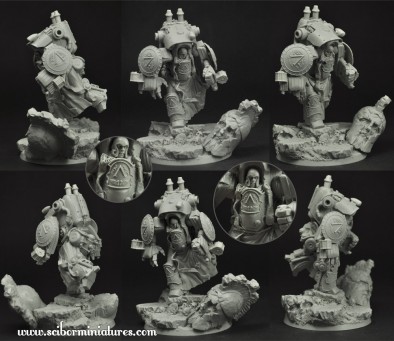
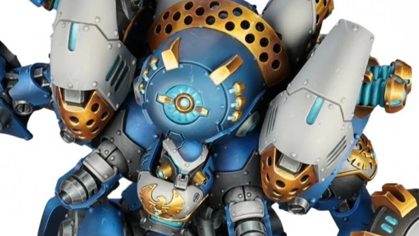
Scibor have always been full of detail, but their can be no denying that their latest Cruiser Mech is somewhat Spartan in design.
We previously saw some WIP's for this mech design and while I still think it is rather overly bulky, the detailing does make it look at least a little bit more practical.
All in all, I think that, while the detail of the model is good and it makes for an interesting and unique sculpt, the finished model is not something I would choose. It hardly looks like it would be capable of movement, while the stance looks like it is performing a song and dance routine (although you might be able to change the stance to fit your own tastes).
Supported by (Turn Off)
Supported by (Turn Off)
Supported by (Turn Off)










![TerrainFest 2024 Begins! Build Terrain With OnTableTop & Win A £300 Prize! [Extended!]](https://images.beastsofwar.com/2024/10/TerrainFEST-2024-Social-Media-Post-Square-225-127.jpg)



















I remember seeing Scibor’s space marine conversions on CMON back in the day and thinking they were so cool. His original stuff, however, is so clunky and awkward, and not in that baroque way that GW’s stuff is. His space knights are just odd looking.
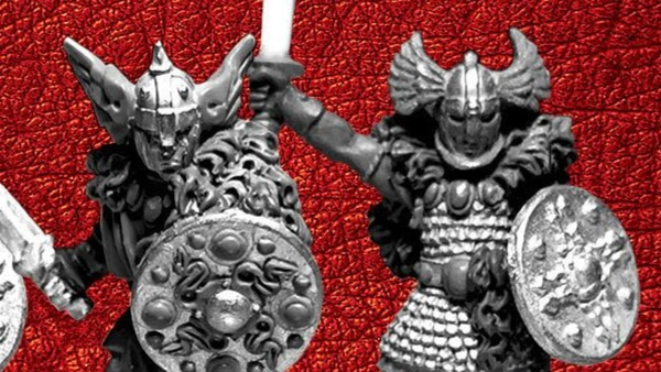
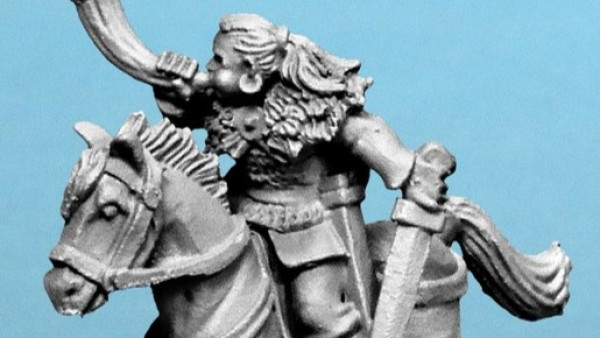
His fantasy stuff is great. His conversion bits are great. His space knight model kits are blech.
The things about the scriber stuff is that they have tried too hard to add too much technical detail to everything. I prefer the power armour from Anvil Industry, which is much more basic. This stuff does not look like it belongs on a battlefield because it looks too pretty. It looks very cartoonish.
I don’t know what to say about this type of armour. So many things work well with it, yet so many things looks wrong as well. I get mixed vibes whenever I see the sci-fi range they do. Conversion parts are extremely well planned yet the full models just go flat. Fantasy is always great from them at least.