Get A Dose Of Old School Swedish RPG With Modiphius’ Fantasy!
November 21, 2019 by brennon
Modiphius is getting stuck into some old school gaming with options to pick up the new English rules for Fantasy!, one of Swedens best selling roleplaying games available in both print and digital mediums.
The idea with this game, originally by Tomas Arfert and translated into proper English by Chris Gonnerman and James Lemon is that it goes back to a time where the rules were easier, the combat was more brutal and things could be tweaked and twisted to fit what you wanted from your games.
Whilst this is quite the claim considering the toolbox of options available in pretty much all RPGs this does sound like fun and it might be a nice pick for the grognards out there who want something a little more pure and akin to the old days of Dungeons & Dragons. The artwork certainly looks the part.
The game boasts easy and fast to learn rules for beginners who want to delve into roleplaying games for the first time and also veterans who want to skip past all the rules-heavy systems out there. The focus is on telling a good story rather than simulating reality which is always nice to hear.
One of the core rules in the game is that any rule can be cancelled and changed by the Games Master if they so desire if it improves the game feel. Rules are there as a framework and help both sides of the table to tell a fun story.
Could this tempt you?
"Rules are there as a framework and help both sides of the table to tell a fun story..."
Supported by (Turn Off)
Supported by (Turn Off)
Supported by (Turn Off)









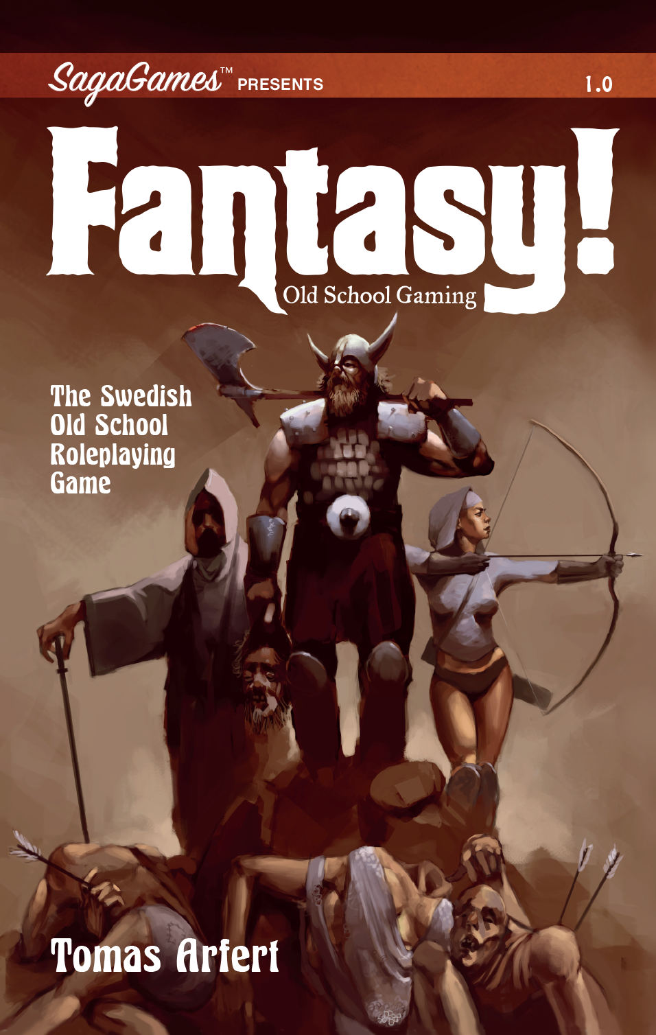
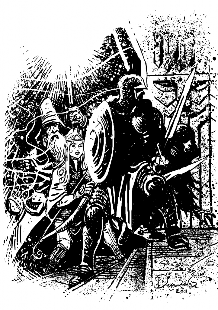












The B&W image is really cool and has a nice menacing atmosphere to it,but the cover art is dire. I’m not one to complain about scantily clad female characters but she’s literally standing there in underwear.
I think the woman looks weird as well. It looks as though someone wanted a Red Sonja bikini look but was also trying not to draw criticism for having a scantily clad woman. The result looks like a woman who has just got out of bed wearing pants and a pyjama top. It looks really, really silly. I wouldn’t mind but it’s not as though the artist did much to disguise her boobs either! It’s quite a figure hugging top and doesn’t leave a great deal to the imagination, only marginally more than a bikini. As a piece of artwork… Read more »
Might be slightly overthinking a cover, it’s not particularly good or bad. Not saying that either of you are you offended by it…but I really don’t honk there is anything objectionable about the cover
Nobody is offended by it, just saying it looks weird. It’s like it’s trying to please everyone and as a result pleasing no one
Not offended or objecting to it, I just think somebody standing on a pile of dead bodies in something they bought in a lingerie shop looks stupid.
It’s the knickers/shirt combo that’s ruining it for me. Don’t get me wrong there’s definitely a time and a place for that look, just not convinced cover art for an RPG is either
Yeah the cover is odd, and the lady’s outfit boggles the mind. Go modern PC or go full chainmail swimwear but not half way.
The black and white is fantastic though.
My first experience with fantasy art was heroquest. The black and white on the cards and in the books is still my favourite to this day.
I feel it carries so much more atmosphere than some coloured works.
Half way is totally fine, if you reverse the combo – full trousers with a crop/bra top totally works.
To be honest, that look on the cover works when it’s my girlfriend and we’re at home. But I doubt she would want to be seen in public lol