New Images Of Archaon The Everchosen Spotted Online
November 24, 2015 by brennon
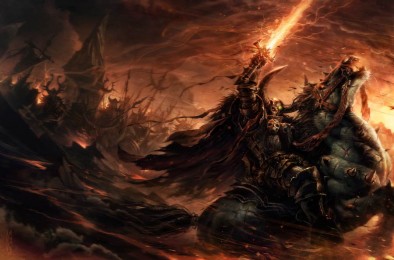
New images of the updated Archaon have been spotted for Games Workshop's Age Of Sigmar. You can see what he looks like here atop his demonic mount Dorghar who has taken a very different form from his previously horse-like visage HERE...
Now we've got a closer look at the model it's a lot more impressive. I like Archaon who looks like a brutal warrior clad in black armour with his deadly sword. The mount is also great looking although I still don't like the Nurgle head.
If you have any idea how to read German then you might be able to work out some of his statistics but he looks like quite the deadly nemesis. I'm sure he will be a nasty foe to face.
Images From GamesTrust.De
What do you think of the model?
"If you have any idea how to read German then you might be able to work out some of his statistics..."
Supported by (Turn Off)
Supported by (Turn Off)
Supported by (Turn Off)



















![Make Your Own Star Wars: Legion Heroes! Rebel Agent & Officer Set Review [7 Days Early Access]](https://images.beastsofwar.com/2025/12/unboxing-atomic-mass-games-star-wars-legion-rebel-alliance-agent-_-officer-coverimage-225-127.jpg)










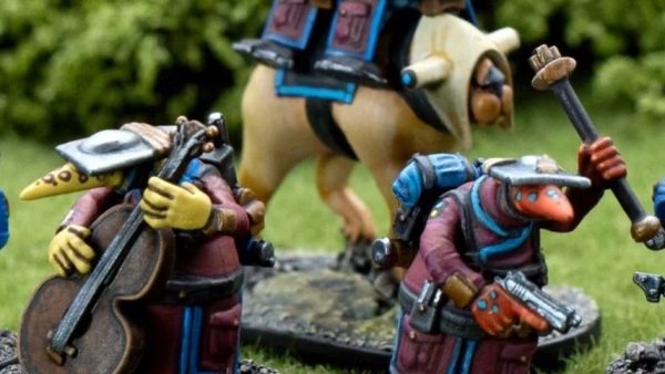
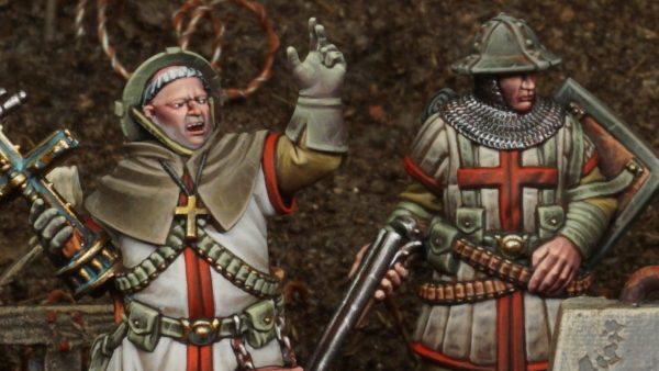
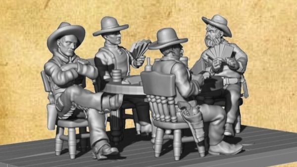
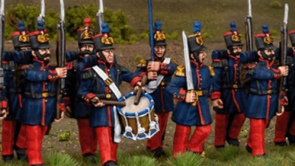





Looking at promotional pictures of AoS I find my eye just skipping over details. In fact I can’t even find the details, it literally makes my eyes go funny.
It’s too bright and messy. It’s like a representation of ADHD in miniature form.
Check out these pictures and tell me that they aren’t what made you fall in love with GW:
http://heresyandheroes.com/2015/01/28/old-school-eavy-metal-photos-why-i-fell-in-love-with-40k/
I was wondering if it was just my eyes getting old. I struggle to make sense of the mass of colours and excessive detail.
Whilst those aren’t what made me fall in the love with GW, the point is well taken.
Yeah you are right, my last point isn’t going to be true for a lot of people 🙂
I know times move on and nowadays kids are probably overwhelmed with flashy stuff 24/7 so GW has moved along with the times, but I do think the promotional pictures are very poorly laid out.
I do really miss the old style of Warhammer and 40k, and I think if GW tried harder to recapture that spirit it would be no bad thing.
It isn’t flashiness or excessive detail- it is poor composition with too little value contrast.
It isn’t a problem with the sculpts; painting it right can fix that problem quite easily.
It certainly doesn’t help that it looks like it got caught in an explosion in a rainbow factory, though I do see the models unpainted as well and don’t care for them in that state either. They tend to suffer from one or both of excessive CAD detailing and/or 80s action-figure-itis.
Explain, @odinsgrandson. I did a two-year stint in graphic design, and don’t think I could fix this. It’s just plain lost in its own detail.
Couldnt agree more, still battling with the choice i currently have of do i paint my new mini’s bases green to fit in with old army (plus i have 3 sealed pots of goblin green 😉 ) or do i brownify my old armies bases.
Love those pictures! My first step into the miniature world was some free magazines from GW…read them until they fell apart. They were full of pictures of beutiful painted minis and lovely terrain. Been buying old White dwarfs just for the pictures and terrain tutorials 🙂
@abbadon if you can track it down the old citadel how to make wargames terrain book is ace! So pleased that escaped my foolish sell off of stuff i still wish i had (seriously i had a 1500pt legion of damned army i sold for £40, and pretty much a complete necromunda mini collection, was a buggermuppet when i was 17!)
Has a large section dedicated to the greatest 40k diorama ever made (in my opinion) Mike McVey’s Emperor vs Horus with a slain sanguinius at the warmasters feet
With a half gcse (vocab, no grammer :D) in german i can helpfully contribute nothing other than a question of why didnt gw translate three heads in the german text???
Even with my non ability to converse in german i know that could translate to drei kopf…?
That looks really busy. They really went overboard with this one.
All of the above. Dear GW: please make the model look like the art for once.
I personally think it looks flippin’ great! I especially like the pose of the mounted chimera looking creature along with it’s grotesque heads!
I empathize with the accusations that it’s looking a bit busy and toy like but I’ve often found, to my surprise, in the flesh and with different (better!) paint jobs that the larger GW models always end up looking pretty great.
At least this has been my experience with the Imperial Knight, Treeman and Stormsurge which hadn’t won me over in the previews…
That said, it has an eye watering price point which end all interest as a curiosity to be painted up for the fun of it!
*goes back to fiddling with 15mm tanks*
I’m with you there. This is not a good color scheme for him. With a little love, and some sensible composition principles, he could look quite pretty.
Was kinda hoping he woulda achieved Daemonhood by now, but perhaps cos he loves ALL the Chaos gods, he’s not gonna take the promotion until Slaanesh says he’s coming to the ceremony.
For me, it’s very much too “nouveau-GW” – fiddly and confused design, and at the same time blocky and basic. Not inspiring me I’m afraid – it’s a hard ask though since Archaon, Lord of the End Times was a thing of absolute beauty.
What @solar mentioned is somewhat true in that the picture is confusing. I don’t think it’s the model itself that is the problem. I find it is a nice looking model overall and the paint job is not really that confusing. What I do find hard to look at is the surrounding models and terrain. The background is just overtaking the actual model on display. Tone it down and people will know what’s being pitched in the ad.
*Sigh* Looks like GW has axed Slaanesh.
@toxicvex, nah just restrained and gagged him/her/it, cant retcon slanesh out of 40k unless they advance the plot and the harlies manage to unite the eldar, play the ultimate trick and so on and so forth. As for AoS i think they are stalling for phase 2, slanesh will be back hopefully redesigned as a faction so they are less eurotrash s+m club goers/cenobite ripoff and more varied in their excess and depravity, prehaps an army of bankers, gluttons, hyper vain poptarts, and creepy looking weirdo’s basically a tamer version of kingdom death would be perfect in my book…