New Dark Miniature Previews For The Others: 7 Sins!
July 7, 2014 by brennon
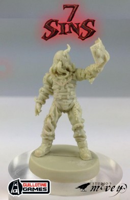
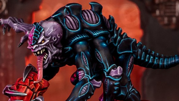
We saw some more artwork last week from The Others: 7 Sins and this weekend we're looking towards more miniatures instead! See what you think of the Werewolf we checked out last week, Karl, in his human form and also some form of Possessed soul...
The miniatures look very clean and well detailed as you'd expect from the folk at Studio McVey and this could well be one of those nice premium products that come out once in a while you want on your shelf. Going down the board game route again is also a great way of making a game nowadays I think because it will contain everything you need to play in one place - no hassle!
I'm really interested to see the other members of FAITH team and what these demons and creepy creatures have in store for them as the game opens up and spills the beans.
What do you think of the sculpts?
Supported by (Turn Off)
Supported by (Turn Off)
Supported by (Turn Off)



















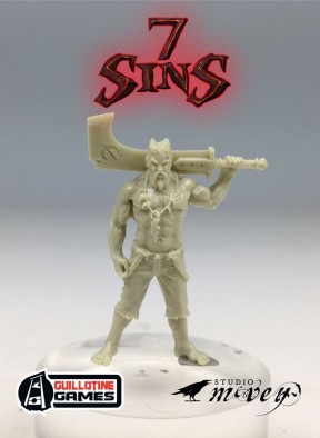



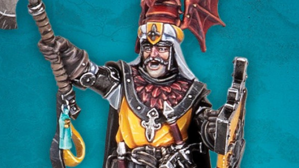
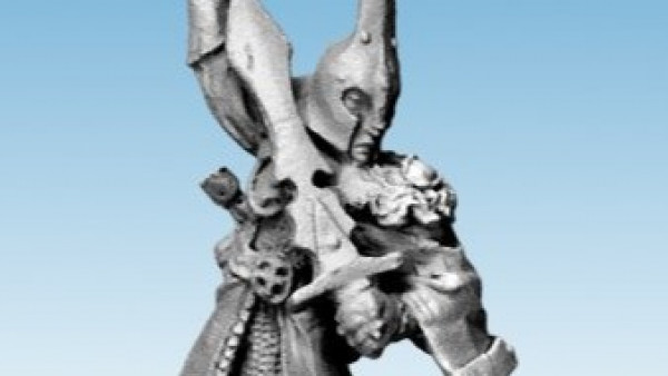


Very nicely detailed miniatures. It good to see proportionate musculature on Karl instead of the usual over the top exaggerations you see on many fantasy figures. However, I’m not too keen on his impractical sword with the weird right angle. Try swing that thing around with any precision.
7 sins seems to have a cthulhu feel about it which has got me really interested. I will be keeping an eye on this one.
I don’t think the sword is meant to be practical. It’s a design aesthetic and my guess is that Edouard Guiton did the original concept. http://www.edouardguiton.com/index/
Having this post right next to the Space Wolves post certainly doesn’t do the SW any favours.
I think the original artwork for Karl was by Adrian Smith although they have a lot of different people working on this game.
BoW Ben
You’re undoubtedly correct. Adrian has contributed a couple of concepts to Zombicide and the figure suits his style. Edouard is the main artist and art director for Zombicide and the sword is in his style so presumably there’s a bit of house style going on there.
If you are out of step then that makes two of us. Those space wolves don’t appeal to me at all, especially that one with the shaving brush head and don’t get me started on Ogryns or we will be here all night.
It’s all well and good to use design aesthetics. However, that is a subjective consideration that has to be balanced with the saleability of the miniature. Does this sword appeal to you? Would you like more miniatures to have this type of weapon? For me with an interest in edged weapons this simply does not work. If this figure carried a weapon that was capable of being used in a fight it would give it a much more gritty dangerous appeal. A good example of a curved blade would have been an Arabian tulwar or Japanese Katana. Because this weapon… Read more »
Yes it does appeal to me and the aesthetic is proven in the marketplace through Confrontation, Zombicide, and Wrath of Kings. Not every aesthetic will appeal to everyone, but it doesn’t have to. It just has to appeal to enough people.
It is interesting to read other people’s views on the subject of aesthetics in miniatures. So thank you for that. It is good that our hobby can cater for all tastes. It’s not just this weapon I have issue with; I have similar problems with other miniature designs, currently on sale, like swords the size of canoes and barbarians with ridiculous muscles, like overinflated Michelin men is another no-no for me. I also get annoyed by females going into battle wearing bikinis, thongs or fetish party wear. I am not saying you approve of those. However, since these designs are… Read more »
Expanding on my brief Space Wolves comment earlier in the thread. I cannot understand the appeal of their bulbous heads, stiff poses, and odd facial expressions. They look extremely dated to me and pale in comparison with what’s now available elsewhere. All of that said, I understand that Space Marines are the single most proven commodity in our industry so I accept that I’m out of step with the majority on this one. Diff’rent strokes and all that 🙂
I don’t know how representative our tastes are, calmblueoceanangel, but your preferences match mine quite well. Anime aesthetics aren’t for me.
The more I keep an eye on this the more interesting it seems to be getting. They seem a bit more of an organic shape with soft edges, really good quality for that type of figure at least, to me. I can understand how some people don’t like the sword, I mean, it is a bit odd looking, but hey if they were shooting for realism, he wouldn’t be a werewolf.
nehpets,
werewolves, vampire, zombies and any other fantasy character or cliché I don’t have a problem with. It’s when something is used that you look at and know that won’t work like square wheels on a chariot, a Viking helmet with the horns on the inside and then there’s this sword. Seriously, what is the point of that shape? does it double up as a boat rudder, a spare false leg in case he loses one or is it meant for fighting around corners?