New Avatars Of War Vampire Count & Wild Sabretooth Released
March 7, 2018 by brennon
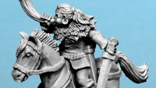
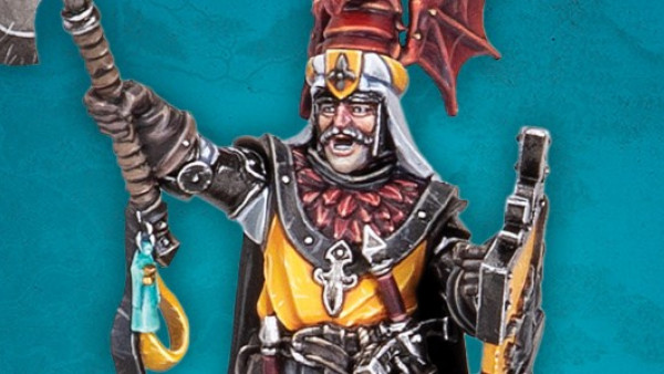
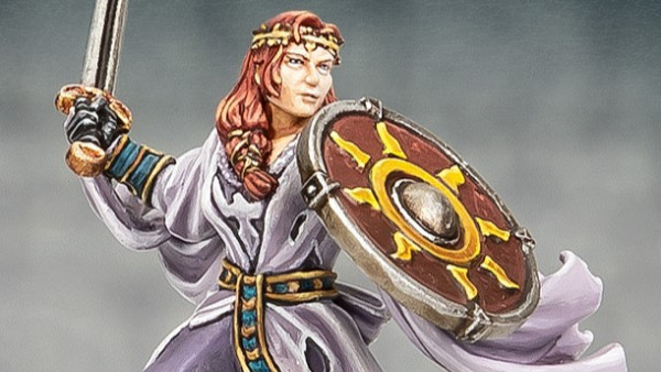
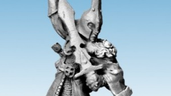
Avatars Of War have two new kits for you to check out this month. The first of these is a new Vampire Count who comes with a number of different options.
This fellow has been designed so that he works for a variety of different 'bloodlines' in the game which would be perfect for those who are still playing games of Warhammer Fantasy. As you'll notice by the little label, this model and all of the characters by Avatars Of War have been designed with 9th Age in mind.
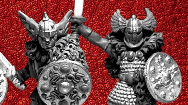
I think the fellow looks great, especially the middle model with the flowing hair. He looks like a commanding figure, bearing down on some unfortunate soldier, about to slice them apart with that sword.
Primal Hunter
As well as this dark hunter, we have a savage beast of the wilds too. Here is the Alpha Sabretooth Tiger.
Shown lunging forward, about to rip you clean in two, this beast would be great for those looking for a new mount upon which to sit their general perhaps. You could also see it fighting in a bloody pit fighting arena, ready to savage the unwary.
What do you make of these new releases from Avatars Of War?
"...this model and all of the characters by Avatars Of War have been designed with 9th Age in mind"
Supported by (Turn Off)
Supported by (Turn Off)
Supported by (Turn Off)





![TerrainFest 2024 Begins! Build Terrain With OnTableTop & Win A £300 Prize! [Extended!]](https://images.beastsofwar.com/2024/10/TerrainFEST-2024-Social-Media-Post-Square-225-127.jpg)










This is a bit heavy-set… I don’t know. It’s old school, but recently even GW is moing away from that sort of thing. I’ve seen more elegant miniatures.
I really like the vampire! Great model in a style I totally dig! Brings back the good old days of WHFB 😀
I like him! Not sure about the tiger…
Now that I look at the cat, I think his body is too short.
Fabulous looking vampire with variety parts the sabertooth looks great as well.
Those are very nice.
I’m looking those tigers and thinking the look links ads better than the current GW frost sabers, these would make great replacements!!
*thinking they look loads better
The tiger looks great, the vamp not so much.
Nice try with a lot of options but it’s just a badly executed GW 8th edition design and those were already dreadful when done right
The middle option with the flowing hair is the best but the sword is totally unbalanced.
Great detail on the vampire but the strange pose makes him look weird. Reminds me of old GW figures and not in the good way.
Tiger looks like some sort of a skaven.