Wyrd Summon Forth The Tidecaller In New Malifaux Preview
April 30, 2020 by brennon
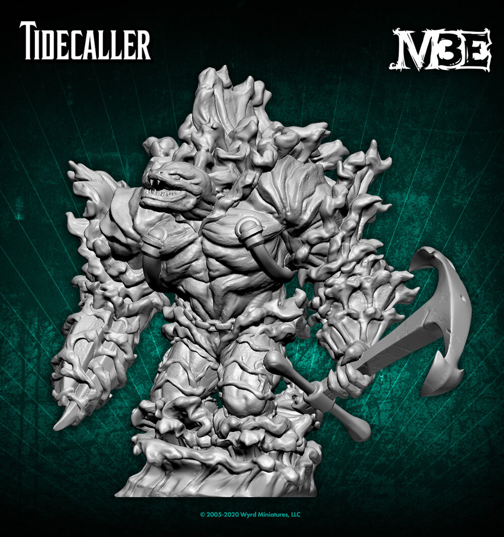
Wyrd Games has dropped another preview for the world of Malifaux and this time it seems to have been summoned from the depths of the ocean. Here we have the Tidecaller for their weird and wonderful world of oddities and monsters!
This new creature is a roiling mass of water which has been summoned forth by eldritch skills and is now looking to crash down on some poor fools who end up going up against it! As someone who likes their elementals, this addition to the world of Malifaux looks very nicely suited. I love that they've gone with an eel head emerging from the surf too.
This fellow is certainly going to be an interesting challenge for you to paint. You could either go with Contrast paints to get it done quickly or perhaps try a mix of traditional painting techniques, washes and drybrushing in order to get the look of roiling water.
Maybe you could even go for something a bit different and instead of doing the clear blue water, you could try and get the look of a storm-tossed green sea which looks even more menacing!
What do you think of the Tidecaller preview?
"...you could try and get the look of a storm-tossed green sea which looks even more menacing!"
Supported by (Turn Off)
Supported by (Turn Off)
Supported by (Turn Off)












That’s a task to paint…. a task beyond me.
Great design and idea again from Malifaux
Oh that’s cool!!! You really don’t see many generic water elementals these days.
This will almost certainly be available as a translucent blue plastic special edition during online sales (Black friday etc) or as organised play rewards, like the Rasputina/December set I picked up a few years ago.
If I had to paint this, I’d be using my airbrush to get a zenith-like contrast base from white to grey (or even a dark navy blue) over which I’d be looking at translucent washes or contrast paints to do most of the work, finishing with some dry-brushing and manual highlighting.
Actually, looking closer at the drawing I think that where they have dark blue around the fringes is actually what I’d show as a foamy, frothy spume, so much of the shading and light caustics would be reversed for me.
Looking more closely at the render they’ve given 3d shaping to the blue-gradient water sections and the white froth/spume making it less of a painting challenge to know what goes where, but instead trhe skill is in the water shading/blending.
Hmmm this kinda doesn’t work for me. The art is great but I kinda don’t like the render. Might have to see it in person but I’m not impressed.
Yeah I see what you mean – I think the problem might be that while the concept art has the vaguely human overall shape but the detail is still of water and waves, the render has sculpted musculature and where the waves *are* sculpted, they just don’t look right.
An interesting character.
Not a fan of the head coming out of the chest/neck.