Dropfleet Commander Boot Camp – Saturday
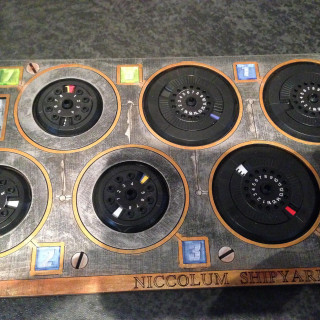
Checking Out The Dropfleet Dashboard From Dark Ops
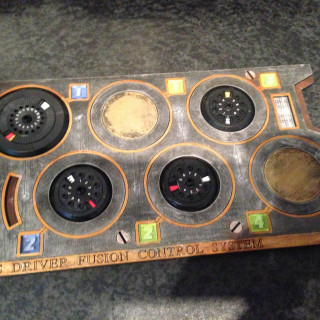
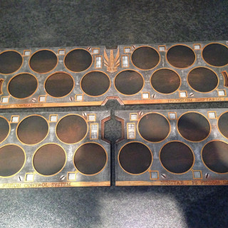
We take a look at the awesome Dashboard that Dark Ops has put together for use with Dropfleet Commander condensing everything from the tabletop into one place.
Look out for them towards the beginning of next year and we're going to test out the prototype today!
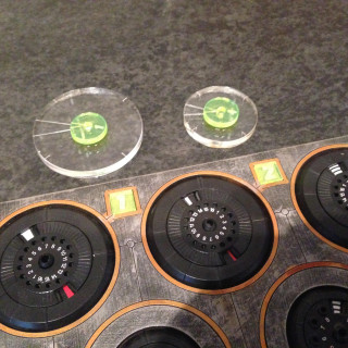
This does make viewing your fleet a little easier and allows you to use clear bases to see the tabletop beneath, especially when it's a nice Deep-Cut Studio mat!





























![TerrainFest 2024! Build Terrain With OnTableTop & Win A £300 Prize [Extended!]](https://images.beastsofwar.com/2024/10/TerrainFEST-2024-Social-Media-Post-Square-225-127.jpg)


















Where can I get some of these? Need UCM and Scourge… This would be the best Solution for the fiddely bases.
They should become available towards the start of next year @jocke 🙂
Looks like Pezzapoo will be getting my money.
The coloured rings are fine when distinguishing units but the individual ships need a number so as well as a blue 1 token on the dashboard you would need a blue 1 ring on the ship stand, and the same for blue 2, blue 3 etc – e.g., for a squadron of frigates.
You may need more than one dashboard in a bigger engagement.
I like the idea – it means all the dial manipulation stays off table BUT then your opponent does need to see what level you are currently on for fair play. They look like WW2 bomber cockpits.
Look at the first picture, The rings are numbered.
red 5 standing by
I was a bit concerned by those dials when I saw even Hawk staff picking up their ships to use them. Seems like they are hard to use without messing with your placement.
this seems interesting i wonder if it is also for the opponent!^^
these look like a great addition to the game
This looks really great. Every video makes this game more appealing
These make me think of Ender’s Game … the Admiral is in the background giving commands at his station and his ships fly through space doing his bidding and the effects of his actions show up on his board in front of him … such a cool touch.
Those are a very cool idea, need to get more use with the bases to see how useful the dashboard would be.
An interesting idea, but it does strike me as taking up a whole lot of extra space which I usually find I don’t have available when playing at tournaments.
As an example, even just for a 1000pt list I was planning to use at a tournament this weekend, I would have needed 2 of those, and I dread to think how bad it might get if I went up to 1500pts.
It is an interesting idea. I do want to see how they work in practice.
I love when companies develop accessories for games. From dashboards to tokens to box inserts. Not requirements, but great ways to organize.
An interesting addition. Might look into these.
Nice looking stuff.
that’s a really clever idea. I think I will be looking for them when they are released.
That is a almost must have for these types of games. It’s my one complaints about Armada, having to fiddle and knock the bits and pieces around while you adjust the ships.
Really like this idea and organization. I’m a proponent for clear bases, as it shows the underlying map through, and gives a better optical sense of flying over. Well done!
i need these
Want! Want! Want!
Hmm not convinced TBH. I dont see why provided bases are not good enough?
The provided bases are a bit fiddly. Ok for spikes and orbital layers but tracking damage is a bother due to the small size of the pegs.
I’m sceptical on this one… But who knows, haven’t played a game yet.
You know, that dashboard might actually be a good way to transport your fleets too. Pop the stems in the dials and pop the ships on top. When you get ready to play pop’em all off and put them on the clear bases.
I thought the same
That’s very cool, hopefully the clear bases will have the fire arcs on it.
Well Done! Pezzapoo
very useful, lets you keep the bases clear and more realistic